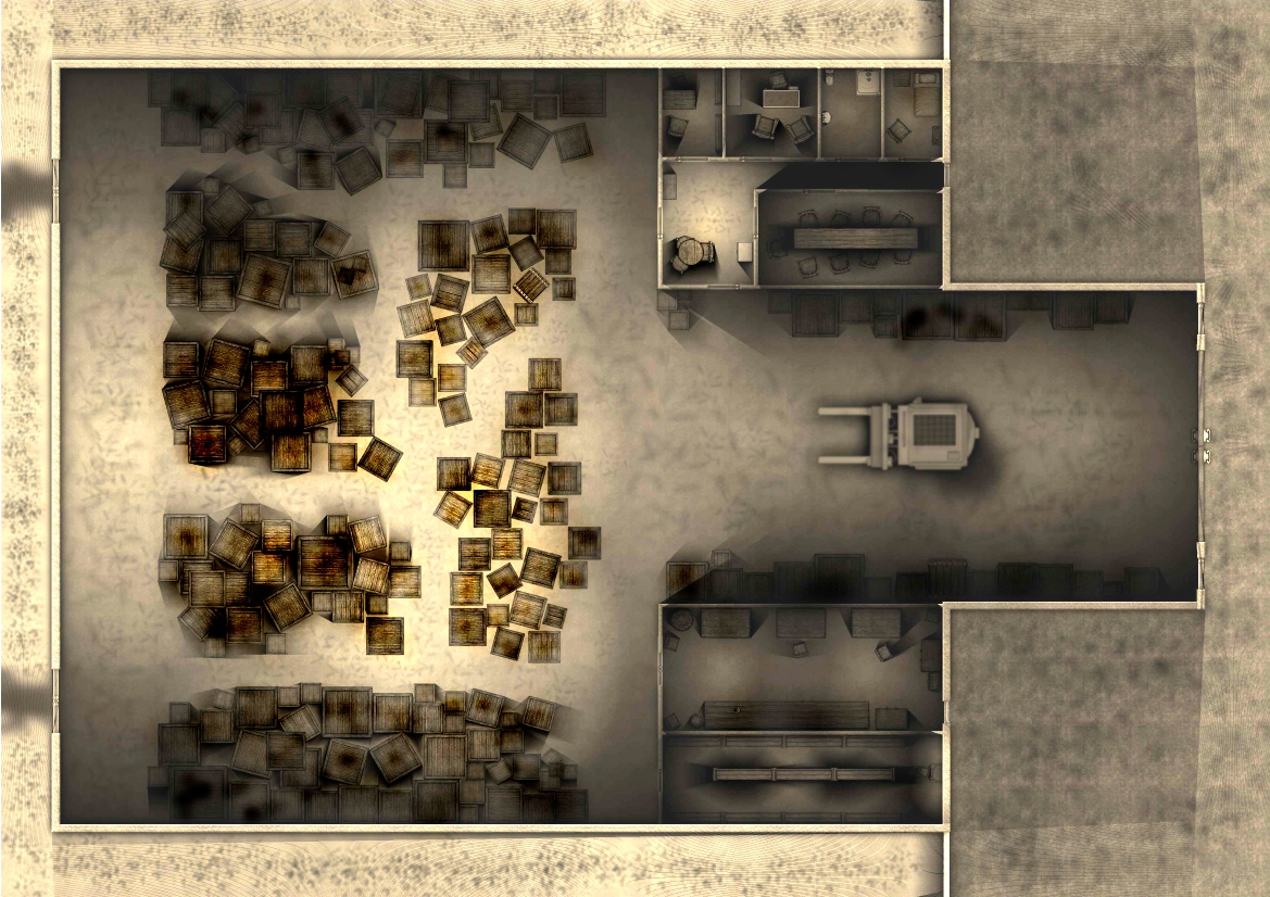
Post Production on a Call of Cthulhu Warehouse Map
Hey all.
I just had a sudden realization that one can alter images in Gimp. So, I have been playing around with "Post-production" if you will. In this map, I definitely like the texture that I gave the warehouse floor, it really broke it up a bit and made it seem more real. Then I found the Burn tool. I think this has a lot of promise for the kind of maps that I am making. My question is does the burned brown on the warehouse boxes seem too overwhelming compared to the rest of the map? Has anyone used the burn tool in Gimp or something similar in photoshop to do something similar? I think the burn on the map gives it a really old time feel. I like the way it brings out the texture of the boxes too. Is this too much for this map or should I maybe try burning the whole thing slightly to get a slightly browned color?
This is my first attempte with altering a map outside of Cartographer. I gotta say I am having a LOT of fun but want some guidance as just because there are these tools available doesn't mean that I should be using them!
Nick


Comments
This map looks good, but be careful about shadow depth, direction, and how light sources push shadows though. One technique that you can use to plan shadow angles and intersections goes like this:
I have taken the liberty of drawing a green circle on your map section - this circle represents - let's say - where an overhead utility lamp exists in this room that is suspended from the ceiling, but that is invisible to the map viewer due to the top down perspective cut away. Let's imagine that this lamp is the only source of illumination in this room. The green lines eminating out away from the imaginary lamp that I have drawn represent the light angles - and thus - how your shadows will be oriented. Shadows are at their darkest and most sharply defined - the closer that the object casting the shadow is - to the light source. Light always moves radially in straight lines outward from light sources, and shadows always follow the angle of the light rays as they radiate outward.
Remember also that the farther away an object is from a suspended light source, the longer it's shadow will be. If a box in your warhouse is closer to the brightest overhead light than the dimmer one - then the shadow cast by the brighter light will have a shorter length on the ground than the shadow cast by the lesser light. Think about how the sun casts a shorter shadow at noon than when it's either morning or evening.
I love your map image, I think it awsomely rocks!!!
@mosswood17: Great map. I like the brown burn effect, but by using it, you do place the focus of the map squarely among the boxes, since they look more colorful than the rest of the map. However, given the light levels in that room, that is maybe your intention anyway?
@Monen, I didn't really want the boxes to pop out like that, I just liked the burn effect on them so much I thought I would post it. The other thing is that the map seems to print much darker than it looks, so with a map sufficiently moody-looking on the computer screen it comes out almost black when I print it. This map comes out much darker but still easily readable.
Nick
sorry about the misunderstanding guys - but I assumed that only one light source was used in the room and that the shadows were done using custom brushes in post production.
I totally missed it dude! Lol.