Symbols Set(s) Project Update: "Scooby Doo" Syndrome...
 Terraformer_Author
Newcomer
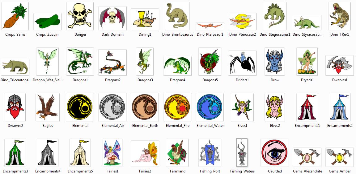
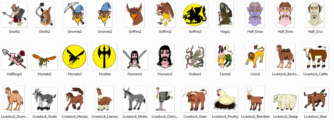
Ok, I have been drawing, and drawing, and drawing, and drawing. I have been told by the sacred sages of this forum to "keep'em simple" (paraphrasing), i.e. - To not make them really detailed or they will look gunked up on a map. I also know to keep colors as vivid - yet well blended as possible - so that they look good on a map as overland symbols and map markers without looking goofy. I also know to make them as readily recognizable as possible.
Ok, check - check - and double check...
I have looked them over - and unfortunately have come to the conclusion that they look like they should be stamped on a playschool toy, or emblazoned on a pre-scooler's tin lunchbox. In short - my drawings are suffering from a horrible case of "Scooby Doo Syndrome". I am afraid that they have crossed over the border from the realm of super cool awsomeness - to the happy land of "Aaaaaawww - ain't that adorable or what?". The Fisher Price Company would like these, as would anyone looking for interesting letterheads and clipart for a day care center, lol:)
Question - am I being too harsh on myself, or right on the money about it - be brutally honest please - your critique?


Comments
I need more input though - I'm wondering if they are really even appealing or not - because I'm tempted right now to trash can them and start all over again, lol.
I would definitely use those symbols but probably on vector maps (see Monsen's comment).
.Png and .svg I know, but .FSC I don't. I'm gonna have to look that one up. I DO know that when I'm ready to package these puppies up, they will be in both .png and .svg versions.
I'm assuming that .FSC IS a vector format - or it's a compressed package containing vector files.
.FSC is just the regular CC3 map format, nothing special about that one. Everything inside is of course vector entities, CC3's native stuff. To draw proper CC3 vector symbols, they mist be drawn inside CC3 with CC3's own tools though, I've never seen a converter. CC3 can read autocad (DWG/DXF) files, but those doesn't support the same features as FastCad (CC3's engine), so I don't believe going through that format will be perfect (although it may give a starting point if you can convert to it, so it is worth a try).
Your symbols do look like they will be perfect as vector symbols though, but vector symbols are usually best drawn from scratch, and not converted.
Anyway - the main point is this - will these look good in CC3, not necessarily with the symbols that are already installed - but say - if I did additional symbols for mountains, trees, hills, structures, whatever - in order to establish a full art style pack? Would the effort really be worth it?
Could these symbols be used to produce qaulity, great looking maps, or are they just mildly novel clip art? How truly useable do you think that they could be, from a qaulity control perspective? Would they look good as .png symbols on a map through CC3?
As far as converting the images from .png to .svg - I have in my freeware disk collection an app called "Potrace" somewhere - that can remove / smooth out pixelation (even though some of the images are so large - that I don't think that it would probably matter much anyway). That may mean however, that I might have to do some recolorizational touch ups and tweaks in Inkspace possibly. I believe that there may be a script or trick within Inkspace itself that will "depixelize" an image, not sure.
Either way - I'm going to keep drawing,lol
And again, to use it in CC3, it must be a CC3 vector image, that is, a drawing built using CC3's basic shapes. Bottom line is, if you draw them on paper and scan them in, you should probably stick with the png format. If you want to have them in vector format, you will most likely need to redraw them inside CC3 from scratch.
As for creating a complete style pack, well that is a good idea. I love having multiple styles to select from when I make maps, and I am sure most of the community do as well. However, it is a lot of work, so you should decide for yourself if it is really worth it. If you enjoy doing it, then it probably is
I think the CC3 versions will just remain the original .png files (maybe even refined within inkscape, and then exported from there as a .png, If I could somehow export, or reestablish image transparency).
Since I am working with a mouse - for drawing up the CC3 symbols - it's gonna have to be scanner, ink, and paper, lol
P.S. - I have a big "multifunctional" scanner / printer / fax machine / photo printer machine (Epson Stylus CX6000), and I haven't ever used even half of all of the functions on this kooky thing, lol. Just used the basic scanner and printer modes - and the software that it came with just gives me the option to output .bmp, Jpeg(yuck), .pdf, and tif / tiff.
Standard CC3/DD3 symbols are PNGs
Filled, Line, Monochrome etc are vectors.
It's ok for forum thread images (because it does keep page re-load time brief and clean) - but a lousy format for an image or media product.