World of Caera - The Free Lands
RalfRalf Administrator, ProFantasy 🖼️ 18 images Mapmaker
I've created a map for our own games (too rare these days) and blogged about it on the Profantasy blog.

I've attached the map to this post, and here are some jpg images:

The Free Lands map in Jon Roberts' style:
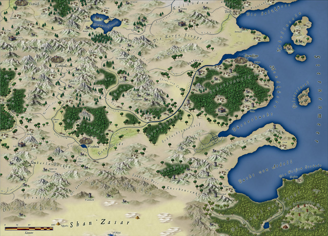
image
Same map in medium size
Same map in large size

And with 10km hexes:
image
Same map in medium size
Same map in large size

Let me know what you think!

P.S.: Check out the map's game too, it's free and available in English.

Comments

  • Very awesome map. I'm about to embark on creating a very large campaign map and this i making reconsider the style I choose.
  • A beautiful and artistic map with some great information and usage. In my experience running, though, it is hard to mix artistic style and absolute reality. That map with 10km hexes gives some odd results when you have to make judgement calls about which hex something is actually in or the terrain people are traveling through. I wouldn't mix the styles.
  • RalfRalf Administrator, ProFantasy 🖼️ 18 images Mapmaker
    Thanks, folks. I agree about the hexes not normally being something I'd do on such a map. It was just that the originaly always had a hex and non-hex copy, so I did one here too. It didn't really take any time after all. :) It's still generally useful for gauging rough distances.
  • RalfRalf Administrator, ProFantasy 🖼️ 18 images Mapmaker
    Being smitten with my own map (oh, the vanity!), I proceeded to have it printed at Posterjack, my German print service of choice. It came out mighty fine:

    image

    The 28mm miniature is for size reference.
  • Jeez. I don't think I could create a map like this ever...

    Did you only use CC3 or did you use expansions like symbols sets? I'm sort of a rookie and looking to sort of...not be... xD
  • Practice will help. Some of us have many maps. I am one at over 1 800 maps.
  • That looks great, Ralf. It's interesting to me how few types of symbols you used to create that map. I'm still making my first map, and I think I could learn something from your restraint...
  • RalfRalf Administrator, ProFantasy 🖼️ 18 images Mapmaker
    Posted By: The CarterJeez. I don't think I could create a map like this ever...
    Did you only use CC3 or did you use expansions like symbols sets? I'm sort of a rookie and looking to sort of...not be... xD
    Don't let yourself get discouraged. This map wasn't complicated at all, since I worked from the original b&w map. I placed the png in the background and just traced it and used it as a guide for placing symbols.

    I used just the "Jon Roberts Overland" style from the March Annual issue. Nothing else necessary (well, apart from basic CC3 of course).
    Posted By: SarapisThat looks great, Ralf. It's interesting to me how few types of symbols you used to create that map. I'm still making my first map, and I think I could learn something from your restraint...
    Well, necessity is a harsh mistress. :) The amount of symbols in the Jon Roberts style is limited (I used almost all of them). As an Annual style it doesn't have the same breadth as the full default CC3 style. You'll notive that I used just a few symbols from CC3 default: The pyramids in the desert and and the step pyramid and towers in the jungle. I don't normally like to mix different styles, but there were close enough to Jon's style to make it work.
  • Posted By: RalfBeing smitten with my own map (oh, the vanity!), I proceeded to have it printed at Posterjack, my German print service of choice. It came out mighty fine:
    You have every right to be smitten, Ralf! It's stunning. Will we be seeing it on the wall at Essen?

    Gavin
  • RalfRalf Administrator, ProFantasy 🖼️ 18 images Mapmaker
    Posted By: gakYou have every right to be smitten, Ralf! It's stunning. Will we be seeing it on the wall at Essen?
    You bet. :)
  • FarsightX3FarsightX3 Surveyor
    edited March 2011
    Where did you get this style! Oh MY I WANT THAT STYLE BAD lol! I just seen its the march annual. I haven't purchased an annual for a while. My question is, when I purchase annuals do I pay the 30 bucks for 1 month or is that good for every month for the whole year? I'd honestly just want the march annual. Any help would be absolutely appreciative!

    As for the world map. I would say that is amazing. Perfect flow of environments and biomes. Very good transition zones as well. I could really use some of those symbols that you've used. I love the new buildings and mountain symbols very much!
  • RalfRalf Administrator, ProFantasy 🖼️ 18 images Mapmaker
    We don't sell individual issues of the Annual, but the $30 are good for the whole year of course!
  • 12 months later
  • I love the style...simply beautiful. What font did you use?
  • RalfRalf Administrator, ProFantasy 🖼️ 18 images Mapmaker
  • Really like the Jon Roberts style. Eventually I'm going to have to get the Annuals, as I'm already disenchanted with my map enough that I've made virtually no progress on it.
  • Posted By: Kendall-DMReally like the Jon Roberts style. Eventually I'm going to have to get the Annuals, as I'm already disenchanted with my map enough that I've made virtually no progress on it.
    I've been derailed by this before. My suggestion is to ignore the feeling. There are lots of great map styles out there--pick one and stick with it. If you stop because you wish you'd started with a different style, you'll never finish: you'll get part-way through with one style and another one will catch your eye and you will want to restart again.

    I think it's built into our genes; we are attracted to the new shiny thing.

    Steve
  • edited March 2012
    Nope, I'm finishing my map as intended. Just like my map to look more... hmmm... "professional". Better yet, it needs to have the same mystique and feel that the game you run has. Mine "feels" more like the Jon Roberts look and style. For now, my map will get finished in the current style I'm using. I just feel stymied on it at the moment, not enough time in the day for everything. I'll eventually make another map more in the style I'd prefer... eventually.
  • ModricModric Traveler
    This is a great map, but I've never had a good feel for it. I think part of the problem was how the forest terrain comes out. I will need to play around with this style again.
Sign In or Register to comment.