Ancoria and Tirgan kingdoms
 Medio
Surveyor
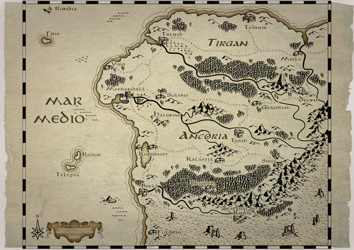
Ok, this is a map i made this week. It´s about two kingdoms in my world, Ancoria and Tirgan. For creating the map i used the B&W style but wanted to get a bit more of map-look, so i added some Photoshop effects like texturize and blending with a parchment texture.
I´m not yet satisfied and i bought the Annual 2007. But i´m realizing it will be easier to use Photoshop (a newbie on it in anyways) for switching the white background and change it for the parchment background, than using CC3.
Tips and suggestions welcomed.
I´m not yet satisfied and i bought the Annual 2007. But i´m realizing it will be easier to use Photoshop (a newbie on it in anyways) for switching the white background and change it for the parchment background, than using CC3.
Tips and suggestions welcomed.


Comments
Looks really cool!!!
Nice job!
I promise to put here next maps, hoping to make them better and with more details, i´m still learning the ropes.
Like the first one the best although I like the dark red coloring on the text in the 2nd map.
I need to create a map just like that, i mean black and white and so, just like yours.
Would you please give me some tips?
For start, how i create a black and white map?
The only program i own is the CC3, is what you use to make this map?
Hope you can help me, thanks alot!
And... really nice job man, impressive!!!
Hope that helps.
Tips? well, read first some guides. That helps alot. There are some very good ones for beginners as us, like the Gandarf ones for cities, which are really splendid. Then, just use imagination, try to find some real life examples of what you want, and then get some inspiration. CC3 makes you work a bit slow at the beginning, but once you get used to it, you can speed things alot. Also, play with effects. That´s the hardest part, but also the most satisfying.
My personal tip is: try to fit the best scale for the map. Check what kind of size the map will have, and scale the symbols accordingly. I tended to use CTRL for sizing to the size i liked, then used such size for all the symbols except the ones i wanted to look bigger for some kind of reason - like perspective or just to break monotony.
Spend some hours making tries instead of wanting to make the map perfect at the first try. Spend also some time searching for the right symbols and textures if you plan to do them.
I added some Photoshop effects but they´re not really needed, i used them because i´m also learning to use Photoshop a bit.
Glad you enjoyed it.
I am unsure if the necessary Sheet effects were available back in 2010, but you can do all of that in CC3 these days.
Sue: yeah, indeed. When i got time i will test on doing it, and i´m sure it will improve the maps alot.
It can give you a scare if the map isn't set to open with effects switched on next time you open it. I automatically set all my maps to open with effects on.
And yeah, my maps usually don´t open with effects on. Maybe i should change that considering how fast is CC3+ compared with CC3.