

WIP - Wayward Village and Inn
 Glitch
🖼️ 33 images Surveyor
Glitch
🖼️ 33 images Surveyor
Because all adventures don't need to be epic....a small rural village with a large inn and casino.
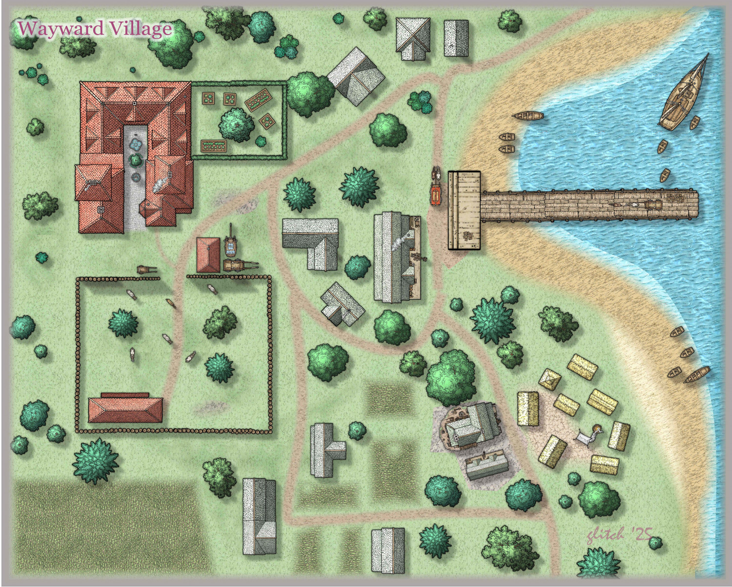
Inn and Casino:
Dan Ger - Proprietor (Connection to local thieves guild)
Dapper Dan - Gambling Manager
Sweetie - Bouncer
Travelers, Farmers, Traders, Various Miscreants, Occasional Officials.
Village:
Cade Meddleson - Dock Master
Rosie Larin - Pawnbroker / Loans
Mason Bos - Tailor - Custom Clothes
Buck Sidel - General Stores
Mason Strong - Cobbler / Leather Works
Various Fishermen, local farmers


Comments
One tiny tip.
Add a edge fade inner to the deeper water, so it will look less harsh.
Even a tad of transparency will kick it up a notch.
Happy Mapping!
Thanks - How's this look:
This is excellent!
What's up with the person in the house at the bottom center? I don't trust them. They're up to no good, and they need to be vanquished.
This map makes me want to play. There's an adventure there, for sure.
KertDawg Administrator, ProFantasy 🖼️ 4 images Surveyor :
That's the fun part - to populate with characters and figure out what they're doing!
One of the ways I work is with pen and graph paper - I watch TV, and work on rough layouts and scale (my wife calls it diddle bopping).
The recent annual - Handdrawn Fantasy, is quick and easy enough that I have started using C3 to explore overland layouts.
Question - is it possible to create a similar simple style for Dungeons ? The idea would be to keep it simple, with just a few symbols to help scale rooms and identify their uses. I'm not a really sophisticated user - I haven't looked into creating scripts or drawing tools. What I'm thinking of would be kinda like:
Glitch asked: Question - is it possible to create a similar simple style for Dungeons ? The idea would be to keep it simple, with just a few symbols to help scale rooms and identify their uses.
There are already hand-drawn options for dungeons, including the Handdrawn symbols from SS2, for example, albeit not in an identical handdrawn style to Ralf's overland style.
For the kind of basic layout you drew, there's also the Create Your Own Style pack from the first Annual, which comes with the basic OSR-style "blue" dungeon style, which is very straightforward to use, and very forgiving. You can maybe get a better idea of what's possible with it from this Atlas map I drew in this style back in 2023. That's extremely easy to recolour to not be blue, if you prefer!
Fixed rendering acne impacting farmlands, shadows on corral fence, played with boat shadows. calling it done for now. Moving on to create the Casino............
Did you use drop shadow for the boats on the lake?
Thanks! I couldn't remember the solution to the floating boat problem. OK, one more fix and render. Please let me know if anyone spots anything else!!!!
I didn't even notice the signature on the map.
Do people sign their maps? I put info into the "map notes" but never thought of signing one.
I hand out my maps to players, frequently they came back to ask if a particular map came from me - this stops the questions. For some of the other C3 users where their work is closer to illustrations, I think it would also make sense. There are some pretty good creators out there - take credit for it!
First draft of Wayward Casino. Need to find a better roulette table, improve stairs and balcony, add more level of detail. As always, comments and suggestions appreciated.
I find it a little difficult to read the text where it's mid tone against the hex grid. Maybe make it paler? I'm not sure.
Otherwise it looks good to me.
Agree with Sue.
Or a glow on the text, to shut out the hex grid. (make sure text is lower on the sheets list than grid.)
Wayward Casino
Located in the front of the Wayward Inn, the Casino is run by Dapper Dan and order is maintained by Sweetie (Lead Bouncer) and her crew.
The doors behind the bar lead to the kitchen, beyond that is the Inn’s main dinning room. There are no windows and the only public entrance is the foyer off the street. On either side of the Common Casino are a set of stairs leading to a balcony and the “Rent by Hour” rooms. The Common Casino also has a small stage – currently playing are “Bletcher” Smites (Various Instruments) and Uvaldi (Singer).
The Casino takes 15% of each pot and charges table fees that range from a few coppers to 5 gold pieces. Games include: Poker, Cheater’s Poker, Whist, Roulette, Various Dice. There is also “Barrel Riding” contests where two opponents face each other standing on the barrel and exchange slaps.
The Casino is usually well attended with weekends being extremely busy.
That looks better.
I just remembered something I saw another mapper do (it might have been Royal, I can't remember now), but if you put a Color Key on the GRID sheet you can cut out neat rectangles around your blocks of text so there's no tangling of hex lines and letter lines at all. It's more readable now you've adjusted the background colour, so that's just an idea.
I just remembered something I saw another mapper do (it might have been Royal, I can't remember now), but if you put a Color Key on the GRID sheet you can cut out neat rectangles around your blocks of text so there's no tangling of hex lines and letter lines at all.
It wasn't me, but I think it's a fantastic idea. I've always just used glows with the text to make it stand out against gridlines, but I really like the Color Key idea. My maps sometimes have thousands of magenta polygons, so why not a few more! 😉
Yea it looks good, but adding in the glow, or text boxes will take it up a notch.
Just curious why you went with hex.
Try do a version where you do a square grid, and see what that aesthetic looks like.
One thing if you are feeling adventuous. Add two temporary lines. Line up all the text to the edges of the pictures.
Then you can select the entire floorplan and make it larger. Filling up more space, making details easier to see.
1. Used Color Key on Grid. What a wonderful solution – I had been playing around trying to find a way. As soon as it was mentioned, I slapped my forehead and shouted “Duh”.
2. Moved “Balcony” floor to its own layer, adjusted stairways
3. Aligned Text sections.
4. Enlarged base drawing – thanks, again a great suggestion
I use the hex grid since it is intended to be a battle map, and it displays well on our home made tabletop.
Tomorrow is a travel day, so no more work until Sunday. As always - any comments or suggestions are welcome!!!
Oh that was great to move that one block of text to the top to give even more room to enlarge the map.
One change and it made the map 50% larger. (60 square inches on my monitor, to 90 square)
Move your sig up to the top sheet.
I hope your players enjoy it.
I've been working on a sig for all of my maps.
Looks great. I was confused with the stairs and balcony on the first map, but it's much clearer now. Nicely done!
It is possible just to set up a grid (whether hex or anything else) just to cover part of the map by using the "Select points" button in the Grid Overlay panel, once you've set-up the type and size of grid you want. You then just pick the points (room corners/wall lines in this case) and click accordingly. Snap is your friend here, assuming you've set-up the area's walls to fit to the snap grid.
Here, you'd have to mask off the grid areas alongside the entrance hallway, but that's easily done, and it would mean not having to worry about keeping the text outside the building free from the hex lines. It would mean needing to set the grid below the wall lines so as not to lose the shadow effects on the outside of the wall lines, however.
Of course, the problem then is to have your hexes fit neatly to the wall-lines and room corners, but that's something to worry about another time!
Two easy ways to handle Grid then -