

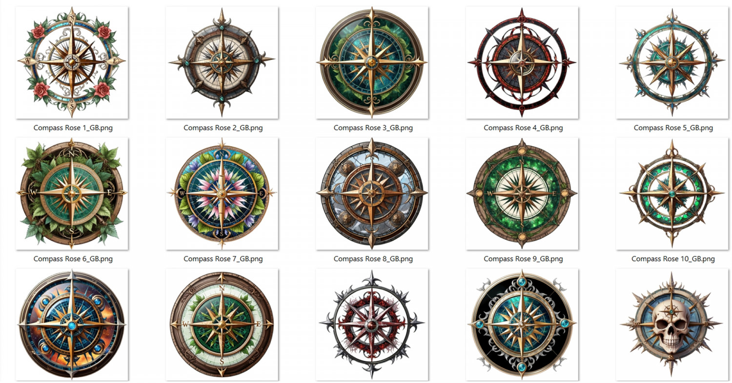
Compass Roses
 Shessar
🖼️ 34 images Mapmaker
Shessar
🖼️ 34 images Mapmaker
I have been doing a lot of design and art for my gaming world lately. Not a lot of mapping.
One thing I've been doing is making specialized compass roses for regions of my world. I'm not sure how well these would work for anyone else, but if you would like me to make them available for your use, I can try posting them here. I am just starting to make scale bars to go along with them, so have nothing to show for that yet.
Let me know if you would find them useful.
Tagged:


 and 12 others.
Comments
Wow, Shessar! Those are gorgeous.
These are absolutely beautiful. I use your fireplaces a lot and I would use these, too. Amazing.
They look lovely - what software did you use to create them?
@Simon Rogers I draw them by hand, scan them, use photoshop for coloration, then upload them to several AI image to image generators until I get something that resembles my original hand sketch. Then back to photoshop to clean up the AI sloppiness.
Those are absolutely gorgeous!
Very nice. A few more, or maybe some other map decoration in the same style (Like boxes for titles & legends, scale bars, etc), and you have a great annual issue right there....
They're stunningly beautiful!
I'm not sure how well these would work for anyone else, but if you would like me to make them available for your use, I can try posting them here.
Oh, yes please!
I second Remy Monsen's suggestion
Sounds like there is interest in expanding this into something that would be suitable for an annual. I think if I did that I would want to make them more compatible to current mapping styles. Maybe make them a bit more hand drawn looking while still keeping the same level of detail. Scale bars are needed, and I like Remy's idea of legend boxes too.
I'll experiment and come back to see what you think.
They are indeed very nice! And yes, I'd love to see a collection like this as an Annual as well.
Outstanding work
I will work towards making an annual, Compass Roses, Scale Bars, and if I can get it to work, Title boxes. I do have a couple of questions of course.
Is there a preferred resolution for png images? Most AI image generators export pngs at 96 dpi but am not sure if that is adequate for CC3+.
How many sets would make a good sized annual?
It's a bit more loose when it comes to decorations like this compared to actual map symbols.
Dpi doesn't really have any meaning in CC3+ context, but if you look at the existing compass roses, you'll see that Schley's ones are about 750 pixels in the largest dimension, while the ones from CC3 standard overland are a bit larger, with 1200px. Sue's Darklands ones are a whooping 3000 pixels tall. But considering nobody should ever need to zoom in closely to a compass rose to export it like they might do with other parts of the map, it is less critical.
Technically, the size for overland symbols are supposed to be 20px per map unit, but compass roses are rarely designed to be a spesific size (Scale bar on the other hand often are. A standard 100 miles scale bar should be 100 map units long, so therefor 2000 pixels, but even the official ones are often quite a bit smaller than that)
Thanks Remy, that refreshes my memory on import resolution. However, I'm talking about the resolution of the actual png.
For example, one from the High Space annual is 72 dpi:
And one from the 13th Age Annual is 300 dpi:
Mine are 96 dpi, and I wasn't sure if that was adequate. I can upscale them using an AI image upscaler that I run on my system, but I don't know if I can get it as high as 300 and still keep the image's detail. I know that 72 dpi is fine for Dungeon symbols, but didn't know if requirements were different for Overland symbols. I guess I'll just play with it at 96 and 300 and see how much difference it makes in image clarity on a map.
DPI is based on the size the image is rendered it. So, it will really depend on how big the user does it.
What I can say is that web size is usually 72 dpi, with 150 bring considered high quality for web. For printing, it needs to be 300 dpi. A 2 in x 2 in image at 300 DPI, will be 150 dpi at 4x4.
What Julian says is correct, but just to add one thing; just ignore that number entirely. It doesn't have anything to do with the quality of the image. Or put differently, there are two ways to know the quality, either you know the resolution in pixels, or you know the dpi AND the display size (inches). While sometimes used to make sure things is right sized for a computer screen, the dpi is really a value only appreciated by people who does professional printing and print layout.
Okay, perfect. Thanks to both of you! I will ignore. :D
I habitually export at 300 dpi, but it really doesn't matter to anyone but me.
As someone who prints, it very much matters to me.
Julian, do you see a difference between symbol resolutions when printing from CC3+? While I know it likely won't make a difference on screen, I can't help wondering if it makes a difference when printing, especially for those who print at large scales, like poster size.
If you import a symbol at a scale of 20 pixels per map unit, it doesn't make any difference what the dpi is of that image. It might be 72 or 600 dpi. It really doesn't matter, because it will be 20 pixels per map unit in the map.
What the dpi tells is the size it will be in a document. For example, if I have a symbol of 1000x1000 pixels set as 100dpi and add it to a document (in a dpi-aware application), it will show up as 10 by 10 inches. If the exact same image was instead set to 250 dpi, it would be added to the document as a 4 by 4 inch image instead. That is the only thing it determines, how large should it be printed. It does not change the quality in any way whatsoever. Think of it as a hint for recommended print size, not a quality thing.
But when used in a program like CC3+ that doesn't operate with print sizing at all (as symbols are scaled to be the correct size you set them in your map, not to the real-world size of the paper), there will be no quality difference. A 1000x1000 image at 10 dpi is of no better quality than a 1000x1000 image at 4800 dpi.
(Of course, that applies to the image side of things, for the hardware side of things, a printer capable of printing 1200 dpi is better quality than one that prints at 300 dpi)
I learn so much from everyone here and really appreciate this discussion. I feel like I finally understand something that I've had trouble wrapping my brain around. If you were standing here I'd probably give you a little hug out of sheer joy. LOL
This is more of concept piece for a scalebar for this specific compass rose, but hopefully gives you and idea of what I'll be trying to do. I'm not crazy about the placement of the roses, but don't hate it either. Input is welcome because it will guide me for other styles.
I like it. Scalebars just need to look like they belong with the compass and function as a measuring stick.
I have 3 done so far. Opinions and input welcome.
Well, except from the obvious lack of cats, they are awesome.....
I find the divisions of the bottom scale bar slightly hard to make sense of though.
Maybe add some in color and black and white "sketchy", to take advantage of the rustic map styles?
They are absolutely stunning! These will be a great to have available for map styles that don't come with cartouches (and as a supplement for others that do).
As a jog for inspiration, if you're open to ideas: sinister/evil (evil sorcerer, lich king/vampire/undead, etc.), fairy tale, swashbuckler/pirates, maybe demihuman-inspired ones (elven, dwarven, halfling, orc, draconic)? Maybe seasonal -- your top one is great for spring and summer vibes, but it would be cool to have autumn and winter options.