

First Map Feedback

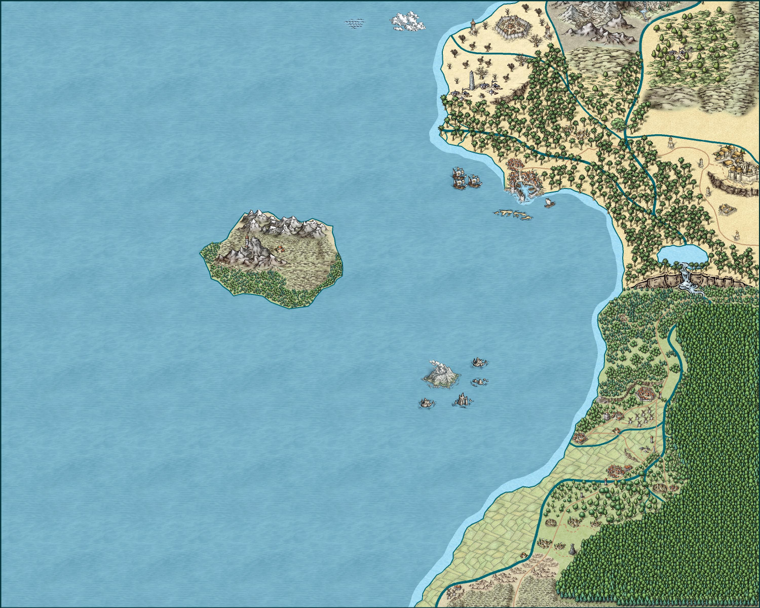
Hello all, I recently began my fantasy mapping journey using CC3+ and wanted to share my progress / open up to any critiques, I would really like some feedback on where I could improve as I'm still figuring out the systems. This is an overhead view of a region which will be broken down into smaller panes for my TTRPG group. Not a finished product yet. Moreso looking for ways to get better, please disregard the random cloud and wave to the top of the map😁
Thanks!!!


Comments
Hi Ryan, and welcome to the forum :)
This is a good start to your project. You've asked for a few pointers, so here are my main ones:
Symbol scale.
I notice you have varied the size of the symbols, particularly the trees and/or structures (the towns/cities/villages etc) to relate to each other in a more realistic world scale - a bit like you might if you were making a dungeon map, or an artistic picture map that is also a kind of concept image of the world. However, this has left you with structures that are pretty hard to identify for what they are. I recommend that you consider making the structures at least twice the size they currently are so that people looking at the map can see the difference between (for instance) a walled city and a city without a wall. Remember that when you are mapping at this kind of scale the structures are symbolic rather than realistic depictions, so a city might well be 100 miles across according to the map scale, but it's centre is in the right place and you can see what it is without squinting at it.
That leads me to the next thing. You really need a scale bar - perhaps somewhere to the bottom left.
Placing a scale bar.
Turn on the snap grid (the button called SNAP in the bottom right corner of the window), and click the Borders/Political button in the top bar to access the cartouches (scale bars, compasses etc). Pick the scale bar you want and hover over the map. Right click anywhere you like before you place the scale bar, and hit the Set normal button, and then the More button.
This will give you a scale bar that is the correct length according to it's name, and a way to place it neatly in the map so that labelling it is relatively easy.
Title and compass
In some of that ocean you might want to add a title and a compass?
...
I hope that helps :)
Really nice for your early start at CC3+.
Add some stuff in the sea/ocean to the left. Give some purpose to that wide open area. Be it a scale bar like Sue says, or a legend, or text. Just give the viewers eye something to do with that area. Even some ship, or sea monster symbols.
Good work with random points of interest to pique viewers curiousity.
Welcome, Ryan! One more thing, which you might already be planning to do: when you break it down into smaller regional maps, you can then add more details that might be too small for this map. I'm not certain what scale this map is, but for example, this map might only have the major rivers, but smaller rivers and streams might then show up on your regional maps. Or this may only have major cities, with smaller villages and hamlets being too small for this scale until you start to break it down. That gives you the freedom to follow creative inspiration as you dive in deeper.
Looking forward to seeing more!
Sue,
I really appreciate the feedback! This was a blind dive into the software so I can see where your first point comes into play. I think I was halfway between a more expressive map and more accurate map. Thank you for the pointer on scale of buildings and scaling in general. I do think with these points I will certainly be able to narrow my scope a little and hopefully produce something both more eye friendly and useful! Thank y0u!
Great point! Thank you as well, I appreciate the kind words:)
Hi, Ryan. I must add a contrary opinion to Sue's - whom I normally agree with. But I don't think your structure symbols need rescaling - I see them quite adequately as they are, and I am sure when the map is printed, it will be considerably larger than we see on the forum. They still cover a much larger area than they would be in reality. And if you are using it directly from the computer, then of course you can zoom in as necessary. For my own Schley maps, I use the scale more or less as you have it, despite criticism from some quarters. So as much as I really do hate disagreeing with Sue, on this occasion, I feel I must do so.
Quenten,
With this alternate opinion and my lack of experience. I suppose the answer is just print one of each! Given this is for a table top game I am sure that upon printing one will become immediately evident as better. I appreciate your input as well.
Hello Ryan, welcome!
If you'll allow me, the rule of thirds is a powerful ally in both painting and the aesthetics of map presentation.
Looking at your interesting first drawing, I would say that the right third is well filled and has a good aesthetic of the continent and island. However, and on the left side of the image, we have an empty "canvas" devoid of information.
1 In this first example, if you have an idea of what exists inside the continent, you can move the landmass to the left so that the image is still balanced and develops more information about the interior of this land.
2 In the second example, you leave it where it is and, to make an interesting image, I would add things to fill the left side. Some of the suggestions are giant monsters without scale, frames with information, legends and local stories, flags and drawings that fill the space.
P.S to example number 1 and 2, It is always recommended that all the main information and images are within an imaginary frame (in green with crooked lines lol) to also give a more harmonious final image.
3 Another possibility you can transform this map into a 1x1 scale, for example 100x100 miles/kms and "cut" a good part of the ocean if it is not useful.
In all situations, after your map is done, you can finish writing name the cities, the island, volcan and points of interest to draw more attention. Plus Decorate the map with the name of the kingdom, region, etc.
As @Loopysue said, scale and rose wind are also essential resources.
Personally, I would go with the first or third.
Cheers