What I've been working on
 Calibre
🖼️ 39 images Mapmaker
Heyyas, fellow Artists and Mapmakers!
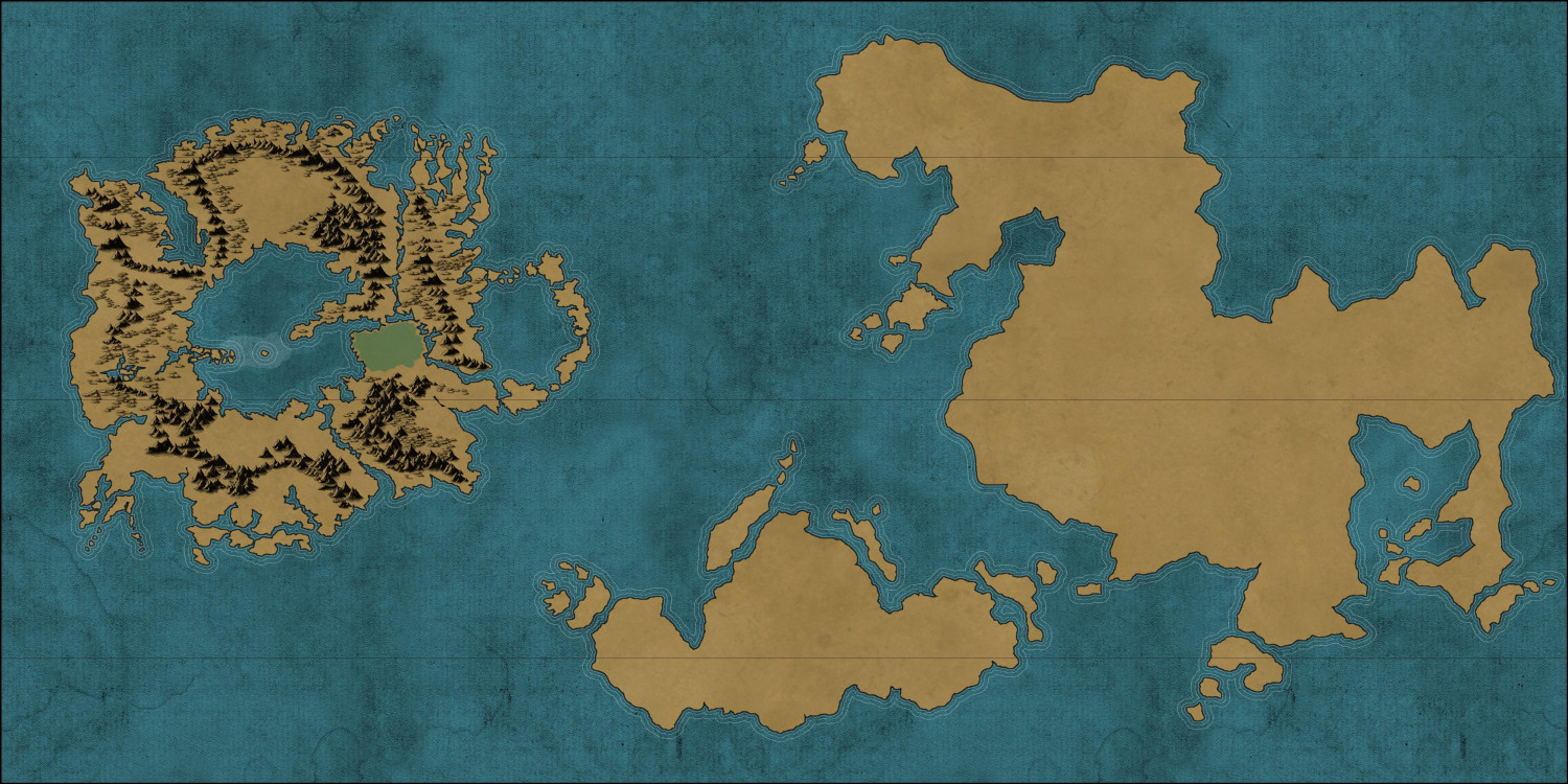
I've been working on this and need some critique. Main question: is the blue sea working? I'm wondering if it needs to lighter?


Comments
Oh, for reference, here's the map of one of the continents in my tabletop RP game:
I love the color you picked for the sea. I personally do not think it needs to be lightened.
Colours are always tricky.
If you are unsure about the colour of a fill relative to the rest of the map try using sheet effects to lighten/darken or change the hue, and go through a happy hour of hitting the Apply button until you are happy that the existing colour is the best one, or find a better one.
I like it, it's a dark theme.
Looks great but dark. 🤗
I would leave it as it is for now and try how it looks with a bit of lightened tone, after all the rest (Terrain, Map Key etc.) is added.
I personally would lighten it - use adjust hue effect. That way you can lighten it by degrees till you have what YOU like.
Maybe drop the saturation a bit because it seems that the ocean color saturation is higher than the land color saturation, which suggests to me that the ocean is more important than the land. Another option would be to decrease the saturation of the ocean once away from the coastlines. That's similar to the way that the second map uses a lighter (and greener?) color near the land except that dropping saturation out farther will keep the broad tone without pulling the eye away from the main land areas.
Then again, I'm a programmer, not an artist.
Anyhow, here's what Photoshop does with a -50 adjustment on ocean saturation (I got the forest in there too, I think):
Thanks, all!
Cal