Is there any way to adjust contrast?
I'm using CC3+ to make both the full-colour and black and white version of a map. I work with colours; when I need to export the b/w version I just deactivate some sheets and activate a series of effects which end up in making my map black and white.
When I say "black and white" I mean actual black and white: I don't want the symbols to be in grey scale. I want all greys to turn either to black or to white. Ideally to white, because this is intended to be a "printer friendly" version of the map.
And here comes the issue: I'm having troubles in achieving a pure b/w.
As you'll see I'm working with the Annual Classic Fantasy style (CA101), and the problem only pertains to the symbols.
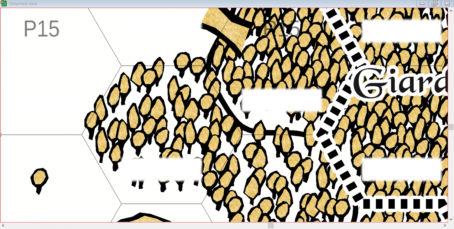
This is the starting situation. I already removed the LAND sheet, so now the land looks totally white, and this is what I want.
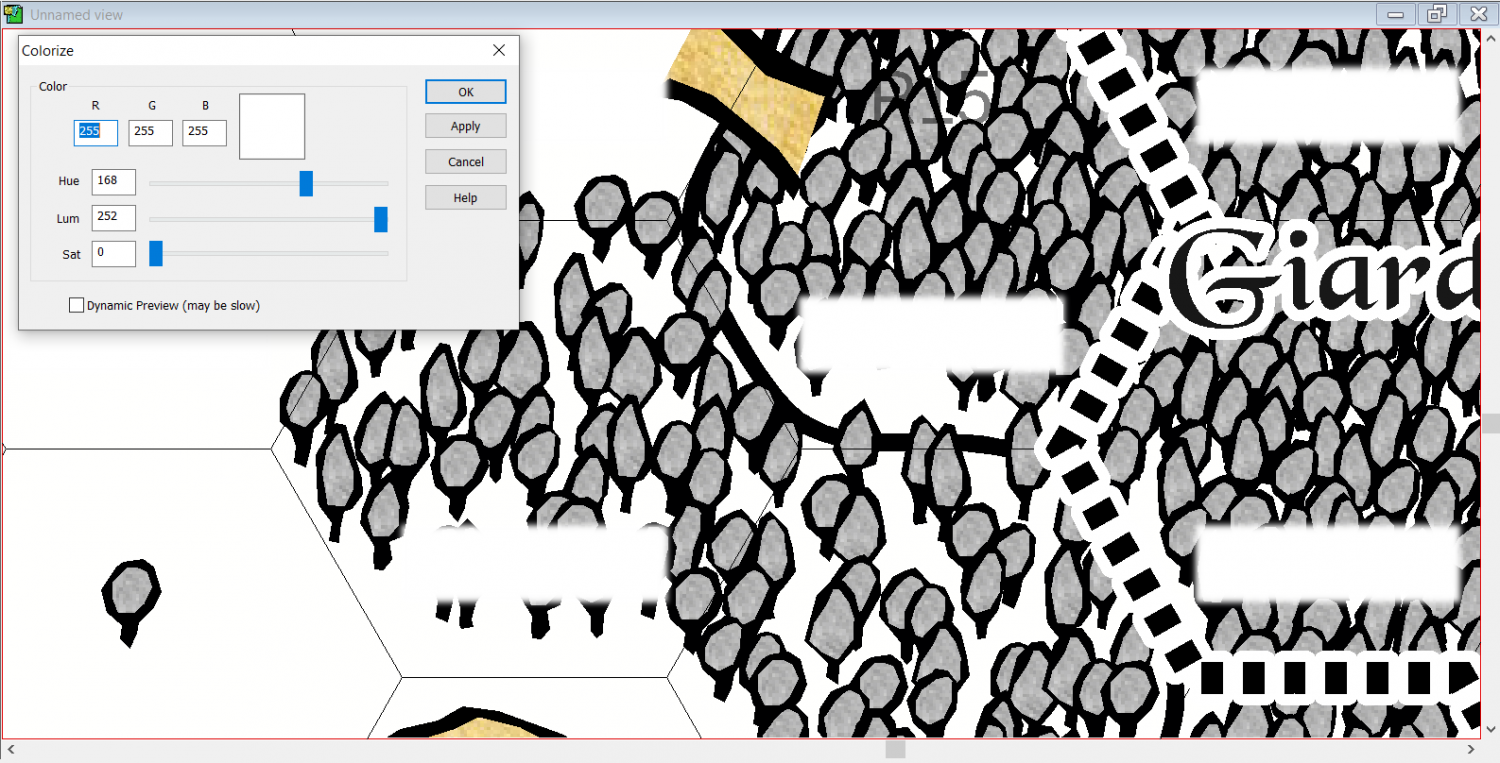
Let's say I want to make those trees black and white, though. They all are on the same sheet, called "FOREST". The most reasonable thing should be to colorize it...
...and then to higher its lightness, so that anything that isn't black fades away.
Now, what I would do at this point would be to higher the contrast of the sheet so that those grey lines go back to being black.
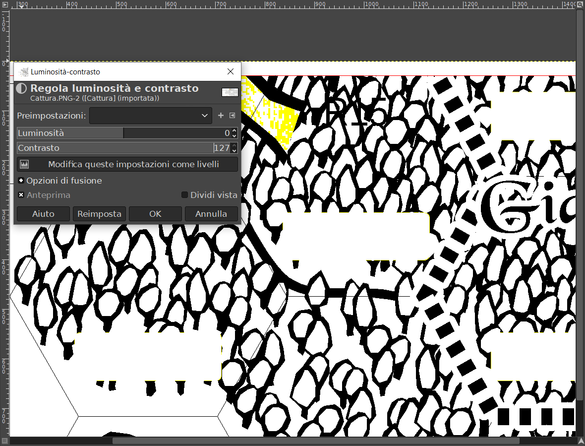
This is something that in a raster editor like GIMP I would do very easily with the typical lightness/contrast tool. For instance:
In this case I highered the contrast of the whole picture, because I was working on the previous screenshot. But you get the point, of course: if I could apply such an effect on the very FOREST level, I'd be done. Also, this shows why I can't proceed this way, with a raster editor, after exporting the image: by highering the contrast I lose a lot of details because I also remove the grey blur around those white rectangles.
To my surprise there is no such effect. I tried several similar solutions, but I couldn't nearly achieve what I want.
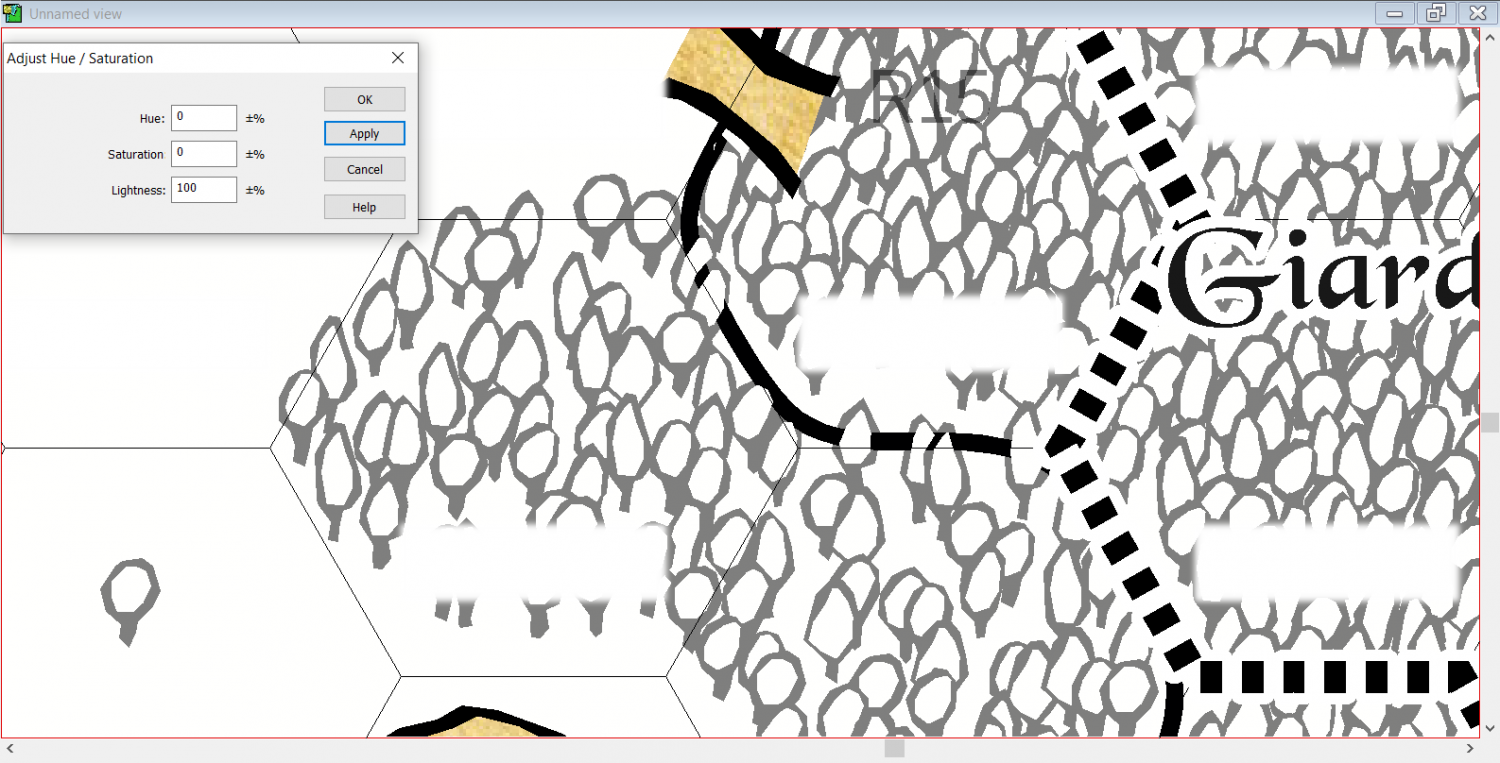
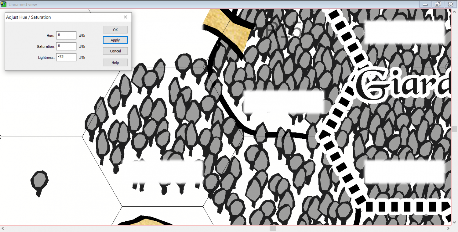
For example, I could darken the image using an other "Adjust Hue/Saturation" effect, but in this case the white part of the tree becomes grey.
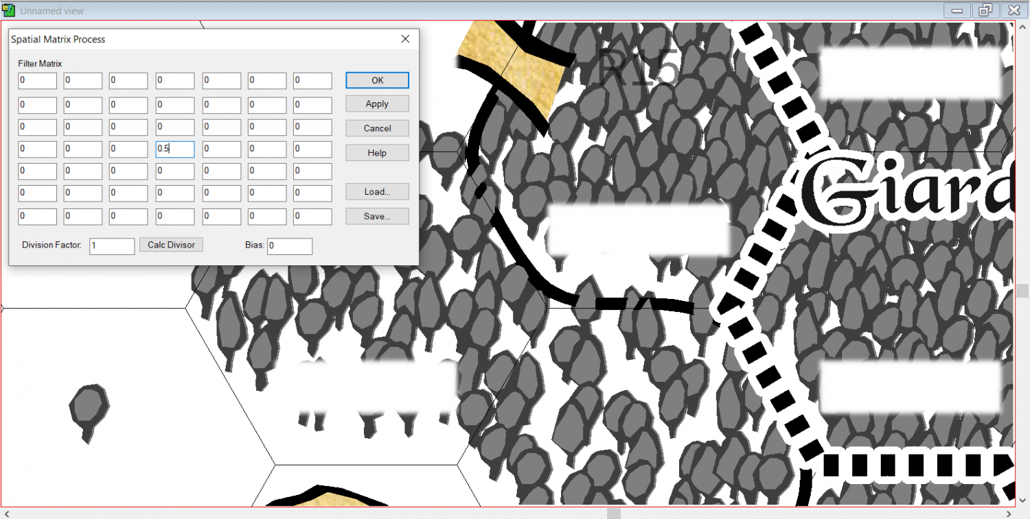
Something similar happens if I try to darken the pixels with a Spatial Matrix Process effect. I tried to play around with the division factor and the bias, but I didn't obtain anything good. Also, for some reason a sort of shade appears at the right side of the tree symbols.
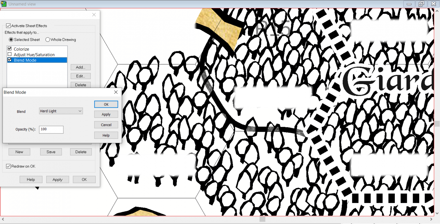
I could use a different Blend Mode, but none obtains the desired effect. The most similar thing I get is to use "Hard Light" while applying only the "Colorize" effect, for some reason. But in this case the white parts that lay over other sheets becomes basically transparent:
What I think I could do is to duplicate the whole FOREST sheet, to use these effects to make the lower trees white, and then to use this Hard Light blend on the trees above, so to preserve the black border. But that seems an extremely unelegant solution, to be honest, for a vector graphic software like this. And it's easy to see why: my symbols have been scattered on around ten levels, meaning I would have to duplicate all these sheets and to apply the same effect to all of them just to have a full black and white picture. This doesn't seem to be the ideal solution, also considering the work that I would have to do every time I decideded to plant a new tree in this map.
So, how to proceed?


Comments
Would this work for you?
A single RGB Matrix Process sheet effect on the 'Whole Drawing' level (radio button at the top), with everything set to 1 except the end column.
The only grey I can see in my amazing test map is where the structure symbols are red.
Brilliant, that's exactly what I needed! :D
Thank you ;)
That's good :)
To put the effect on the whole map add it with the Whole Drawing radio button selected.