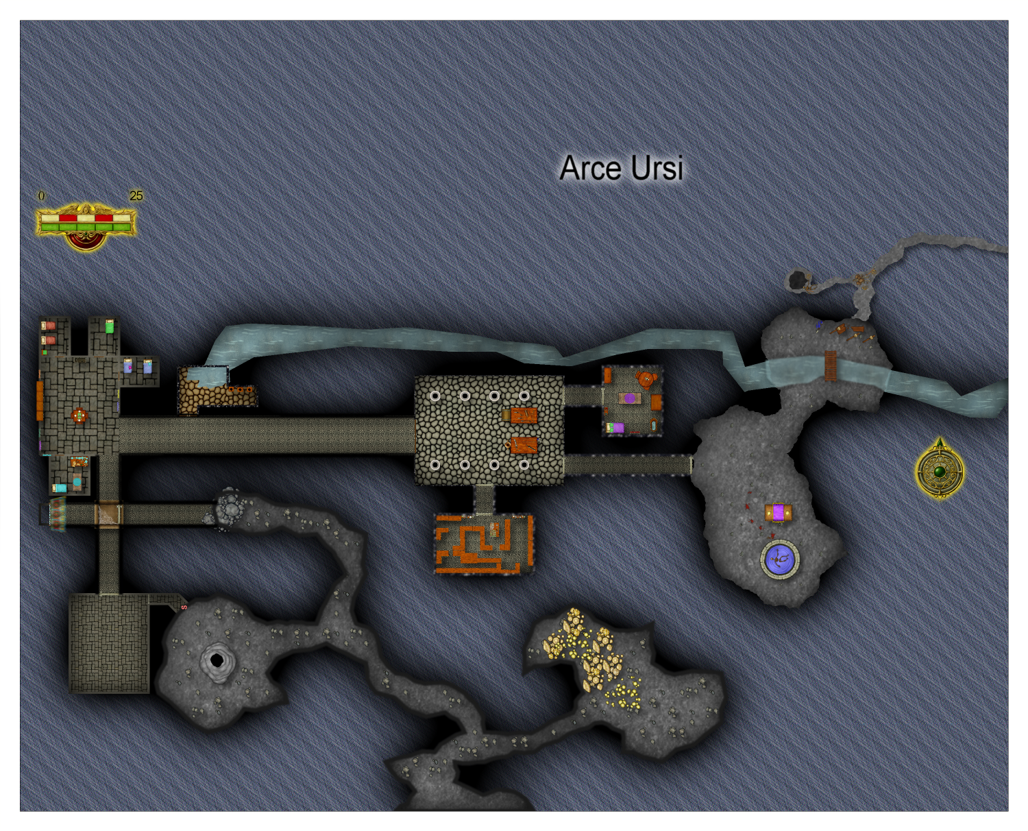
Arce Ursi
 Frosty
🖼️ 22 images Surveyor
I am not 100% happy with this map.. I am still struggling with keeping everything the same scale on a map. But at least this one is better than the last.


Comments
The background isn't one of my favourite fills, but the rest looks ok :)
If you keep the symbol scale at 1 everything should automatically be the right scale for the map.
Aye challenge I had is I custom scaled some doors and then forgot to set things back to 1. And yes agree with the background I was looking for one that was stone..but a red shale like stone would have been better for this.
That old hatched stone fill seems to be stuck in the DD3 repertoire, but there are other alternatives around. If you are looking for something reddish you could use one of the Dirt fills instead, or maybe the "Stone Lava Cooled" and a sheet effect to change it's colour to something more reddish.
If you have other add ons there's no reason you can't use a fill from one of them if there's one you would prefer. How you do that is use Insert File in the Draw menu and pick a pre-prepared blank map of that style (or the actual template file .FSC) and press ESC just before clicking to place it in your map. That will import just the fills for that style which you can then use in your map.
Huh, that is a neat trick. I don't assume there is an easy way to replace the fill after the fact.
Sure, changefs is the command on the command line.
type changefs
select what you want to change. It might be helpful to freeze all layers except that fill.
right click, select Do it.
go up to the upper right and click on the FS area, go to the fill you want to change to.
Click okay. All done.
Oddly that did nothing. Let me go through it again..perhaps this is the background.
There is an alternative way.
Hide all sheets but the BACKGROUND sheet and use Change Properties on it to change the fill.
You can change the fill of any polygon the same way.
A little better thanks. Going to play with background color for starters to see if I can mke this look better, This might be too ligt. May look for something in a dark brown or dark red brown.
That's certainly more restful to look at.
Have you tried using an "Adjust Hue/Saturation" sheet effect on the BACKGROUND sheet?
@Frosty Have a look here at what @jmabbott gave me for a suggestion. It gives the map a nice 3D effect and really "pops". It may work for you too. :)
https://forum.profantasy.com/discussion/13219/wip-tomb-of-shadows#latest
Will take a look hsv216..I also was looking at this Dungeon Alchemist thing and that kinda of blew me away but feel like I am I already invested here though DA does not do everything CC does for darn sure.
No but I will take a look here when i get a chance.