[WIP] World map, feedback?
Hello!
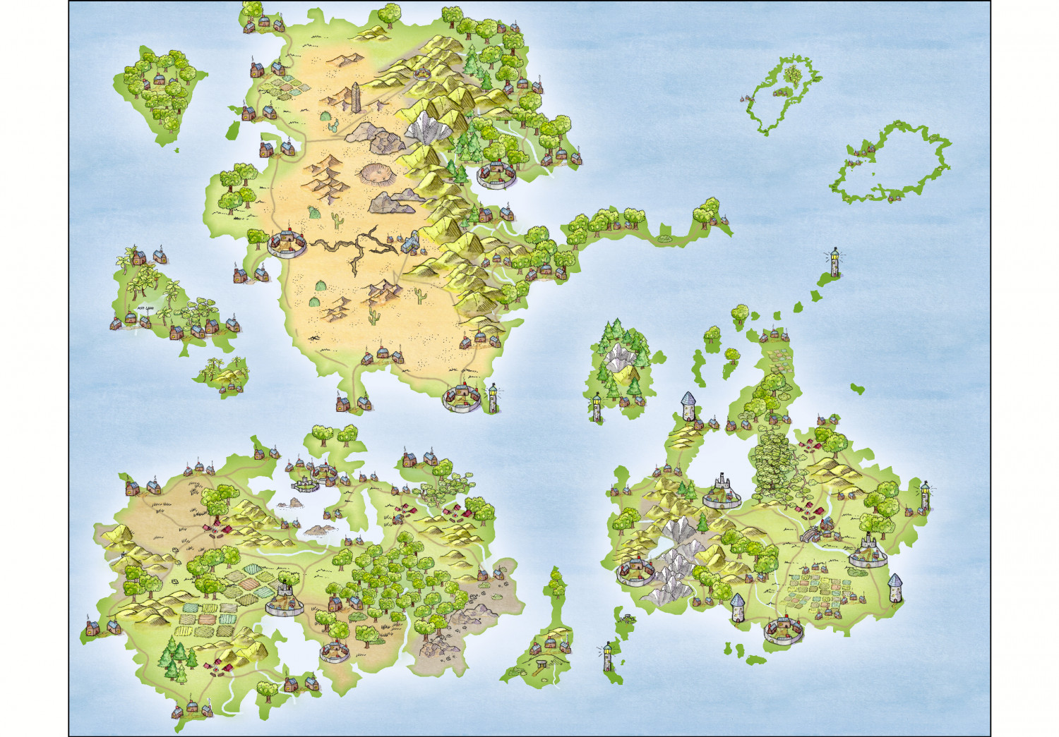
So, I've been working on this world map for the last week. I have not put labels on yet. That is the next step. In the past, your advice has invaluable, therefore, what do you think? Ideas for improvements?
Thanks in advance =)




Comments
It looks wonderful, and I think you chose the right scale for the symbols even though it is a world map. Smaller, and they wouldn't be easily idetifiable.
Are you going to be doing regional maps?
Only thing that comes to mind is maybe adding some darker pieces of ocean and maybe playing around with seeing if some type of glow on the land.
This is a delightful-looking map - though I do especially like this style, so may be a bit biased!
A scale would be good, as the symbol sizes make it look like a little group of small islands right now, not a world map.
Maybe adjust the overall map size so the northernmost peninsula and tree symbol aren't vanishing off the top border edge of the map. It also looks as though the one snowy mountain symbol on this same northerly landmass is partly sitting over a couple of the grassy mountains that should be in front of it.
As Julian mentioned, some further ocean colouring would be helpful, and perhaps seeing if those two large green atolls in the northeast are on the same Sheet as the general landmasses, as they don't seem to have the same outer glow effect to them, which would hint at shallower seas closer to their shores, and perhaps also in their central lagoons (assuming that would be appropriate for what you have in mind here, of course).
Thank you for your feedback! I've tried to apply them. =)
And I think I'll move on to the labeling part now!