Mapping old computer roleplaying games
I'd like to share a few early attempts at using CC3+ to map old computer roleplaying games. Mapping is part of what makes these enjoyable to play, and I'd like to find a method of drawing grid-based maps that is both fast and produces clean results.
The Dracula Dossier seems like a good fit for this. I like the clever use of a semi-transparent bitmap to produce the effect of warn out tiles. After experimenting with the style, I ended up using a few of its components.
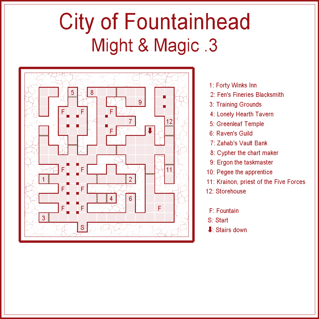
My first attempt is the opening town in Might & Magic III. I transcribed this from a map made from someone else.
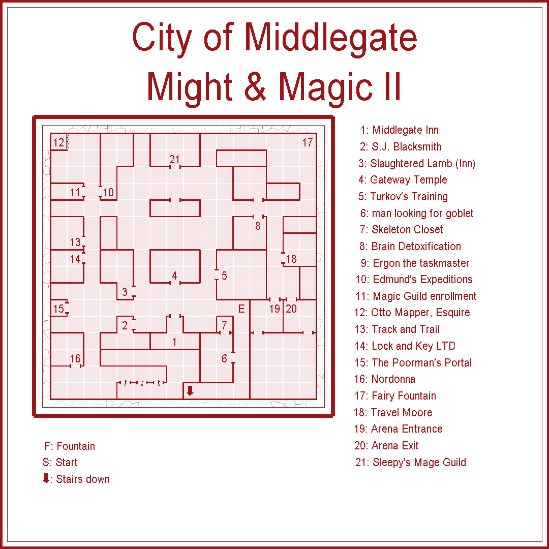
For the second map, I wanted to see how it would feel to swap back and forth between CC3+ and a game. I loaded up Might & Magic II and mapped out the first town. This process took more time than I expected, but there are plenty of opportunities to improve my process. I may try to make my own CC3+ style where all the default tools perform the action that is most useful for the type of map I want to make.


Comments
@thehawk Is all of this work yours, and did you use CC to make them?
A long, long time ago I got wrapped up enough in a video game that I wanted to map it. I don't even remember what the game was, but it took place in a castle and on the grounds. On the grounds there was also a manor house and cemetery down the hill, and a small village further down with a fairly expansive 3 level underground complex. I got as far as finishing an elevation/aerial map, but never got around to mapping the rooms of the castle. Now, of course, I recognize that it's not really finished at all (there's no scale bar, no title, etc. and it's missing a lot of others stuff as well).
So are you planning on completing it now @Maidhc O Casain ? I do find something very appealing about the clean-cut lines of these older vector styles, personally.
Maybe? I like the vector styles as well.
I'm also noticing as I look at this map again that the relative scale of much of it needs to be adjusted. The village buildings are all of a similar size as the manor house, which in turn is MUCH smaller than it should be relative to the size of the castle itself. I'd need to tinker with that stuff if I decided to put in a scale bar, at least.
I'll see if opening it up and tinkering with it brings any inspiration...
I never really settled on a style that 'fits' for me; except the MM2, I think you might recognize the style in those. The later ones became more a framework that I always intended to go back to - like in retirement or something. Most of them are made from scraps of paper I still have laying around, but I did do some fact-checking in cluebooks and such.
My use of CC is pretty rudimentary, the ones that aren't are drastically different. Most of those are screenshots from in-game and lined up pixel-by-pixel (or as close as I can get in some cases). A few others are direct extracts from the game files that someone smarter than me figured out. A few are Visio from the days when I had to learn that for the work that I use to pay the bills.
I mostly use the old 'Simple' DD style for objects, that I keep having to go back and put the button into CC for.
I was in this phase for a long time where I didn't annotate the maps. I have this obsession with needing to visit every square in those games, and I didn't want to know what was there, only that there was a there there. But good luck finding that sort of map (at least in those days, no idea now), so that's what I started with.
Yours look really good - polished, and like something you'd find in an atlas, or an actual compiled work of some sort. I especially applaud the use of Might and Magic as your inaugural choices!
@galik You described exactly what I first tried to do last week (I just bought the Humble Bundle). I spent many hours in the computer room after school playing the OG Might and Magic and mapping was part of what made it fun. I bought the game on GOG a while ago but haven't really played it, but with CC3+ I thought I would give it a shot.
For the first map you show there, the City of Fountainhead did you use the corridor and room tools? I really struggled to get those tools to do what I wanted, particularly the "wrap corners" feature, in the context of mapping while playing when I don't actually know where the corridor is going to lead. I spent hours on this and my process did improve but the corridor tool is still making some things look wrong in some cases when joining to existing rooms and corridors.
Your maps look great by the way.
@macdanny With these maps I drew all of the rooms using the "wall" tool. There is a "room" tool as well, but that doesn't save any time for the reasons you described. Using the wall tool does have a disadvantage in that the floor must be drawn separately. The trace path feature is a big help getting those floors in place quickly.
@galik I've been playing with this off and on for a while now and I'm even more impressed with this map style. Using this style, and drawing the walls first as you suggested, is fairly efficient. It also has a lot of useful symbols, more than the other ones I have tried.
I've also learned more about the program. I can deal with the corners getting messed up using combine paths, at least with this style.
But now I'm curious about how you achieved some of the features on your maps. Your floors are showing as individual squares having a light coloured outline. When I pick the floor tool it just makes a solid floor. Also in your City of Middlegate map, how did you get the doorway effect? The door next to number 12 on your map I recognize, but all the other doors on that map just kind of look like a doorway with no door in it. I don't see a symbol for that.