WIP - Tomb of Shadows
 hsv216
Surveyor
Hi all,
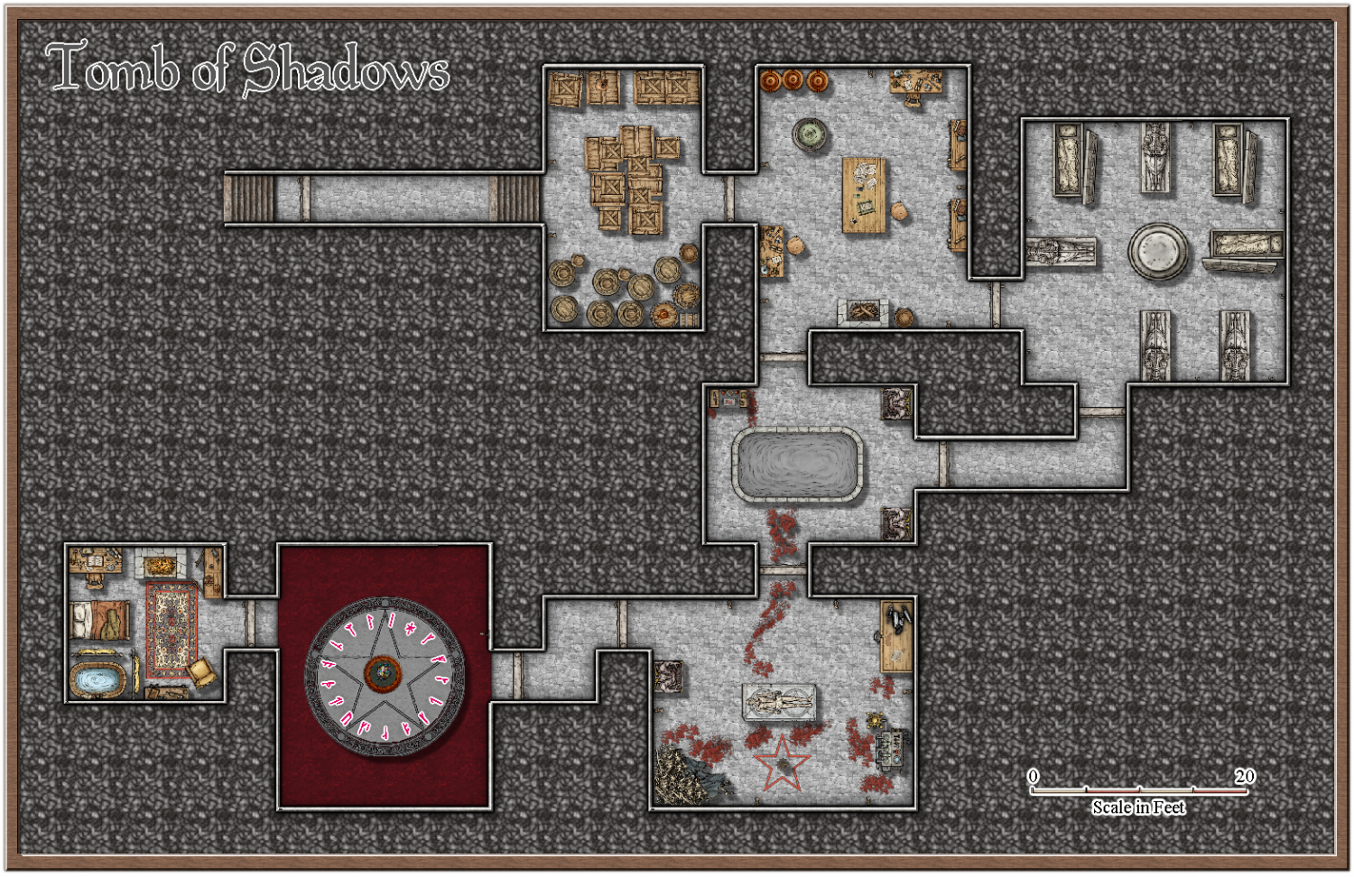
Took a break from my continental map, and have been working on a writing a module. This is a map of a necromancer's lair within the module. There are traps, and monsters in the dungeon but not displayed on the map. I am generally quite happy with it, but any feedback is appreciated. :)
PS: same as what was posted on FB.


Comments
Nice map, but the background repetition steals a bit from it. I would have tried either changing the scale of the background fill, or replace it with something that isn't so noisy, or maybe fade it out a bit (can be done by placing a polygon on top with one of the solid xx fills)
Thanks @Monsen ,
It was one thing that was bothering me too, but not sure how to "fix" it. How does this look. I have added a solid polygon and then put a transparency effect at 40% on it.
That looks better, but before you take the same texture any further down the same road, have you thought of switching the background to one of the other fills?
Thanks Sue, would you recommend a plain or textured fill? I think I like that textured one below, and that is without the transparency effect applied.
Plain:
Textured:
I think I prefer the textured one. It does something to fill the gaps between the rooms where there are some quite large ones.
The place to use plain solid backgrounds is when there are no large gaps.
Thanks again Sue, Updated with all suggestions. I did notice (and Sue also noticed) that the blood had a shadow effect on it. I have moved those symbols to symbols flat. I also slightly adjusted the gems and pedastal thing in the trap room (the one with the blood red floor) as it looked a little off centre. Also fixed my blood red pool colour. :)
Nice little map. Try this little trick:
Thanks @jmabbott ill give that a go!
@DaltonSpence the necromancer is already (un)dead, so guess they are not too concerned, but still a good idea. Thank you. :)
Thank you. When I do that I get this type of effect, which is really nice! Is this what it is meant to look like, because if it isnt I still really like it? :)
When you say change scaling and fill styles, where am I changing that? if I click on the FS in the top right hand corner, it does not reflect any changes on the map, regardless of which fill style I choose. I assume I am looking in the wrong place, or not doing something I should be doing.
Yes, that is exactly how it’s meant to look. To change a fill style, hide everything but the sheet that has the fill you want to change. On the left hand menu, right click the Change Property tool, select Change Fill style, select the fill style you want change, press D then select the fill style you want to change it too. To rescale make sure the fill style is the current one, you can set this by using the eye dropper tool on an appropriate polygon, right click in the Fill Style box on on the top right, you’ll see scaling down the bottom.