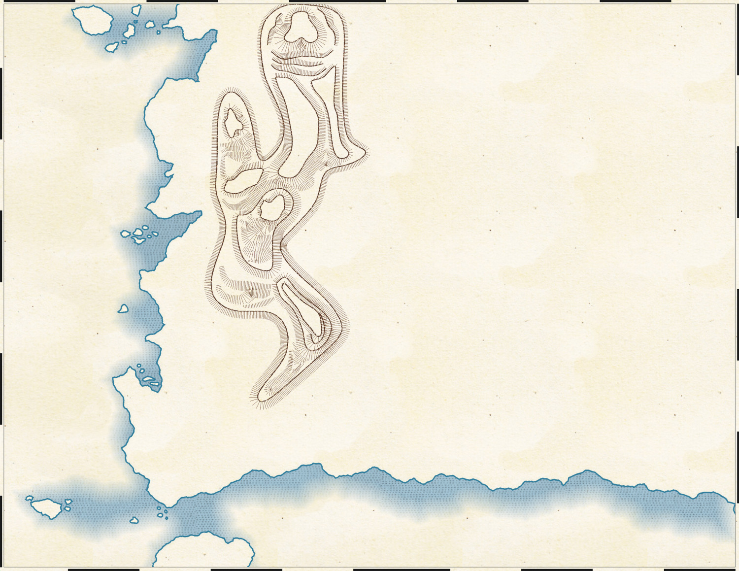
1930's Overland Mountain Mapping
So I am trying to mimic the style of the 1872 Baedecker mapping style more than the 1930's. Thankfully, the 1930's map has the tools I need.
But doing the maps is a bit more difficult to mimic when it comes to the mountains. Insofar as I can tell, the area seems to use narrow lines for shading and most things are filled in. The tops of mountains or other spots occasionally have no lines. Also, the tops of mountains seem to have the contour line, while the rest just have shade lines drawn.
Here is the style of map I am trying to replicate. The map is on the front, page 7 I think. You can zoom in for detail.
So here is the maps I've done so far. Any suggestions on what I should do with the map to better mimic the 1872 style?


Comments
It looks pretty good to me :)
It really depends how close a match you want to that original Northern Italy map you linked to.
Looking closely at the book's image, it seems they used mainly one set of hatching lines to represent the general appearance of the landscape, with denser, longer hatching for what I imagine would be higher peaks and ridges, less dense, shorter hatching for lower hills. Occasionally, there is more than one such set of lines (Mt. Viso, a little below the 45° line on the map's left edge, has some complex examples, for instance), but this seems fairly rare, often used only for some of the higher, or possibly larger, more complexly-formed, mountains.
In places there does seem to be a "contour line" drawn for some - but by no means all - of the unhatched higher areas and hilltops, though that seems to be sometimes only on one side of the top, or only around part of it. In some cases, this seems to be an illusion due to the density of the landscape hatching lines. In others, it looks as if it has been drawn to show ridge or scarp features partway up a hillside too.
Similarly, the line density and direction can be variable in different places around the same peak or along the same ridge, probably to show ridges and spurs, or other smaller features, that can't be shown just using the "hatch and bare hilltop" style because of their sizes.
Unfortunately, because the map looks to have been drawn to try to replicate much of the overall patterns shown by the actual landforms, I'm not sure creating drawing tools will allow a very precise mimicking of the style, and might need to be done almost entirely by-hand, like the original. As I said though, this really depends how close a match you need your version of the style to be.
As Sue suggested, what you have now is a perfectly reasonable facsimile overall, though I would probably make less use of the dashed "contour lines". Maybe think of adding some of those blue speckled areas for the icy, glaciated highest peaks as well?
Hachures never quite had a perfectly-defined set of rules, but it's generally strokes of a similar length drawn in the downward terrain direction with thicker lines showing steeper slopes. On some maps, stroke spacing may also play a role in the slope depiction. Generally, I haven't seen cross-slope lines (contour lines) on hachure maps except for very late in the 19th century and the hachures seemed mostly for decoration in those cases.
A commonly-seen property of hachure maps is that the strokes may vary along their length, often appearing as triangular shapes. In this case, the thicker part is usually a steeper slope area. Not all maps show this effect and the technology involved in producing the map (copperplate engraving vs. quill pen drawing, for example) usually has an impact on what is seen.
Another commonly-seen effect is what appears to be "contour lines" where the strokes of a similar length end and the next set of strokes start just below them. Some cartographers are very consistent about this effect and others make it a point to interleave endpoints in an attempt to eliminate the effect entirely.
As far as CC3+ tooling goes, ESC (escarpment) is usually a way to get something that's broadly close to hachures. Because ESC doesn't have any notion of the already-placed hachures and can't tweak the individual hachures, will tend to do incorrect (from a hachure sense) things like overly-diverging lines on sharp corners and overlapping hachures on concave areas. Those two constraints generally mean that you will want to use fairly short and relatively straight curve segments as the controls for ESC in order to get fairly constant density.
If you're willing to put in the effort, a set of bitmap symbols that show the characteristic features of a pen stroke (width variance along the stroke with slight variance in length) and in several different stroke weights might give more pleasing results than the simple mechanical strokes.
Is this closer to the style in the book? I realize I am not going to be able to mimic some of the things because it is being automated, but I'm not going to draw my hand. Besides the time, I am just not that good with doing that.
I am happier with the mountains on the right than the left. I have been trying to think about how to add glaciers or lakes. I may have to start over on the mountains on the left. if I do that.
That looks reasonable given the constraints. You could also use CONTOURSM with some of the major outlines or TRACED with a painted heightmap set to generate a set of contours that you can base the ESC levels on for the hachures.
One way to make it look a little less mechanically perfect would be to use a few percent of the random operations in ESC for angle, scale, and distance.
The original ESC symbol set has a "thin triangle" that's pretty fat for a hachure, but making a vector triangle symbol that's maybe 1 unit wide and 20 units long might work to capture the pen stroke effect.
I agree the right side version looks better.
I'd suggest making the "contour lines" round the tops thinner and less distinct - closer to how the hatching is drawn, as they seem too dominant otherwise at present.
Not sure if it might be worth trying with a tool that generates longer hatching lines instead of having to draw two or three sets together for the steeper areas. I've a feeling the law of diminishing returns is liable to set-in with too much experimentation, however.
Glaciers might work with a more transparent version of the fill you have showing the seas right now (not sure how the style generates that appearance, so this might need extra work). The original book map looked to have a scattered series of small pale blue dots and tiny circles to show the glaciated tops.
The book-map lakes used a lot of lines drawn parallel to the lake banks right into the lake's centre, more or less, which was also how the seas were shown, although that looked uncomfortable to my eye, so you might want to try that, or maybe tone it down a bit.
So, I took the suggestions posted so far. Any of suggestions, or are these about as close as it can get to that style without drawing it by hand?
Loos pretty good. Given the limitations of CC3+ automated tooling and how much time you have available, I'd say that's pretty much as good as you're going to get.
I will second Joe, and your glaciers look about right.
I lucked out on fiddling with the glaciers. It was pretty much how I tried it at first and it seemed right so I just left it.