New Commission. Ghorfar
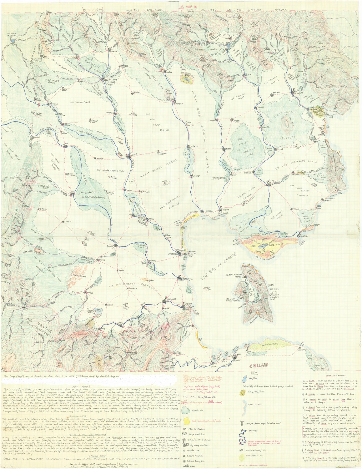
Hi, well I now have a new commission - to map the land of Ghorfar.
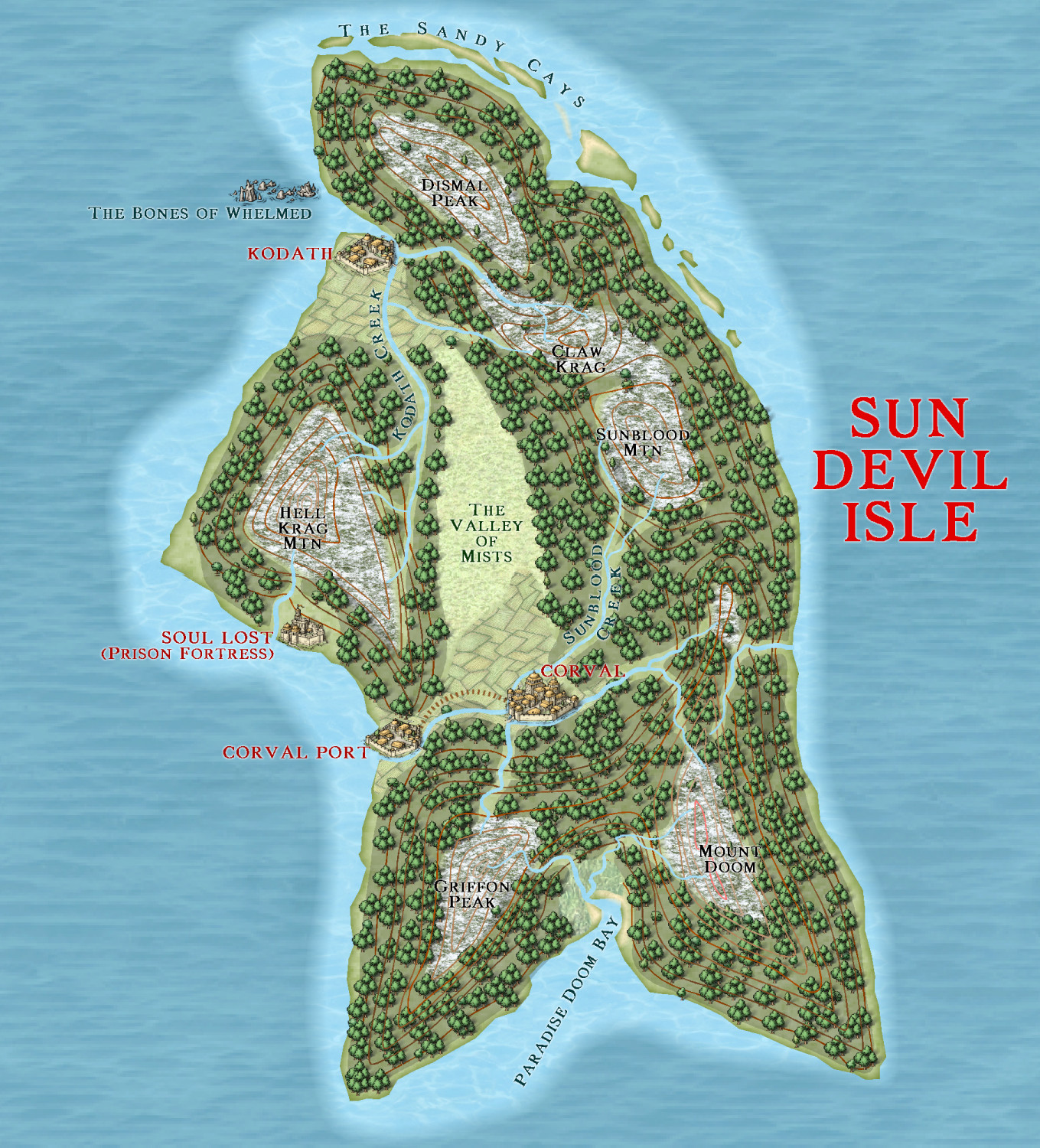
I am using mike Schley, but instead of mountains and hills, I am using contours instead. I have done the small Sun devil isle to see how it turned out. Comments will be helpful.
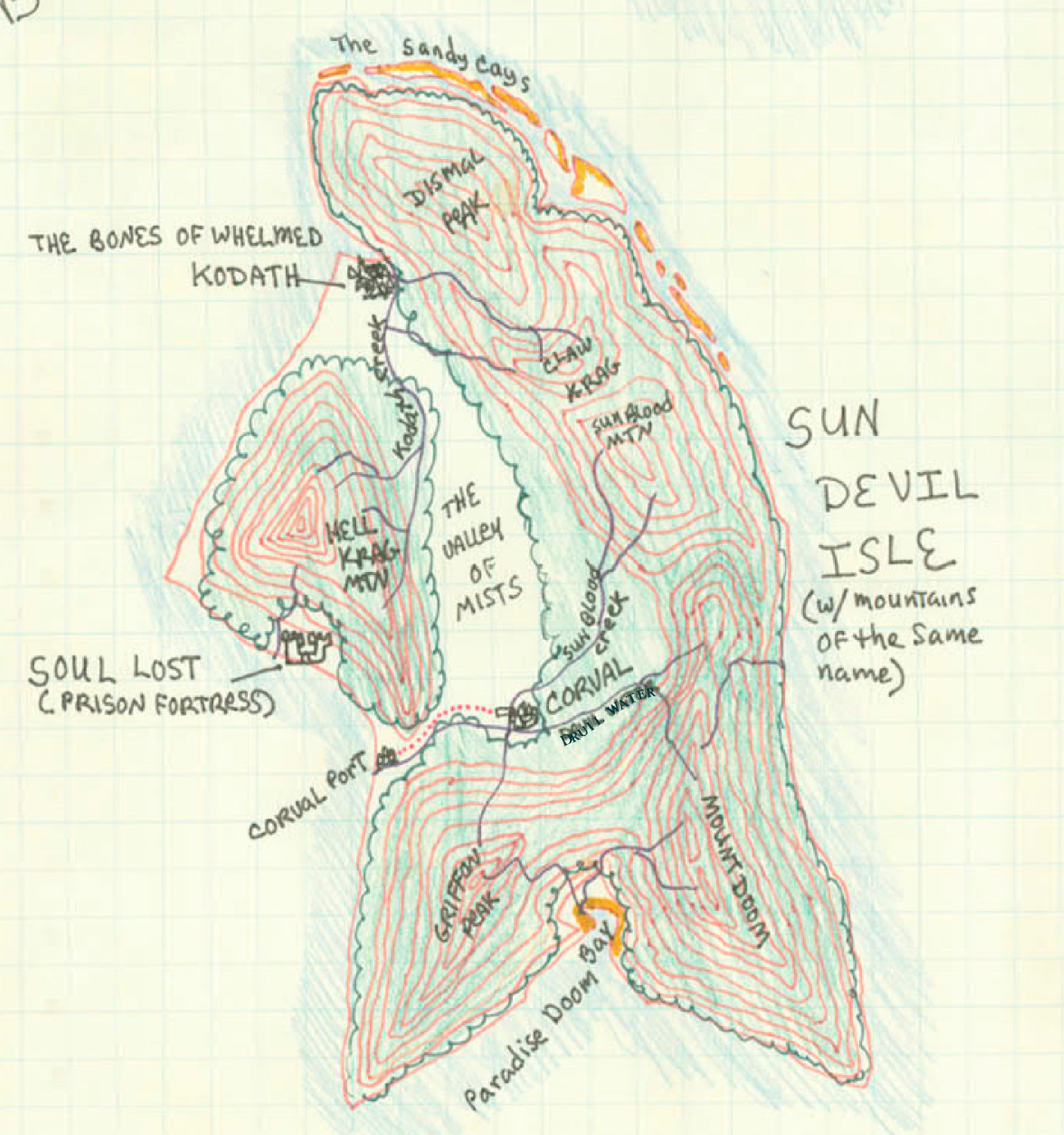
The first pic is of the Ghorfar map as a whole, the second just of Sun Devil isle, and then my version of Sun Devil isle.


Comments
Looking pretty good. One thing I'd suggest is to use less of the pre-fab tree groups, as you can see the repetition quite well. Instead I'd use individual trees in most places and make my own little woodland clumps.
I may be misreading the hand-drawn version, but aren't the trees meant to go right across the mountain peaks as well? On the CC version, it looks like they're almost all bare rock currently (judging only by the coloration, not whatever that grey fill style is meant to represent).
The hand drawn map does show that, but I am aiming for a graduation of vegetation up the higher mountain slopes. I intend to replace the higher deciduous trees with conifers, then smaller alpine bushes then bare rock. This was mainly to see how replacing MTN and hill symbol with the original contours looked. I might still use a bitmap fill instead of symbols, however.
Are you going to leave the contour lines, or try to replace them in a way to give the illusion of height increase?
I think just leave the contour lines.
Have you considered something like Tanaka contours? The idea is to split the contours and make the side toward the illumination white or a light color and the rest black or dark. You can get the same sort of thing with manual shading, but the Tanaka method is a distinctive and relatively uncommon method of converting existing contours into something a bit more interesting.
No, I had not considered that, mainly because I had not heard of it. Can you elaborate, Joe?
It's a technique for doing illuminated terrain from contours (or filled shapes representing contours). In CC3+, if you have each filled contour on its own sheet, add a Bevel, Lighted to each layer to get a shaded contour line (set the Lightness Range in the effect to something like 200%).
If you have filled contours on the same sheet, copy one set in the direction of the light and change the color to white copy another set in the opposite direction and change the color to black, then move the original contour to the front. You can put a hollow copy of the contour geometry in the same place to emphasize the outlines. The result is a little imperfect in sharp corners, but it's easier to set up when you have a lot of contours.
The above example also has some transparency to reduce the hard contrast of the black and white technique. Here's the drawing in case you're interested:
I did all of the drawing with the landmass tool and MOVESHT to get things to the layers I wanted, so there are a quite a few extra entities on the COASTLINE sheet that aren't relevant to the discussion.
You could also use a couple of wall shadow effects to get a result that looks more like the copy+move single-sheet one by putting a duplicate sheet with a white wall shadow on the side toward the light and a black wall shadow on the side away from the light. It requires an extra sheet for each contour level, though, so I'm not sure it's worth the effort.
Here is the almost finished map of Sun Devil island. Contour bevelling, text and tidy up to do.
The contours are very much more visible on the full size map. Still, I am yet to experiment with bevelling
Getting on well :)
I see you have some banding going on north and south of Corval Port. Is that an EXPORTSETMPPP issue?
I don't see the banding, Sue - there is a minor road there, is that what you are referring to?
In the ocean - a horizontal band of paler ocean.
Not that you mention it, I see 3 horizontal lines in the ocean.
Here is the final map. The png has no lines, thank heavens. But this jpg might.
"The png has no lines, thank heavens. But this jpg might."
Yeah, but aren't they for the contours, rivers, roads - Oh wait... 😉
Not sure about the strength of the "Copyright Bay" label either 😎
More seriously, the green skull with horns looks too pixellated to my eye; seems not to fit well with the rest of the map's style and clarity, though I appreciate that's entirely to do with the original source illustration, and not something that can be fixed without some serious redrawing.
Yes, that is a Schley symbol, which I nearly certainly will change.