Quick Village SS6
 Morrgans
Traveler
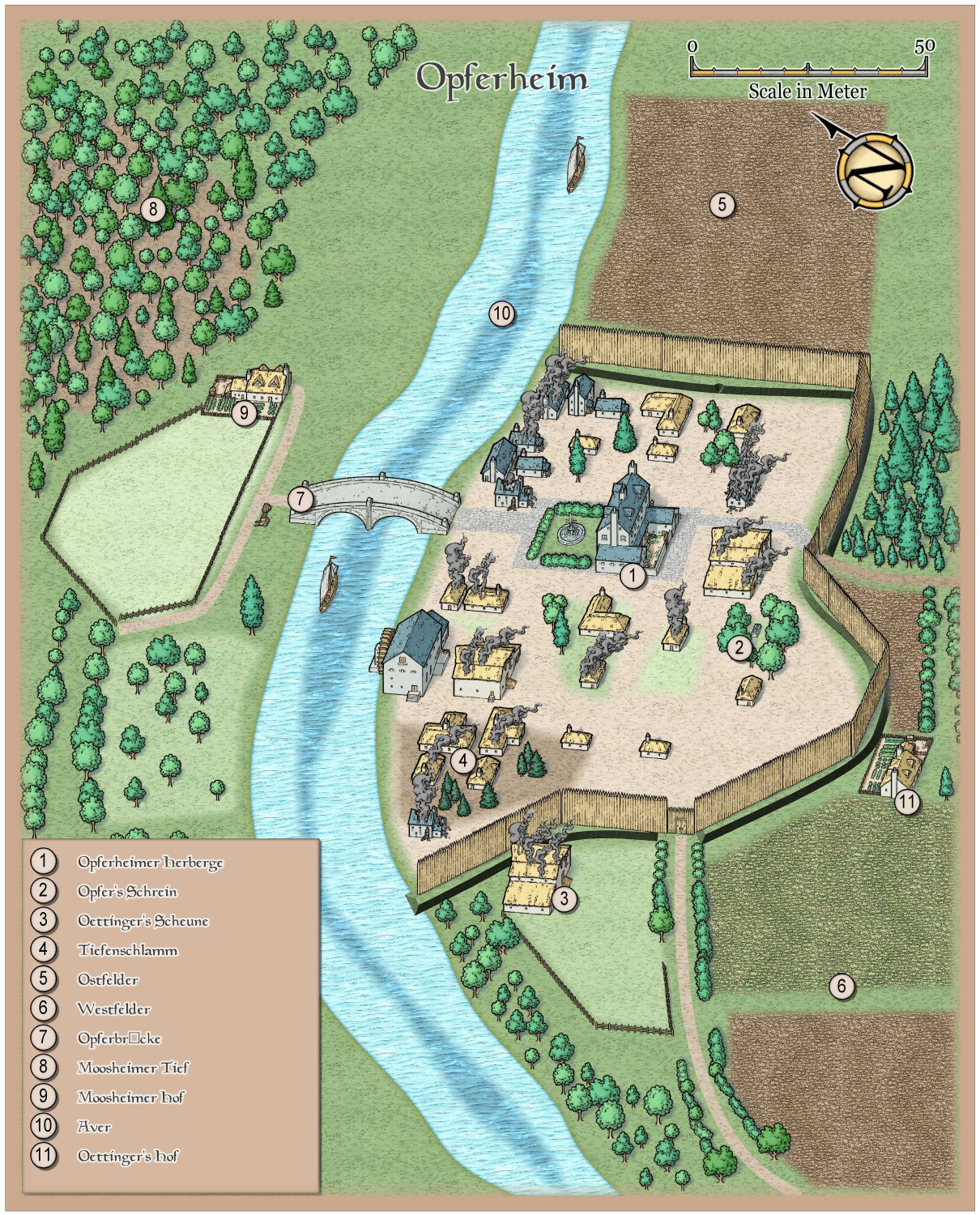
So to show off the new Symbol Set, here it goes.
I did have some HSE (head scratching experience) which is not limited to this style but to all isometric styles so far (John speed is another example, as are Renaissance City and Isometric towns).
In the eastern part of the village, I needed the palisade wall to be at a slightly different angle and so just rotated it by 15°. This however throws it off kilter compared to the other sections... it looks like it is leaning inside. Do not know how to adress that one.
AAAnd my Nemesis... ditches. So I made something with beveled lighted but it is not really to my liking. Anyway. It is only for a quick encounter with some marauding soldiers pillaging the village in a false flag action. Aaaaa. Intrigue and human greed. The most terrifying monsters of all....







Comments
Looks good !
In the eastern part of the village, I needed the palisade wall to be at a slightly different angle and so just rotated it by 15°. This however throws it off kilter compared to the other sections... it looks like it is leaning inside. Do not know how to adress that one.
Unfortunately, that's a limitation of isometric symbols in any style. They can't be rotated (and still make sense). CC3+ is just a 2D-mapper, so to create a 2.5D style like this, symbols have to be drawn in a special way to create the illusion of three dimensionality by building the perspective into symbol image itself, but that also make the symbols only work when they are oriented the way they were originally drawn.
Hi,
I supected as much... sometimes like in the case of the fence it doesn't matter but here I didn't realise it until after looking at the map as a whole.
Sooo Mike... looks like we need more wall symbols :-)
Have a great day!
Olf