Weird looking forest fill?
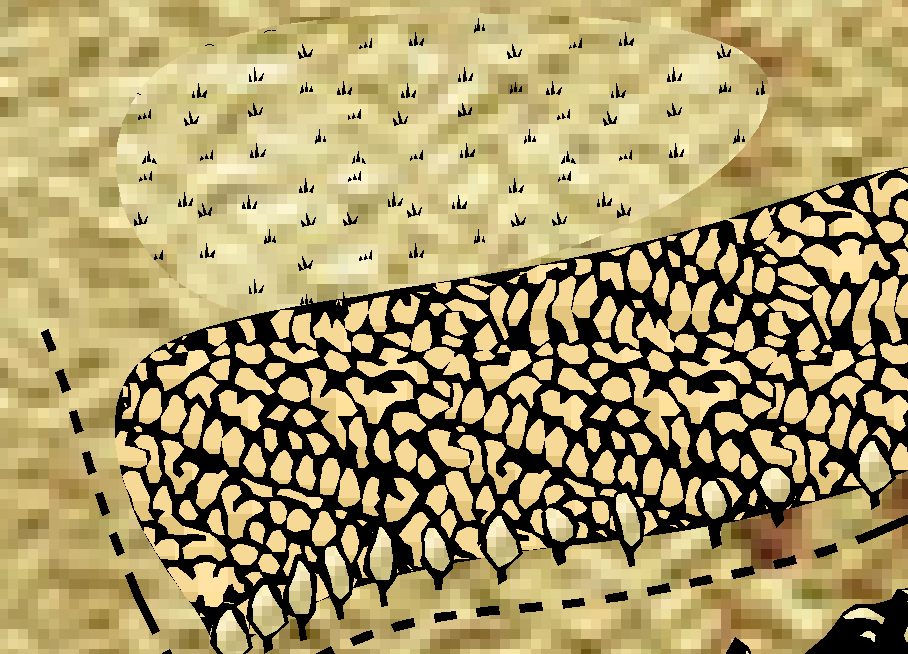
So, I'm working on my biggest map yet (I'm trying to map a whole continent), and to keep the number of symbols down and avoid eating performance I'm trying to use one of the hatch style forest fills (CA128 Forest to be precise), but it looks really, really weird. Here's a piece of my map with the fill compared to some regular trees that are the current boundary at the bottom, with a marsh fill just above it to show the difference:
The marsh fill has a proper match for the parchment background and looks pretty much fine (this tiny difference disappears when I turn on the effects) and the trees are also fine, but the forest fill inbetween the two of them looks really weird - the color's not the same at all, and it sticks out like a sore thumb even with effects on. I've been looking at the live mapping for classic fantasy where they go make a copy of and edit the marsh fill (I wanted to try and make one of my own as I find the fill above looks kinda "blobby" and wanted it scattered a bit more - it seems you can't use symbols in them, though, so it didn't work 😥) and that shows that there's already a parchment background in there...
...which has the correct texture for the map - it just doesn't seem to actually use it for some reason? Is there a way to get it to display the correct color, or better yet, to make a hatch fill that better resembles a bunch of trees? I'm happy for any and all advice that I can get with this - it's pretty much the only thing holding me up here :P


Comments
That's a bit strange. Can you attach the FCW please so we can have a closer look at it?
I am trying to figure out why this is happening, but as a workaround, you can change properties on the fill after placing it.
To do that, first unlock groups (button lower right corner), then use the change properties tool, select the entire forest, but do a selection by NOT fill style solid so you only end up selecting the filled ares, and not the lines, and then proceed to change it to the CA128 Parchment A Medium fill.
However, Hatch Styles are the opposite of good for performance, they will slow your map down quite a lot if you use much of them. Bitmap fills are the best option here.
There you go! I've tested it on blank maps and the like, and it still comes out the same - the color just doesn't seem to match the actual map, and it looks really strange as a result.
Tried the workaround here and it didn't seem to work for me - I'm still new to precision selection stuff, but I clicked the select button on the left side, right clicked to select not under combine, went down to more category and selected by fill style, selected solid, drew the box and it selected nothing. I can manually select things with the tool to select them one by one, and setting them from solid fill to CA128 Parchment A Medium does make it look like they're meant to fit in, though:
You can tell at a glance the ones that have been done and the ones that haven't. The fill is still really blobby (I wish I could make one just using regular trees, or just edit this one to give better distinction between the "trees"), but progress is progress. Bitmap fills might be better (if they work how I'd expect them to do, they'd probably let me get my symbol-based fill - I'm better with Photoshop and paint.net than I am with CC3+), but the symbols I'd want to use for it are stuck inside an .fsc file, and I've got no clue where to start on getting them out of that to use in a bitmap fill, if that's even the right way to get it done. All things considered, though, it looks quite good on the Twin Realms image that comes with CA128 (and is also colored right in there, so the plot thickens), so I'm content to use hatch fills so long as it doesn't choke performance too much...but bitmap fills might be a better port of call if things start to get out of control in regards to performance. Got any info on how to set those up? I'm trying to match the CA128 look, and that's easier said than done 😋
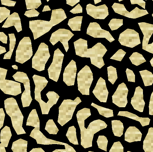
Lots of pixillation there.
Might be because the Classic Parchment isn't meant for 7k by 4k, but I dunno :P
I'm still new to precision selection stuff, but I clicked the select button on the left side, right clicked to select not under combine, went down to more category and selected by fill style, selected solid, drew the box and it selected nothing.
You need to draw the selection box first so it selects everything, and then you can do the Combine -> Not -> Fill style -> Solid part.
Thinking about it though, it may be easier to: Change Properties -> Right click to bring up selection menu -> Fill Style -> right click to bring up fill dialog-> Pick the CA101 parchment form bitmap files. There is nothing else in the map that is supposed to use that fill style, so just selecting everything with the wrong parchment works just as well as selecting the forest and then removing the solid lines from the selection.
That worked! I used that to correct the color of the fill, and then I trimmed the outside using some regular symbol trees to give the idea that it looks like a forest, and this is the result:
Not too shabby, I feel, though I do wonder if I might be using even more objects just trimming the forest with symbol trees, though it surely has to be less than if I tried to make that kind of forest out of just symbols, that's for sure. Lots of work to be done, but this gives me a chance to at least get a start on scaling two of my existing maps together into the continental one, and that's some good stuff.
EDIT: Yeah, this is too laggy - just trimming the forests with trees like this adds even more symbols than the old way of just using a few symbols to mark a forest. My performance went right out the window on this, so using fills isn't going to work. All this trouble for that :(