City of Torlok
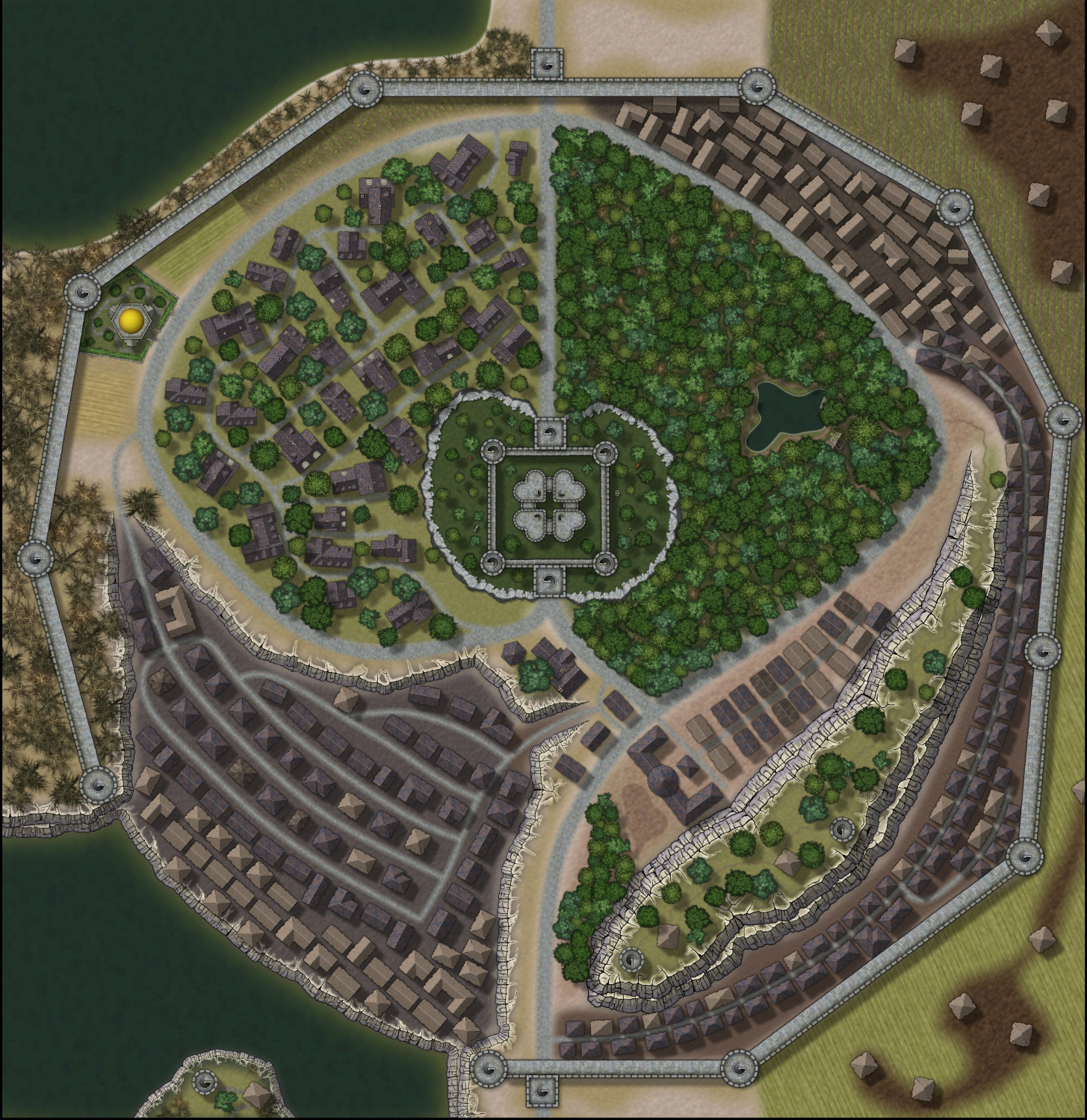
I have been doing some maps for a guy at work trying to bring his 20 year old world to life beyond rough pencil drawings and what he has locked inside his head. Most of the stuff I have done so far is new dungeons and encounter maps. I have been working to create a world map which is still a WIP. He gave me a map of Torlok and I thought he wanted me to draw that city map. I started working on it based on a crude drawing and some written information about the city. Turns ou he only gave me the map for reference of what types of stuff he wanted inside towns, villages and cities. After seeing the early stages of the map he gave me the go ahead to complete it and change things as long as the basic idea was still there. This is what I came up with. Still needs some work and at some point it needs labels but thought I would post it to see what I need to do to improve on it.
First larger scale city map.
Comment and suggestions welcome as always.





Comments
Looks pretty good to me :)
As Sue said, looking pretty impressive!
Might need a touch more work on the cliff lines and their shadows. The central citadel is presumably meant to be on a high, rounded clifftop, but the cliffs there look very flat to my eye (a couple of the trees on the east side are higher than the cliffs, apparently). Also the overlapping cliffs don't look right further over on the eastern to southeastern quarter in places. That might need some individual cliff symbol placements, rather than just using the connecting symbols drawing tool.
@Wyvern
The central citadel originally had a road around the rulers exotic gardens. I thought he would be the type of ruler that wanted to keep people out so I used the rocky outcropping symbols to create a wall around the gardens. Never wanted it to look like the citadel was on a hill. With that said I do like the idea of putting on a hill so I think it's time for version 2.
Cliff shadows, I have not figured out how to do the shadow effect correctly so it looks nice. The is a slight shadow in brown on the cliffs but yes it does need more. I'm all ears if you have suggestions on what I can do to get the shadow right.
South east hill/cliffs that is the only connecting symbols that actually worked. All the others had major gaps between the symbols and I had to place them by hand. I think I know what mean in your comments and I'll work on correcting those before I start on redoing the center section.
Thank you for your comments
Question:
I want to expand the background / frame / screen size but not change the size of the symbols is there and easy way to do that? I want the map to be more of a rectangle than a square.
You can resize the map by going to File -> Resize drawing area. This just changes the size of the drawing area, it doesn't rescale things.
When I do that the setting are not what the current map setting are and every thing gets messed up. The drawinf should be 900x900 but the dialog doesn't show that.
After setting to 900 x 1000 here is what I get.
Don't save it, close it and reopen it as it was.
It looks like for some reason things have ended up on the wrong layers (not sheets but layers this time).
Please can you upload a copy of the FCW file here so we can have a look and see what made it go wrong like that?
Thank You Sue.
That would not surprise me as I may have messed things up when I imported the scan map and started things.
I have started on version 2 after adjusting the south eastern cliffs so I'll up load both copies as they are both bad.
Guess this is a good stopping point as I need to get back on my contest entry.
Ok Jeff - thanks for these.
I will have a look at them for you if Remy doesn't beat me to it.
Thank You both.
The central citadel originally had a road around the rulers exotic gardens. I thought he would be the type of ruler that wanted to keep people out so I used the rocky outcropping symbols to create a wall around the gardens. Never wanted it to look like the citadel was on a hill. With that said I do like the idea of putting on a hill so I think it's time for version 2.
I did wonder if it was meant to be sunken instead of raised, but couldn't think of a good reason why someone would then build high walls and towers in the lowest part of the settlement. In a medieval setting certainly, defensive fortifications were commonly located on a hill as that gives good visibility and makes it harder for an attacker trying to reach the defenders. Obviously, in a fantasy setting, that need not always be the case, however.
There are though examples of actual medieval castles that had gardens within their outermost walls, so that would be a way to achieve what you wanted for the ruler's gardens.
Cliff shadows, I have not figured out how to do the shadow effect correctly so it looks nice. The is a slight shadow in brown on the cliffs but yes it does need more. I'm all ears if you have suggestions on what I can do to get the shadow right.
Cliff shadows can indeed be tricky little devils in this style! I've had my own battles with these at times, and it's often the case to just try different things - the PDF mapping guide that comes with the City Cliffs Annual issue gives some advice you can expand on by experimenting, for instance.
It's often the case with the various CC3+ sheet effects that playing around with them is the best way to learn, and it's tricky to advise beyond that unless you get really stuck on some specific point. If so, please feel free to ask again! However, Sue (as creator of the City Cliffs Annual) or Remy (as our resident all-round CC3+ expert) may have something to offer after viewing your FCW files in this regard too.
Good luck sorting the cliff symbols as well!
The reason for the bad resizing behavior is that you have lots of things on your MAP BORDER layer that doesn't belong there. There's a lot of buildings there, and most of the city wall is there too. This confuses CC3+.
To fix it, show just the BUILDINGS sheet, then use the command Change House Layer on all the buildings, and change it to BLDNG (HOUSE 1). Then make a new layer, call it WALLS. Now show only the SYMBOLS 2 Sheet, use change properties on everything and set it to the WALLS layer. Do the same thing for SYMBOLS 3 sheet.
Now, the resize command should work normally.
Wow, I really messed things up. Thanks Remy
Well I fixed my mess and I was able to expand the map. Here is version 2 with some of the changes that have been recommended. Still need to do labels and fix some shadow effects.
Comments and suggestions welcome
I really hope you can consider popping this into the atlas somewhere. Given the style, anywhere will do. If you need help in finding a place, I can help.
Your city is awesome, by the way.
@Quenten
Thank You for your comments. I would love to add it to the atlas and I will take you up on your offer for help to find a place, Hope that also includes letting me what I need to do for notes and stuff before I give it to Remy.
Ok I read Sue's instructions and did what I could for cliff shadows. dropped the unused sheets and renamed a few along with moving stuff to the correct sheets. I added the key and text to the maps.
Comments and Suggestions Welcome
It looks great, Jeff :)
If you are still worried about the cliff shadows there is this live stream that Ralf did a while back which might help you get rid of those crack issues on the top edge. These cliffs are like the rice paper decoration that goes around the outside of a large iced cake. They need a capping.
https://www.youtube.com/watch?v=yWVbqY8Wxag
Sue my problem with the cliffs is the tools are made for cliffs that are closed or run into the screen. The cliffs which are not closed are the issue. I'll look up Ralf's video this weekend and watch it. I good with the way the map is right now but would like to do a better job on the cliffs.
Next map a regional map of the world map of Endoria I'm working on, After I get that one done I'll revisit Torlok. (Well I had to go fix the docks - fixed version in gallery)
Thank you for the comments and the help.
You're welcome :)
As I remember it, Ralf shows how to blend between the different levels towards the end of the video.
Looking good!
You might want to capitalise the first letter of all main words in the number key list; it's a little untidy presently that way. Also, minor typo; should be "Sergeant-at-arms".
I wasn't certain what the "Wonder Way" numeral was indicating, so looked closer, and there's actually still a tiny text label there saying the same thing. That text could probably be removed, albeit it's not too clear just what's being indicated with the marker currently. Maybe highlight the roadway (?) that's meant - say with a differently-coloured road texture fill.
@Wyvern
I removed the street name (Thanks you for pointing that out) Moved the wondering way marker to help show the street. Added a couple of additional labels and fixed the names in the list. Thank You again for your input.
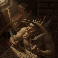
As side note my first character artist image, nothing special but I did do the city ruler. Waiting on some background information to add to the image so this is still a work in progress.
D'you think he knows there's a giant skull monster trying to eat his head? 😉
The gold staff doesn't look quite right though. It seems as if it's behind his hand, not in it. Might be worth checking to see which sheet the staff's on, as if it's the staff version with the hand cutout, it should fit to look as if it's being gripped correctly.
Remy,
here is the .fcw file for the atlas. I have renamed the city to Austfiroir for the atlas and posted an image where I would like the city to be located.
Please let me know if you need anything else.
Thank You
I'm pretty sure that you will need to map the region where Austfiroir is, as it doesn't seem to be marked on the continent map
Here's Austfiroir in the Atlas. Thanks Jeff.