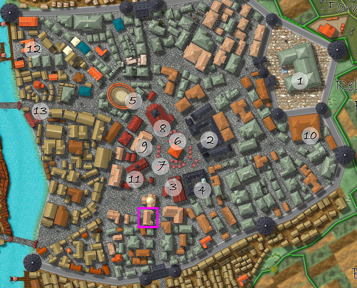
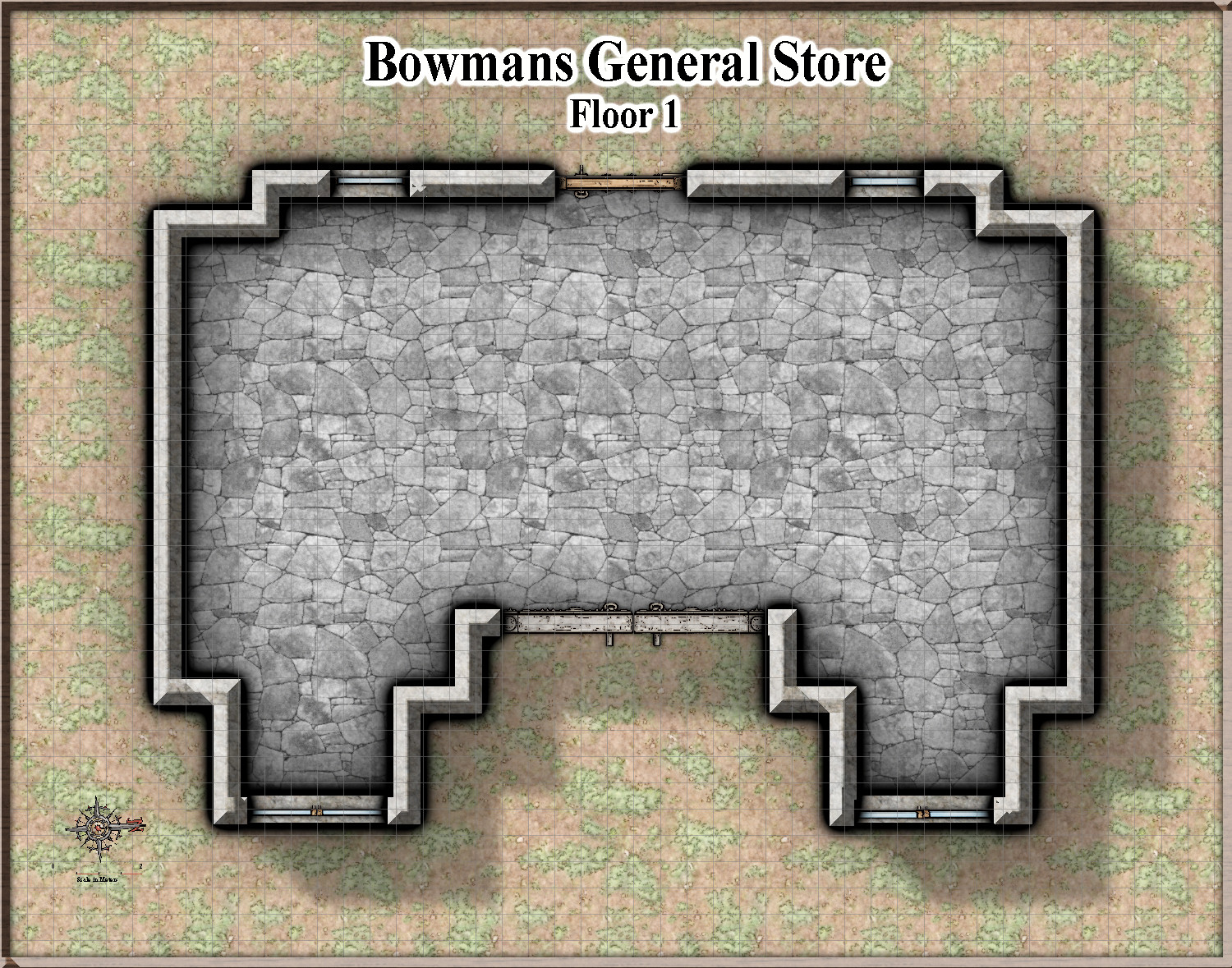
[WIP] Competition - Vertshusen City - Bowman's General Store
Here is the beginning of my entry into the competition Remy just announced.
This 10x8m street building will be a general store - based on the general store on Flinders Island, but with the proprietor's lodging on Floor 3. I hope to build in a few adventure hooks as well.
The building is also very close to the sewer system, so expect a nefarious connection


Comments
Is that Bill Nefarious ? Or just a nefarious path ?
Here are the other floors I hope to do - obviously mere outlines at present. There will be a cafe on the 2nd floor, as well as mainly clothes and stuff.
First Floor inside pretty well done - comments please.
The roof map has changed to reflect what actually is in the map of the city - me bad!
And of course, this means the floorplan of levels 2 and 3 will also change.
Revised Floor 2
Revised Floor 3
Look good so far. You might want to switch to the Bevel, Lighted effect instead of just the plain Bevel to avoid the weird triangular artifacts at corners that aren't perfectly rectangular.
The first floor looks awesome!
However, the stones for the steps at the entrance seem huge, like one of the larger ones is @2 meters. A person's foot could slip between the cracks, especially a child's. This is a situation where scaling a symbol up doesn't work for the actual map scale.
Comments about the stairs I had already noticed. I will be fixing them later on.
Here is my revised, hopefully final version of the 1st floor (ground floor). Comments please.
Here is the 3rd floor (Living quarters) - again hopefully finished. Comments please
Here is floor 2 - hopefully finished, and Comments wanted please
The things outside don't seem to have any shadows. Otherwise good :)
Yes, I see that, forgot to add effects for the two sheets that I had put the outside symbols on for the second and third floors - it is fixed now.
Here is the basement - I am undecided as to whether to write a little story on the bottom. Comments please.
That scale bar is a bit small, making it difficult to read properly. Could stand being quite a bit larger. Enlarging the compass rose a bit wouldn't hurt either. And perhaps move them to a corner on the basement map too?
Yes, I had thought of that - just forgot to do it. Thanks for the reminder. I have fixed the frame on all of the maps as well. I think I will soon be finished.
I have fixed the Compass rose and legend. And added some text to the basement map. And fixed the lack of shadows on the outside symbols.
Rather than repost all maps, I have shown just the updated basement map. The compass rose and legend are the same on all 5 maps.
Unless there are more comments in the next few days, I will submit this to both the competition and the Atlas.
Wow! I love it all!
As there are no further critiques, I am submitting this to the competition and the Atlas.