Forest Lair
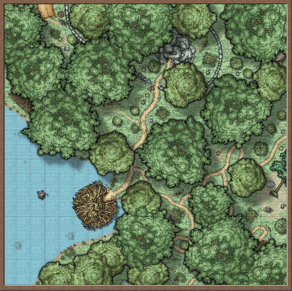
Well I picked up the Mike Schley tokens from his website and decided to try and make symbols catalogs out of them. Making progress but things are not quite right yet. I decide to put together a quick battlemap using some of the tokens to see how they fit together. The result is my Forest Lair Map. Please let me know what you think and how to improve it.


Comments
It looks good. I would suggest you do the insert image instead of attaching the file. That way it will show up in the thread.
That looks really great! I just did the same, but I only bought one of the sets, as I've never made a symbol catalogue before, and I first wanted to try it out and see if I get it to work.
But you don't seem to have any troubles with that at all!
Ok suggestions . . .
In terms of the grid, some parts are more viewable than others. The grid tends to disappear and often at point I would not expect it to. So you may want to address that. Maybe add a glow with the blur/transparency? I do not usually show grids so I am not sure what to suggest.
I think you need to add some sheet effect to the coastline. It is very flat where the land/water meet. You could do a basic glow on the water or land.
It looks like you have some stone/cliffs symbols in the top center showing elevated land. I like that, but I am not getting the sense of depth. Maybe add a wall shadow, directional to them? Or something else to make it seem higher than the rest of the land.
Thank You for the suggestions I'll look at those. The coast line is two different layers so I'll see what I can do.
I changed the water shoreline and tried to fix the grid but the grid still in not right. Tried black but changed to dark brown. Seem to have more of a beach shoreline effect than before.
I coastline looks better. As an experiment, maybe try making a black outline on the land and then a blue outer glow with the water.
Is it just me or does your grid seem to vanish in some parts of the map?
Yes still issues with the grid, trying to get that worked out.
To me, it looks like the grid and some of the trails are a similar, or near, color. I looked carefully and didn't see any missing grid lines.
Where I saw this is about in the middle right side; where the trail curls up under a tree, then goes to the left near what looks like a well or pond, then splits into an upside down Y, and continues on.
Is that it ? Or am I mistaken ?
thats really strange. I wonder why this happens... tell us, if you ever find out!
It might be down to the size of the export and the amount of antialiasing. The only way to be sure is to alter the export settings a bit and see if it looks different.
Try a larger export.
I wonder why this happens.
Grids (and thin lines in general) are problematic when exported to an image.
The reason for this is that a grid line may be for example 1.7 pixels wide in the final export. Well, an image can only use whole pixels, so it will either be 1 pixel or 2 pixels wide. Some people may then think "easy, 1.7 obviously rounds up to 2, where is the problem?".
Well, the problem here is that if you round up all the grid lines, these pixels add up. If your map have 20 grid lines vertically, and each takes 0.3 pixels more than they should, then there are other parts of the map loosing out because there are 6 pixels that actually belong to other elements. (And while 6 pixels seems low, remember that everything in the image fights for space, it is just that the grid lines are more visible here, but the image sizing algorithm have to deal with everything).
Let us just for the sake of example try to export 5 touching parallel lines of different colors to a 8 pixel wide image. Evenly divided, each line should then be 1.6 pixels wide, right? But if we round it to 2 pixels, we really only have space for 4 lines, there won't be any pixels left for the last one. Obviously, rounding up isn't going to work. Rounding down? No, not really, with 1 pixel wide lines, we only fill the 5 first pixels of the 8 wide image, with 3 left over. The only possible way to do this is to make some lines 1 pixel wide, and others 2 pixels wide. So even if they were identical in CC3+, there are no way of doing that in the exported image as long as the export size doesn't happen to line up perfectly (For my 5 lines, both 5 pixels wide or 10 pixels wide would have worked perfectly). So this is really the problem the image exporter faces, and thus end up with different widths of the lines on the export. Image resizing algorithms tries to be as smart as possible to lessen this problem, but it is difficult to handle single thin lines.
Using a high level of anti-aliasing helps combat this, because it will merge the colors from nearby pixels, creating an illusion of lines and features that are not a full pixel wide.
I tried some of the suggestions and changed the grid color to see if that helps.
Much better.
You can see the grid better, but it is still quite patchy. How about trying what Monsen suggested, and increasing the antialiasing quite a bit?
I added the antialiasing(15) to the export and exported the jpeg from CC3+ instead of converting the PNG which also looks like it was part of the issue.
Changed the antialiasing to 33% per Sue
Its starting to look quite a lot better.
I usually use at least 20% antialiasing, preferably 33% and sometimes higher.
If you're not already doing it, you might want to use the EXPORTSETMPPP command with a value of about 40000000 to reduce the number of export passes. I noticed some pass boundary glitches on some of the earlier maps in this thread and upping the number of pixels per pass with EXPORTSETMPPP can reduce those glitches.
As an experiment, have you tried adding a glow to the grid? I am just curious as to if this would make the area show up or not. Perhaps a black glow would help. It would be outer, inner, or both. I would also try the different methods of using glow as well.
You may also look to see what your transparency and/or blur is set at for the grid to see if that helps.
Yes it already has a glow applied.
Ok I tried this but it looked like it was already set to that setting but applied it anyway.
Changed the grid back to black.
I think it looks perfect now :)
Yeah!!
Thank You All for your help.
On to the next project