[WIP] The Dancing Princess (Community Atlas, Artemisia, Spiros Isle, Helinesa)
I decided to give the Ship annual a go. I am having difficulty, and any help from the community here is greatly appreciated.
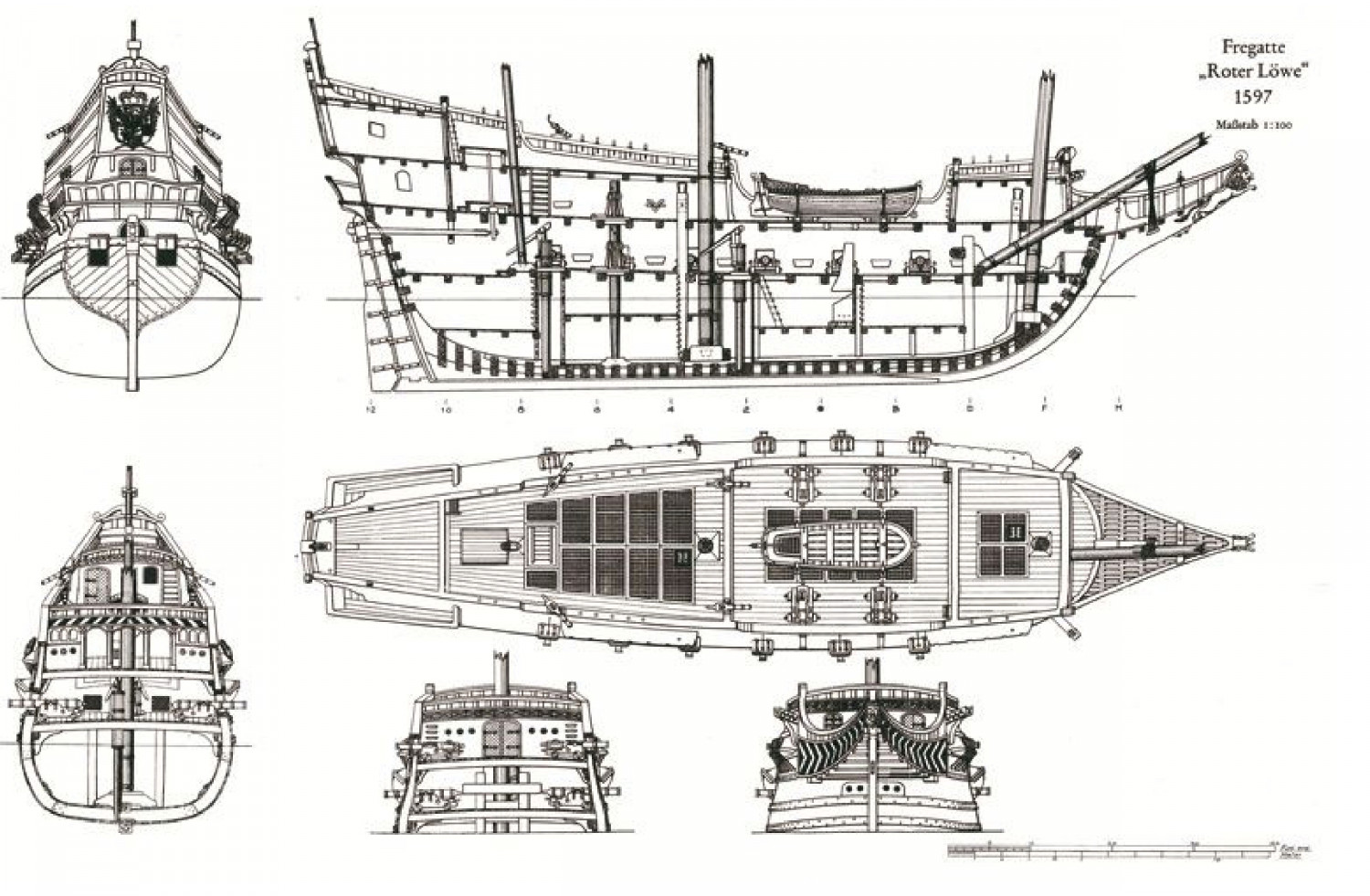
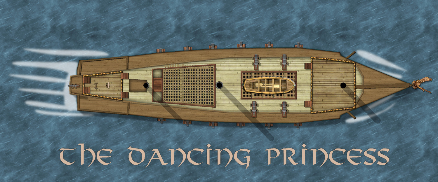
This is what I have done to date, and here is the diagram I hope to replicate.


Comments
You seem to be doing pretty well. Where's the problem?
I think I have the decks wrong, somehow.
You might need to do all those split level differences on the deck with a separate set of sheets for each one, so that you can cause the upper ones to cast a shadow or a dark glow over the lower ones. You've got 3 levels, as far as I can see. The highest one is the stern, or aft deck (and now we are going to see if I can remember all the terminology!). The next level down is the mid and fore deck, and the lowest level between them is... ummm. I've run out of terms, but that's kind of a mid deck also! LOL! And its about the same level as the bow, so you could put them on the same set of deck sheets as well.
I'm not sure how that would translate as far as the general outline goes, but if there's a step up or down in the deck level, then there will also be a step up or down in the freeboard. The bit that sticks up above the water line. So you could draw it as 4 separate decks (on different sets of sheets) that just happen to make the shape of a ship.
I think you might find that the part of the plan view not shown as planked down the sides is the bulge of the lower decks, which if you look at the stern elevation plan stick out beyond the extent of the deck. If you look at where the gun ports are located in all the plans you will suddenly see what I mean. The true extent of the deck is where you have drawn the paler planking. The extra extent should be very steep flanks with the guns poking out of them.
That bow of yours isn't quite right. It isn't solid deck there. Here's a nice image from below from a 3D-model reconstruction showing a nice view of the area: https://cdn1.epicgames.com/ue/product/Screenshot/ScreenShot00002-1920x1080-f0bde8cb76a0de8cd4b3f512f0091aeb.png?resize=1&w=1920
This ship uses a lattice of planks, many other sailing ships just use a rope net.
See more images here:
Looking at the base drawings you're working from, and dependent on how close a copy you're trying to make of them, it's worth studying things in some detail before going further, and thinking-through exactly what's being shown.
For instance, it looks to me as if the full width of the vessel at the waterline hasn't been included in the top-down plan drawing. There should be a sliver of the broadest part of the vessel's sides visible below the cannon barrels, which obviously isn't shown on the plan view.
As a perhaps more significant element, the masts are not all vertical, but at a slight angle (hence why they're not illustrated as circles on the original plan view), they're not all of the same dimensions, and you seem to have missed the bowsprit entirely (or rather, you have a broad linear piece of wood texture at the angle and placement as shown in the drawing, but drawn as if it were merely a flat piece of the deck). The latter will be especially problematic, as the original drawing doesn't seem to indicate its full length (it should extend well beyond the bows, for instance). There's the further complication that it should have at least one yard suspended below it, partway along, to carry the spritsail. You may have to busk this from the 3D model images in Remy's posting, I suspect - much as with the features of the upper parts of the masts, i.e. any crow's nests (which should probably be shown as the ship's highest "level" in an FRPG drawing). If you're intending a vertical cross-section for the ship too, you'll need to think-through where the yards are on the main masts.
There are other features that would benefit from further consideration (beyond what Sue and Remy already noted) - e.g. the hatch covers - but this is already running longer than I'd intended, and I haven't time for more currently!
Thanks everyone. back to the drawing board.
I'm not saying it will definitely help, as I'm not sure what changes were made when the Ships Annual was updated, as they were drawn only using the original, but I had to handle similar deck-level elements, and other features, when designing "The Naughty Lass" for the Atlas. For ease, you can pick up the deck plans FCW here, and the sideview here, in case those may assist.
Note though that I did "cheat" with the yards, by having them piercing their respective masts, partly because it's a magical vessel, partly because I was trying to avoid needing to show the complexities of the rigging...
Thanks @Wyvern I will definitely look it up. I hope the hair I have pulled out regrows.😅
Certainly, I found drawing "Naughty Lass" quite a challenge overall. There's a particular complexity in trying to visualise things in 3D to be able to draw 2D versions from top-down and side-on viewpoints, and deciding exactly which line you'll pick for the cross-section, etc. There isn't an ideal solution, so you end up just picking whatever seems to work better, and hope users/viewers will be able to tell what was intended.
There is a similarity to the cross-sectional views of caves we've discussed before here, though with a ship, you can't usefully vary the line of any sections, as that just makes it still harder to draw for a vehicle.