CA143 Asian Town - Eliminating TA & purple box issues
 EukalyptusNow
🖼️ 62 images Surveyor
Hello again dear fellow forumites.
I'currently creating my first larger CA143 Asian Town map and there's two issues I'm struggling with.
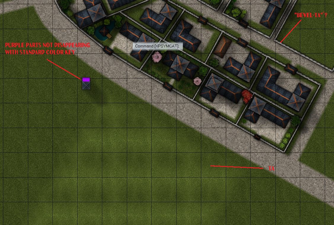
The first is that some textures in the style seem a bit sensitive to "Transparancy Acne". I can live with a bit of "additional unplanned bevel effects" in the walls, but I'm struggling to resolve The "holes" that appear when layering gras textures on top of each other. More detail on that later.
The second issue is that some of the symbols include "purple boxes" - notably the well and wall section symbols. I've tried to set a colour key to the relevant symbol sheet, but the box' colour does not seem to be the default CC pink, so it's not removing the box.
Here's a sample part of the map - with an added well to show the "purple symbol box".
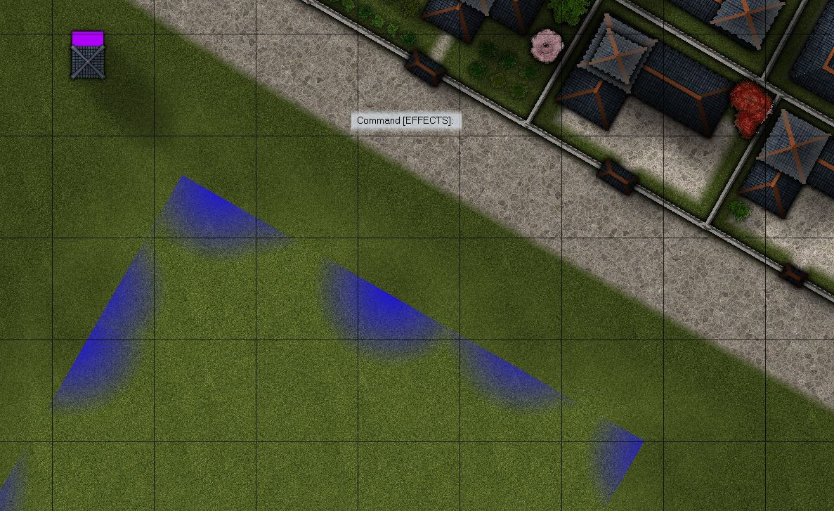
In regards to the edge fade TA, I've tried layering a different monocoloured sheet underneath the light gras terrain. When that produced discolourations, I (eventually) found out that the edge fade effect of the light gras was set to include some general transparency.
But even after I disabled the "non edge-transparency", I'm still struggling to correctly size and align the intermediate sheet. No matter if it's sized a bit too small or too large, there's always some "effect bleed" around the edges.
So how do I best match/ fit my "intermediate sheet" under the light gras terrain, and how do I get rid of the "purple boxed" in the symbols?


Comments
I suspect that the structure shading has slipped somehow for the symbols that are showing purple. Try hiding the layers called STRUCTURES (SHADING), and STRUCTURES (OUTLINE).
You are mostly there with the transparency acne separation sheet, but instead of using a new polygon on that sheet, copy the actual grass polygon onto that sheet and use change properties to turn it solid and whichever blue colour you are using. Copy the EFI effect from the paler grass to the separation sheet, and edit it slightly to make it wider than it is on the grass sheet.
If there is transparency acne happening between the blue and the grass, try using colour 227 instead of that blue. The exact colour of that polygon only needs to be a colour that definitely isn't included in the overlying grass texture, not even as a single pixel.
Excellent Advice. Never would have thought to check the layers.
Hiding the layers STRUCTURES (SHADING) and STRUCTURES(OUTLINE) produced some...interesting effects
but hiding STRUCTURES (COLORS) solved the problem.
I'll get to work on that grass now. Thanks a lot, Sue.
Yes, sorry - I got the wrong layers. I always get confused by all the STRUCTURES ones ;)
Was struggling with the gras but found a satisfactory solution in the end.
Even when I made the two sheets overlap exactly and choose a far "broader" greater edge fade for the monocoulored separation sheet, some colour kept bleeding out from under the gras.
In the end, I solved that by selecting a very light brown for the separation sheet - and making the path around the park go across the "faded edge".
The trees also helped. Here's the beginning of my TA-free park.
Thanks again.
I'm glad you got it sorted out :)