Tabletop Wargames 2D Terrain with CC3+?
Hello fellow Mapmakers,
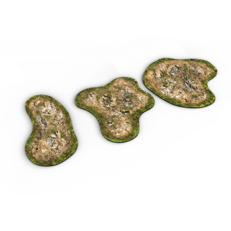
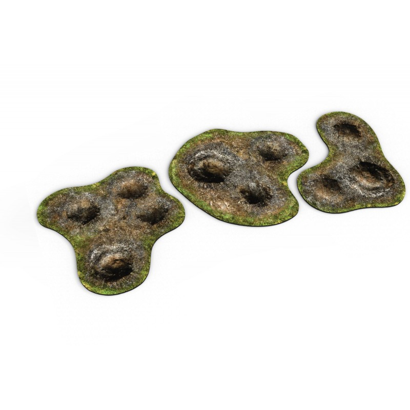
as a Tabletop Wargames fan I thought I could create my own 2D terrain for personal use at home. The question I have is which map style I should use in order to achieve something like the following results (reference pictures from playmats.eu):
For the most terrain features I would like to create I found open source png files but I am mostly interested in how to achieve something like the grass background you can see here.
Thanks in advance!
Best Answers
-
 Ralf
Administrator, ProFantasy 🖼️ 18 images Cartographer
I second Remy' suggestion. Symbol Set 2 Bitmap A style is the most photo-realistic we have and would suit such a project probably best.
-
 Monsen
Administrator 🖼️ 82 images Cartographer
Scaling for such a project is always a bit tricky, because it doesn't fit with normal scaling guidelines for a map. But let us give it a go.
You're using both metric and imperial units in your post, and while I am mostly a metric man, I am going to convert all to imperial here.
Your desired output is 61x35.4cm = 24 by 14 inches. Now, inches are familiar from battle maps, 1" squares are common, and usually, battle maps are scaled 5' (in game) equals 1' on paper. So let us use this dungeon scale, it makes it easier to scale symbols and fills correctly. So, with that in mind, I would make the map itself 120 by 70 map units. (Which is feet for a dungeon template)
To get rid of the white border during export, either in the options dialog for the export, enable the crop to map border option, OR use the Rectangular section file types when saving, since these allow you to specify exactly what to export. That white border is a result of the screen sheet that covers up things sticking out from the map, but you don't want it included in exports.
Now, for the exact measurements. I assume 2 by 3 inches is the physical printed out version. Well, since we used the scale 1" = 5', it means that if you make an entity measuring 10 by 15 inside CC3+, it should come out as 2 by 3 inches. Use grid, snaps, or other precision tools in CC3+ to achieve the exact sizes, and you can also use the Distance tool from the Info menu to measure distances.




Answers
Looks like a dungeon style would be most appropriate. Something like the SS2 Bitmap A style perhaps?
Thank you for your fast reply, Remy!
Will give it a try!
I second Remy' suggestion. Symbol Set 2 Bitmap A style is the most photo-realistic we have and would suit such a project probably best.
I played around with SS2 Bitmap A and it works perfectly! Thank you both for your fast and helpful replies!
Follow up question (unfortunately):
So my setup works and everything looks pretty nice. I know that I will have to export what I created at 300 dpi and 7205 pixels (61cm) x 4193 pixels (35.5cm) in order to get it printed on mousepad material.
I know that is a lot to ask, so feel free to just point me in the right direction where I can go and refer to my books.
Thanks a lot in advance!
Scaling for such a project is always a bit tricky, because it doesn't fit with normal scaling guidelines for a map. But let us give it a go.
You're using both metric and imperial units in your post, and while I am mostly a metric man, I am going to convert all to imperial here.
Your desired output is 61x35.4cm = 24 by 14 inches. Now, inches are familiar from battle maps, 1" squares are common, and usually, battle maps are scaled 5' (in game) equals 1' on paper. So let us use this dungeon scale, it makes it easier to scale symbols and fills correctly. So, with that in mind, I would make the map itself 120 by 70 map units. (Which is feet for a dungeon template)
To get rid of the white border during export, either in the options dialog for the export, enable the crop to map border option, OR use the Rectangular section file types when saving, since these allow you to specify exactly what to export. That white border is a result of the screen sheet that covers up things sticking out from the map, but you don't want it included in exports.
Now, for the exact measurements. I assume 2 by 3 inches is the physical printed out version. Well, since we used the scale 1" = 5', it means that if you make an entity measuring 10 by 15 inside CC3+, it should come out as 2 by 3 inches. Use grid, snaps, or other precision tools in CC3+ to achieve the exact sizes, and you can also use the Distance tool from the Info menu to measure distances.
Thank you soooooo much!!!
I make very good progress.
the only thing I have trouble with are blast craters and maybe someone con point me towards the right track.
I use the SS2A map style, have a patch of earth in the Dirt Dark SS2A fill style and wonder if there is either a (blast) crater symbol to use or how I can create a crater. Somebody recommended that I use a slight gradient dark -> light across the patch and add a smaler circle within with the gradient going the opposite direction.
Would that be possible?
Thanks in advance!
Pure gradients (setting up a fill in a polygon that shades from one colour to another straight across, radially, conically, etc) aren't currently possible in CC3, but you can use a large Bevel, Lighted effect on the crater sheet in combination with a crater shaped polygon of a solid colour, followed by a Blend Mode sheet effect set to overlay.
You will need to edit the effects and play with all the settings to get it just right for your particular map. These are the ones I used on a plain white circle of about 12 feet in diameter, though you can use any shape or size you like.
Nice!
Thank you, Sue!
You're welcome :)
That should have been 12 ft radius, not diameter ;)
You will need to fiddle with the settings quite a lot, but at least you have some kind of starting point to work from.
The craters are done but of course I have another question:
Is it possible to copy or add to clipboard some items in a map, open a second instance of CC3+, start a new map and paste the copied items from the first instance into the second one?
Thanks in advance!
Yes, just use copy from the edit menu (Ctrl+C) to copy to clipboard.
Thank you for your fast reply!
That also worked perfectly fine.
I can see the finishing line but as always the last 20% take 80% of the time...
I found some open source PNGs of grass tufts that would work perfectly well but for my taste they are too bright if placed.
Is there a "in- CC3+" solution to make them appear darker/ less saturated or do I have to change them externally (and if so could somebody please send me towards the right track what program to use in order to do that)?
As always, thanks in advance! You´ve been awesome in helping me so far!
It is probably easier to edit them externally, since symbols don't respond to sheet effects that attempt to change their appearance. Only glows and shadows work on them.
You can use any image editor to alter them. Plenty are free. If all you want to do is change the colour intensity or make them darker, GIMP is as good as any.
Are you using the 4 resolutions - importing everything through the Symbol Manager and creating resolutions? If so, you will need to edit the VH image and reimport the symbol, recreating the other 3 resolutions. It's a lot faster than editing all 4 of each image.
Thank you soooo much, Sue!
You're welcome :)
It´s just fair to show the final results after all the help I got here. I had the terrain pieces be printed on mousepad material and finally found the time to cut it out.
Pretty happy with how it turned out.
That's pretty impressive. We all know how difficult it is to get good colour on a mouse pad, but you seem to have succeeded there.