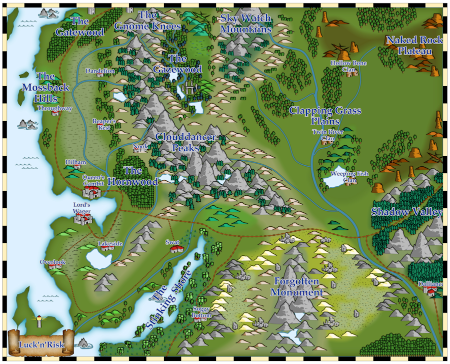
CC3+ Basic Vector Map
 Kathleen Ann Cox
Surveyor
It's me again, Kat. I picked the basic vector style included with the core program to play around with today. After looking through this thread, I think my labels are fading into the background. Farmland is being represented with wasteland hash marks on green. The desert monument area probably has too much green showing through. I think I will move my banner to the right and cover the straight line of trees, but in general, I don't think the map looks awful.


Comments
If that is a gray glow around the lettering, I suggest a lighter gray or white which is color 15.
Or maybe even swapping out the dark lettering for a much paler colour, and adding a darker outer glow to it, as that sometimes helps. Getting text right is always tricky though.