a mountain of work ahead of me
 Fersus
🖼️ 11 images Surveyor
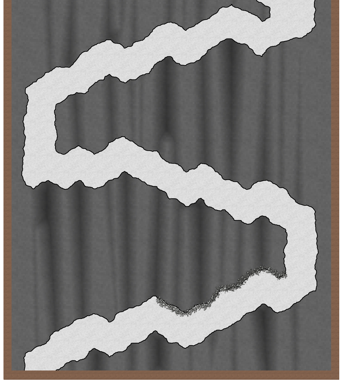
So I thought it was about time to tackle a mountain pass battle map. I've put it off til now, as I had absolutely know glue how to make it look less like a path through a cave and instead convey a sense of elevation.
After reading about Sues amazing Orde on the rock map and Shessars tutorial about elevation it was clear, that the way to go will be shadows that create the illusion I want. But somehow everything I tried does look off:
I tried to convey depth wherever the path has a dent on the lower part of the way, to show that this part "moves in", while the parts without shadows stand out and therefor get more sunlight. But even if I know what it should look like, I have a hard time making the image "click".
Maybe it's also the fault of the outline I gave the path. I felt like the lower part of the path should have an outline, to convey the sharp cliff where careless adventurers could fall of to the lower part, but the upper part of the path shouldn't have this sharp edge. It should transition smoothly into the mountainside, like a bevel effect with a rather strong curve parameter would. So I tried to hide the line behind stones, but they seem out of place as well.
Please help! Any suggestions are highly appreciated!


Comments
So if I understand you correctly, the effect you're after is a path snaking it's way upward on a mountainside, similar to what I did with Corgin.
In that map I relied heavily on the cliff texture from SS2, as I found it works really well. I also gradually darkened the path by using the Solid 10 Fill style, basically by drawing larger and larger polygons, so that the lower part basically has more layers, darkening it more. Since Solid 10 is almost transparent, the edges between the different amount of layers is practically invisible. I also drew in some polygons manually to serve as shadows from the cliffside.
Remy's suggestion is a good one, but maybe (and this is only a maybe) you could tackle it the other way around - make the mountains first and then a soft edged pass between them, a bit like drawing a river in the lowest point?
Do you have City Cliffs - the 2020 Cartographer's Annual? Not a problem if you don't, but if you do you could use the cliffs as rocky bluffs a bit like this. (Sorry about the crude 5 minute drawing).
These are city scale cliffs, but if you use them more as rocky bluffs at dungeon scale (I assume it's a dungeon scale map you are making) you could build up level on level - maybe use different rocky textures instead of grass.
Another idea is to add a sheet similar to the one in SS5 with a hugely blurred Bevel, Lighted effect on it to draw transparent polygons on it for hill shading. I've got one here in the style I'm working on.
You could use a combination of both those things, or combinations of other techniques, but the main suggestion here is to start with the terrain and not get stuck on the path itself. That can be added at the end when the terrain is done, and might even be a result of the terrain, rather than having to be specifically drawn in as a path.
Oh wow, those are really good suggestions! Thanks Remy and Sue!
I'm gonna play around with those and will report back how it went! Thanks so much!