WIP: Tighten up the Kuiper belt
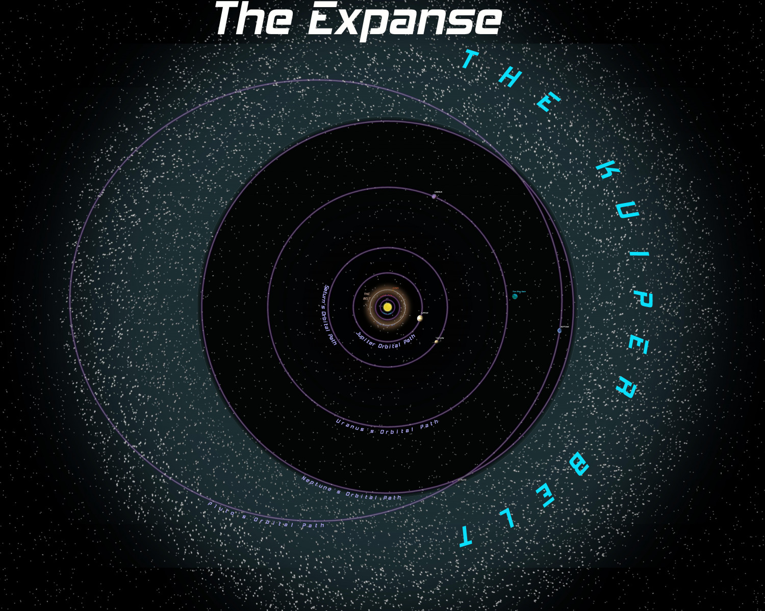
I'm working on a system map for a new "The Expanse" game I'm running online. I made the Kuiper Belt by adding a sheet, putting a large gray circle on it, and adding a large outer glow effect.
I masked the inner part of the glow with another sheet containing a masking circle.
My question is this. How can I get rid of the actual gray line from which the Kuiper Belt glow propagates? It can be seen as a thin gray line on the inner circumference of the Kuiper Belt area, just outside Neptune's orbit.


Comments
You can't actually hide something that an effect is based on, because effects are calculated using changes from the below drawing, but there are a few things you can try to make it less visible.
Thanks Remy. I'll give that a whirl.
So what is a masking circle? How is it made?
Also, as for the asteroid belts, what did you do for the symbols? Is that just a background image?
I might have got the wrong end of the stick here, but what about using a circle with a line width that is the width of the belt, then an Edge Fade Inner sheet effect to fade the edges inside and out to a set transparency in the middle of the ring?
This is a ring of black, blurred and blended to the pale background ( an alternative to using an edge fade). Is this what you mean?
Apologies for using an odd example like this, but I have to be out of the house in a few minutes to get my car to the garage.
@Loopysue
can that be done some way where the opacity is highest at the inner diameter, then fades toward the outer diameter? I couldn't figure that out.
You should be able to stack multiple sheets with varying sizes circles to get an asymmetric radial profile. You can also draw clumps on one of the sheets for a little bonus asymmetry.
Use white circles on a black background for a couple of sheets to establish a mask, then the noise-filled circle on a sheet with a multiply blend more to get then final result.
@Rob_Wordsmith I think I misunderstood your request. I thought you wanted to get rid of the sharp line around the inner side of the ring. My bad - sorry.
Do you mean more like this?
In this example there are two circles. Both are affected by the Edge Fade, Inner, which is as wide as the radius of the outer circle minus the radius of the inner circle. The inner circle is the knockout colour of the Color Key, which subtracts the inner circle, leaving a ring. Then the Blur fades the inner extent. The blend mode is just to further reduce the transparency and make it more part of the background than something hovering in front of it. In this example I used Screen and left transparency at 100%
I'm not sure how smooth the result will be when rendered out. This is my image at 3000 px square, but if you export too large you may end up with rendering issues.
EXACTLY like that Loopysue. Thanks! Ill try that out.
You're welcome :)
The only issue I can see is that the render has these faint rings around the outside edge where the sheet effects are being pushed to limits they were probably never intended to cover, but I am hoping that the rest of your map details will make them less noticeable.
@JulianDracos
Sorry, I missed your question and have been self-absorbed for the past month :). I think the masking circle question was pretty well answered by those who know more about it.
As for the symbols for the belts, I used the asteroid symbols in the cosmographer system sets. I shrunk them down, drew some temporary doughnut circles over the belt areas, then did a "Symbols in Area" command and put the number of them at like a thousand or something. When I got it like I wanted, I erased the doughnut.