Multisheet symbols (first impression)
 Lillhans
🖼️ 7 images Surveyor
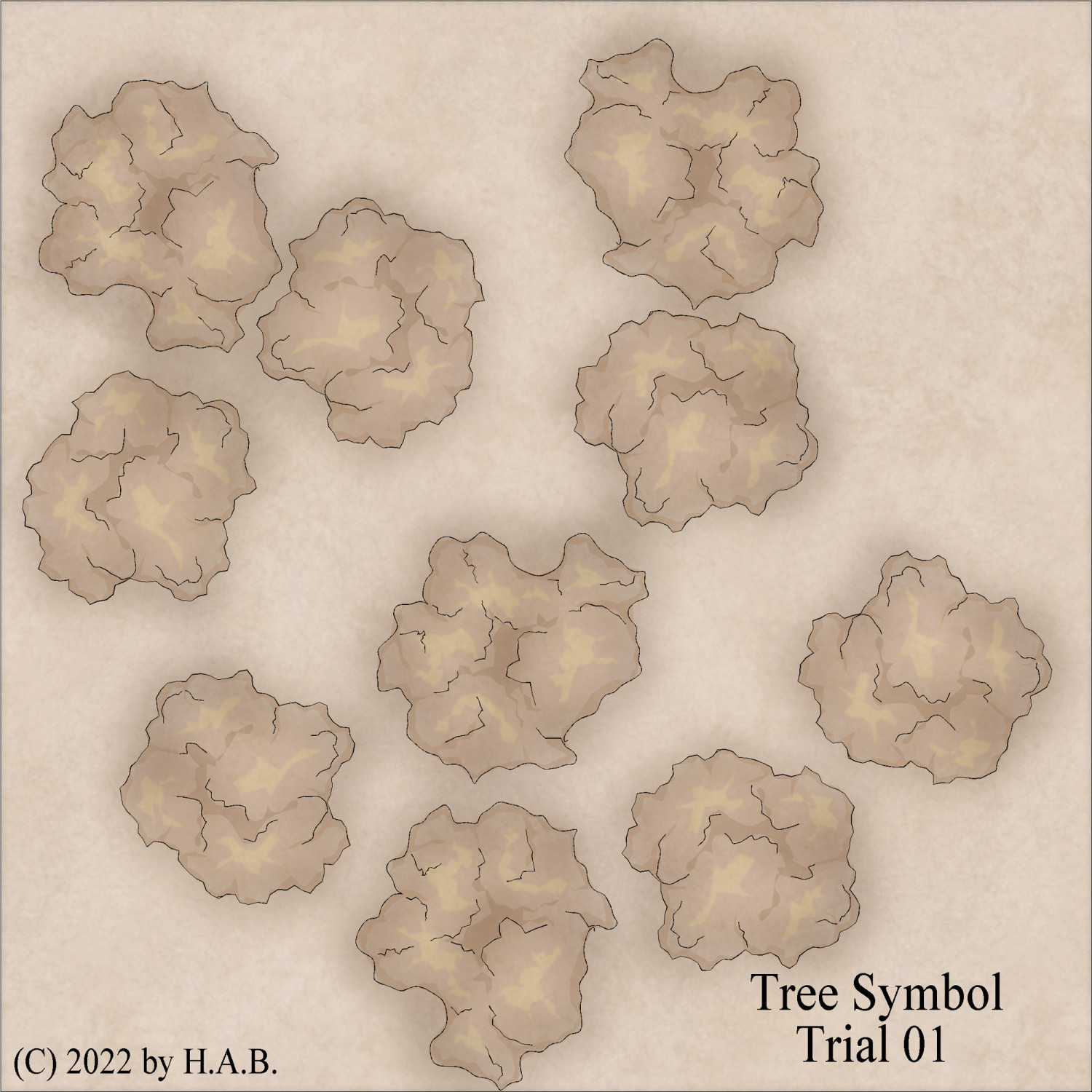
Not gonna lie: the Random Transformations options (rotation and mirror, specifically) make for rather convenient speed painting!
Between five variants for each size category - small, medium and large trees - variation certainly isn't going to be an issue!
I am getting some wonky Layer selection output but it's a start.


Comments
"Fuzz" lines on the smaller variety certainly need an overhaul, but it seems like a step in the right direction.
Cons: my wrist is numb now
Pros: it'll be fine again in a couple of days
With a grand total of 4 colours at my disposal (brown, brown, brown, and yellow) it seems prudent to use lines in such a way as to allow for distinguishing between rocks/cliffs and vegetation. I might be going out on a limb here (always keep puns at the ready!): the left iteration seems better suited for that task!
I am very much looking forward to see how the clash between these crisper canopies, and more fluid elements/texturing in a map will play out. From a colouring perspective it's easy enough to simply delete the colours after the fact and do whatever; but that doesn't take away the fact that the lines are waaaay more defined than previous attempts.
Having added a much brighter "topping" the canopies seems to have gotten a bit more volume. Which is nice.
Also nice: it looks good even without ink contours which means that the symbols can be used outside of a "crisp cut" context too.
Even more niceness: I had a sponge sheet to spare and dropping a colour there, on top of things, facilitates altering the colour to my liking. Which means more tone control for the individual tree, which means more variation. But, more importantly, it means I can also introduce colour-other-than-sepia-tones. This of course means there are popping contrasts to be had in the image.
The Aquarelle and Sepia templates/styles using identical sheet and layer set-ups - but with slightly different sheet effect settings. It'll be interesteing to see how the symbols perform in the Aquarelle environment. Probably stellar!
To conclude: I like multisheet symbols.
Lillhans, you never cease to amaze. I understand about 1/10th of what you're doing but I love it none the less...
Nodes on a grid!
Wonderful
Sloppy execution here, but a grand total of 72 "slab" shapes as symbols (randomized and whatnot) made for some interesting paving. Colour Key:ed out the bits that didn't fit the room boundaries to clear the space for the wall. Kind of circling back to Bande Desinnée aesthetics.
Symbols as contours for the paving was also way quicker than the below 15 x 5 ft corridor section. But it, too, has qualities that I enjoy. The idea of keeping modular sections as symbols is very tempting.
Expanded the "wilderness" catalogue with rocks: I got a comission from a friend to do a couple of encounter maps for their upcoming sesssions and decided to take it out for a spin.
They haven't decided on style yet, but the fainter contours for trees and rocks (bottom iteration) would be my personal choice - especially with this take on topographic features.
I would use a mixture. Use the harder style for the rocks, and the softer style for the trees. But that's only what I would do.
Lovely work :)