Canvas map development
 Loopysue
ProFantasy 🖼️ 41 images Cartographer
Hi Everyone! :)
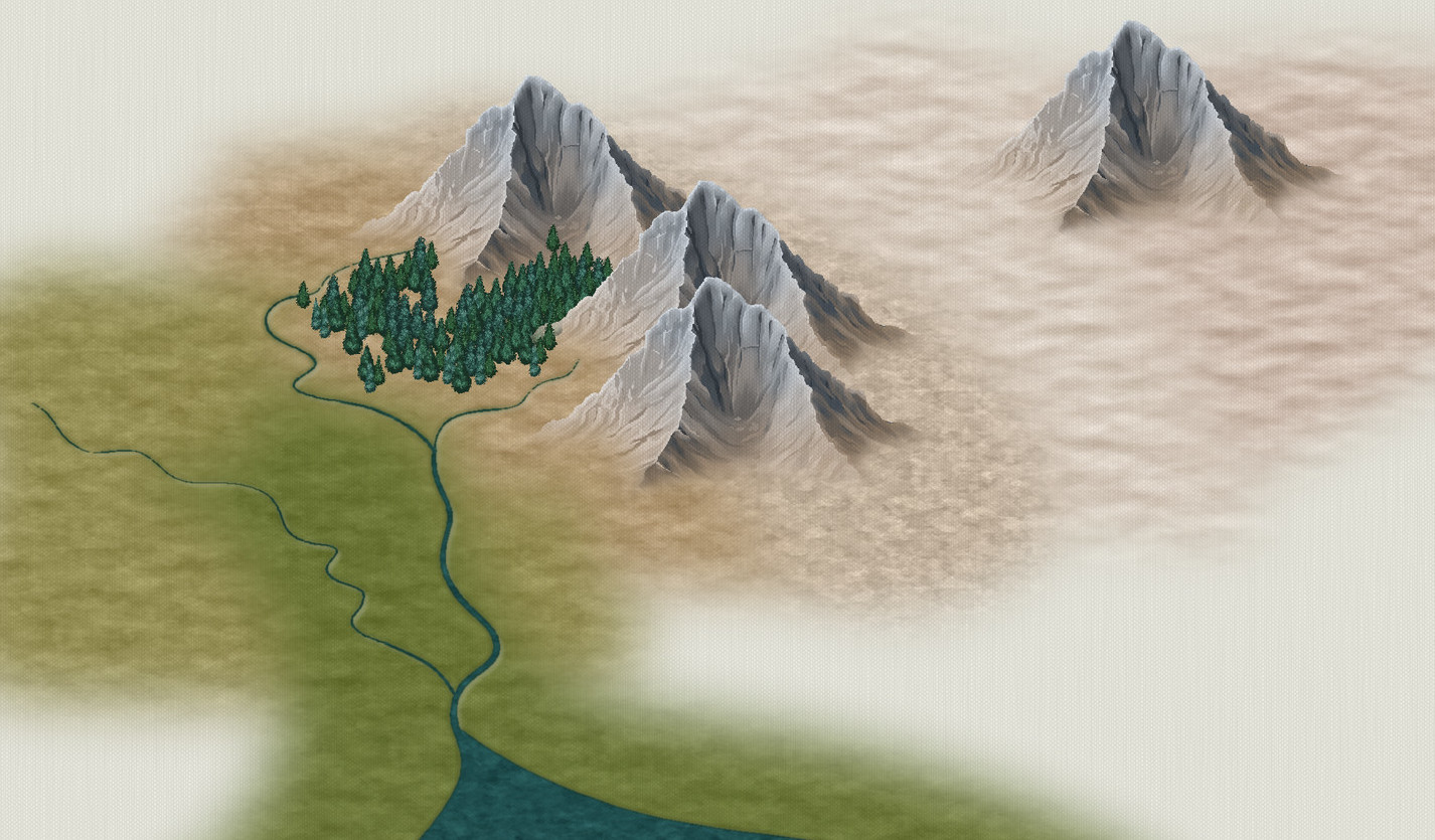
I'm officially working on the March issue of the 2022 Cartographer's Annual issue, called Winter Village, but while its the Holiday season I took a short break to work on another idea I had some time back, and started to play with making a style that mimicked the effect of painting a map on canvas in oils.
I haven't got that far yet, and it will take a lot of time to finish anything like a mapping style, but I have sorted out a basic colour scheme.
Please say what you like about it, since I am still at the stage where I can change the textures before I work on the matching symbols.
Tagged:





Comments
I like it.
Thank you, Jim :)
You're welcome. Of course, waiting for more symbols.
I like it also. It gives the map a sense of depth. One thing you might consider is having two sets of symbols. The ones you used for the test image look great and work well with it but I know you want to show the texture in the symbols but please consider a textured and untextured set of symbols
I just had a map printed on canvas.
In terms of the image provided, I like the rivers. They seem to have a sunk into the map style that I like. The coast doesn't seem as dramatic as an effect though. I would prefer a little more.
The more/darker the color there is, the less the texture shows up. That mimics the print I have. The texture on the far right near the mountain (desert maybe?) I think is a bit too light. Too much of the canvas texture is showing through for my taste.
The mountain texture to the right of the three moutnains looks good in terms of the color. I am not so sure about the pattern. It looks a little too splotchy.
The darker brown to the left of the mountains looks good as well as the trees.
You're one of bigger reasons I always sign up for the next annual as soon as it's available.
@akbdeck @JulianDracos Thanks - that's really helpful. I hadn't thought of doing two versions with and without canvas, but I can see that it would be good to arrange everything so that the overall canvas texture can simply be switched off - an overlay set over the entire map and blended onto it, rather than built into the symbols and fills. I think I agree about that Desert light texture being a bit too pale ;)
@taustinoc Thank you! :)
I seem to vaguely recall we may have had this conversation previously, but the mountains look a little insubstantial right now, as if many of the arête limbs are only paper thin. I appreciate that wasn't necessarily what you were asking about right now, but it is what first occurred to me!
Zooming-in to the enlarged image, I agree with the notes made earlier, where it looks as if the canvas effect is more pronounced on the paler colours, and not at all (as far as I can tell) on the water. Oddly though, the effect is quite obvious on the tree symbols, which is a curiosity, given they're the darkest objects on the whole map. That could suggest it may be more an issue with the texture on some of the bitmap fills which is causing the canvas effect to disappear, rather than simply the darkness of the hues.
I'd agree that it would be useful to have the canvas effect as an option, rather than a fixed default.
Just to be contrary (well, not JUST...) I rather like the pale desert, but then I can see that would be interesting to use as a cloudscape texture (especially the way the mountain peak seems to be coming up through it), which I suspect may not be everyone's first choice as a setting.
☁️🏰☁️
Thank you, Wyvern :)
Yes, we've had that conversation before, and I will try to do something about it. I think the real problem is that I live in a lowland area several hundred miles from anything remotely mountainous and have to rely on reference material that is normally of only the most spectacular mountains, like those of the Andes - but I know exactly what you mean.
When I lift the canvas out of the fills and symbols and make it a full sheet of canvas texture across the whole map using a Blend Mode, we should be able to adjust the transparency to taste.
Clouds (if I do them) will look much more like clouds ;)
If we are talking about mountains, one thing I found I like are foothills. I found them sorely missing from the Darklands style. I find them more useful than just round hills.
Maybe I have the wrong idea about foothills.
What do you see when you think of foothills?
Foothills are not well defined geologically (pretty much every mountain range has its own kind of foothills), but a lot of folks seem to have developed the mental model of something like the Alabama Hills in California (brown lumpy things in front of soaring jagged mountains) due to the very large number of movies shot there early on. There is another contingent that holds out for rolling green hills and another for loose hills, but those folks clearly haven't seen enough old westerns.
Oil on canvas! Fantastic, obviously :)
"The map is not the territory" kind of has stuck with me and I tend to read a whole lot of terrain into the general area of where there is a mountain symbol - similar to how the ocean just doesn't go straight to plains (even if that's what maps tend to show us). And then, there's of course places like that location in New Zealand where they shot Edoras for The Two Towers - where the mountains go from 0 to 100 in no distance at all.
Ecotones are forever a menace :)
With foothills I see lower and perhaps slightly flatter than the usual suspects mountain proper symbols. The scope/scale of map in which foothills would be the "biggest" geological feature sort of barrs proper mountain symbols (as shown in the above example) from play simply on account of their peaky qualities.
Or not: as @jslayton points out, it isn't set in stone (puns!) and whether it's mountains or hills or foothills kind of depends on what you put next to it.
With regards to my first remark, distinguishing between mountains proper and the intermediary foothills in the same map, to me, suggests a level of landscape detail which closes in on the diorama/map as illustration of actual terrain.
Something that transitions between sharp rock and rounded hills. I have found the foothills in Herwin Wielink to be very useful.
You mean squashed mountains and slightly pointy hills? That's the general image I extracted from Han's comment above yours, anyway.
@jslayton I think I possibly don't draw enough of the mountain and cut it off half way down. I've seen plenty of westerns. I think the problem is that it was far too many years ago! LOL!
@Lillhans Quite possibly what is required is a graduated set of lumpy bits that go all the way from molehill to Everest with everything in between.
...essentially cancel all plans and do a 500 symbols mountain catalogue, yes.
Rounded Hills - These are the types of hills that you would call rolling hills. These are what I often see in the hill styles used in CC3
Foothills - These are a cross between a hill and a mountain. They have many of the rock characteristics of the mountain, but not all. They are shorter and flatter.
The Herwin Wielink style is nice with its foothills. This allows you to build out from the mountain base so it does not look like an abrupt switch from flat land to towering rock cliffs of the mountains. In many styles, just making small mountains still does not look right.
I would think of them as rocky hills if I were to draw them. These have low ridges that increase in size as you get closer to the mountain.
https://utahvalley360.com/wp-content/uploads/2013/03/11b.jpg
Thank you :)
I will try to remember that when I do the hills and mountains. There's only one at the moment.
Greets, fellow Artists
Lookin good, Sue.
I do notice you have achieved an effect my old art Prof. disliked: areas of scrubbed-in paint. 'Dead Paint' he used to call it, where too much of the canvas texture shows thru. It would mean not enough paint on the brush and you just 'scrubbed it in'. Not to say 'thin paint' areas, as that was 'ok'. Clouds and the lighter desert areas. But we'd be able to edit that, eh?
As for 'foothills', I may not be able to truly define the term for mapping, but I know what they are as I grew up in the foothills of the Appalachian Mountains---or spent the better part of my younger life in them. I guess I'd call them: low, rounded hills that slowly flow into actual mountains. You can start climbing one, driving along until finally, you find yourself on a true mountain a good distance away.
So I tend to favor the Fenlon style for foothills. And, thus:
Appalachian Foothills Photograph by Barbara Bowen (fineartamerica.com)
Thanks Calibre :)
It depends what style you adopt as to whether the canvas is visible, and a great deal also on the personal taste of your tutors. For instance, I was most commonly criticised for overpainting, or using too much paint, and for painting pure fantasy instead of reality (LOL!). My sketchbook was full of dragons and other imaginary things, and because I didn't paint just like the currently famous painters of the time (who's work was mostly abstract) I was told I would never be a pro. The only thing they really liked about my work was my use of colours.
It should be possible to place the canvas texture on a sheet that is either below or above the symbols so that you can have the background canvas textured, and the symbols more 'painty'.
Foothills are actually quite difficult. To get a true range of everything possible you would have to spend a year building a set of many hundreds of different kinds of foothill, so in most styles the mountains and foothills tend to be more symbolic than accurate. I will see what I can do with this style without overloading it or taking a couple of years to finish it.
Thanks indeed!
😁
Cal
Its a great start, Sue and your techniques keep improving. The cloud cover in the mountains reminds me of a photograph of the Alps or Andes where the clouds looked more like glaciers with the peaks sticking out.
I lack the artistic acumen to offer any other comment. I was once chastised in a class of about 500 when the professor called me out and asked my opinion of a painting and said, "Nice, picture. Looks good." It and first quarter calculus were the only D's I got in college.
My literary critiques were similar. "Rollicking good story, Ma'am."
Thanks Mike :)