issue exporting
 Ricko
🖼️ 107 images Mapmaker
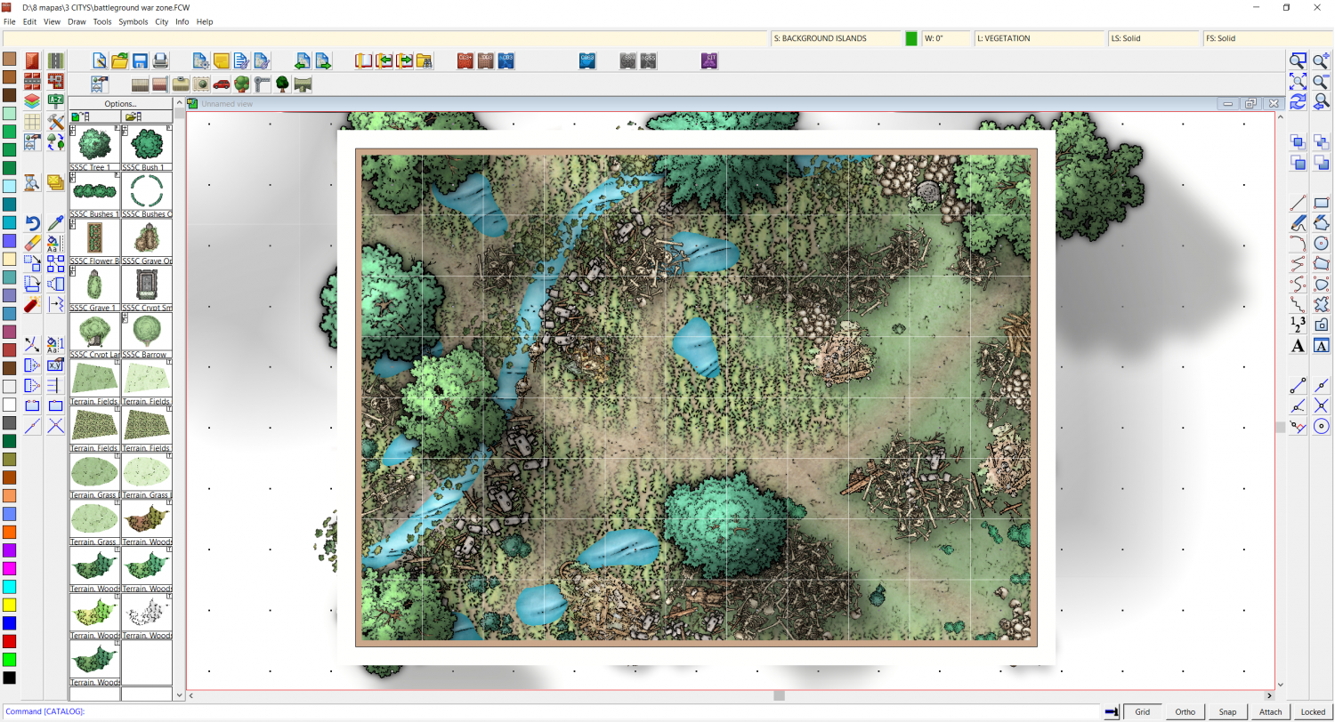
When program is on and sheet effects on, problem dont appear
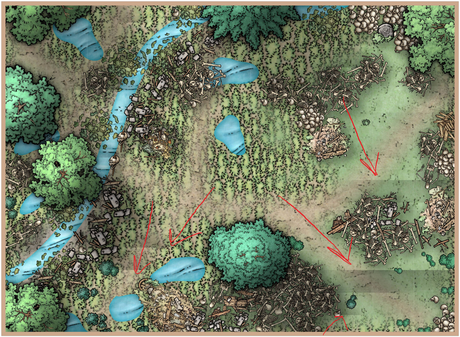
but when i export - using config @Loopysue gimme on lasts post, appear those lines and cant know where they come.
Thanks


Comments
That might be the maximum pixels per pass setting, which can miscalculate very large glows or edge fades if the pass is too small to capture all the information and cause these rather strange horizontal stripes.
Type EXPORTSETMPPP and hit enter, then check the number in the command line. The default value is 4 million. Type 40 million without commas or gaps and hit enter, then try the export again.
problem solved on my old battlefield...
I dont think use this resource to solve the problem - as master Ralf indicates on my last problem with the Font - cause i never touched in those kinds of configuration.
to let you know, when i export in this way you and ralf indicates me... the export was a little bit more faster... before i wait 15/15 steps to save the image in JPG, after i press EXPORTSETMPPP and then 40000000 was only 2 steps and faster to save same image.
why this difference?
thank you os much <3
The difference is because the command increases the number of pixels that will be handled in each pass. This means that a bigger chunk of your map is processed in each pass, and therefore requiring fewer passes overall.
No problem, Ricko :)
Though the result is much better this time I can still see a very faint glitch across the middle of that map, so you might want to either reduce the size of the glow or shadow, or export at a slightly smaller size, because I'm not sure it is wise to go much higher than 40 million. (Maybe @Monsen would know?)
The relatively low default setting is so that people with less powerful computers can export without issue.
i made this map on A4 Battle map size 55 x 40.
What size is the export in pixel dimensions?
@Loopysue I think that "glitch" you're talking about is the grid. I got hung up on that myself, until I zoomed in and had a closer look.
Now I look at it again I think you are right.
Sorry Ricko.
Better if I upload the cc3 filé?
If you wish.
I think the grid might need a very small line width applied to it, and an adjustment to the glow, but these are really tiny details. The map is lovely :)
more thick line you mean?
its tricky the grid. When exported the grid dont show as it look on open program. normally to me is always weaker the on program.
That's what I meant - yes. I think most of the grid is disappearing in the export where the lines are only one pixel wide, leaving only that one line visible where I thought there was a glitch in the render.
In the attached map I have adjusted the grid for you (using Change Properties) to give it a line width of 0.02, and played a little with the glow on that sheet for you. You may need to change it again to suit your style - what I did is just a demonstration of what I was talking about earlier.
Were you aware that you have all the relatively low and flat symbols like the skeletons on the SYMBOLS sheet, and that this sheet is casting disproportionately long shadows over the ground area? I see you have the trees on a SYMBOLS HIGH sheet, so there wouldn't be too much harm in reducing the size of the shadow on the SYMBOLS sheet for this map if you want to reduce those long shadows just a bit.
i tryed to force the shadows to give more dark aspect on things on the forest. to try show a very closed space with few sunlight
You could try making the tree shadows darker?
The skeletons don't really need long shadows, though, because they are very nearly flat.
Something I noticed on maps I have been working on, the effect on the grid is transparency. I turn that off by unchecked it, and the grid reappears.
Currently on my cell phone.