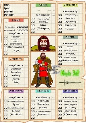
Character sheet
 Joachim de Ravenbel
Surveyor
Hi folks,
I had that character sheet to design for the RPG I run with my kids. After struggling with CorelDraw and OpenOffice I thought of using CC3 to do it.
CC3 gives you so much control over items and text placement that it took more time to draw the character picture (with Heromachine 3, great tool too) than designing the character sheet. It sure took less time than doing it with OO and no more time than with Corel. After adding some effects, I was quite bluffed by the result.

So what do you think? How could I further improve it? I know the words are in french but I hope that won't prevent comments
If someone wants to look at the sheets order and/or effects, I've attached the FCW below though you might experience troubles with fonts and/or bitmap fill... I hope I do nothing wrong because the only symbol used is in the DD3 catalog that comes as a teaser with CC3...
I had that character sheet to design for the RPG I run with my kids. After struggling with CorelDraw and OpenOffice I thought of using CC3 to do it.
CC3 gives you so much control over items and text placement that it took more time to draw the character picture (with Heromachine 3, great tool too) than designing the character sheet. It sure took less time than doing it with OO and no more time than with Corel. After adding some effects, I was quite bluffed by the result.

So what do you think? How could I further improve it? I know the words are in french but I hope that won't prevent comments
If someone wants to look at the sheets order and/or effects, I've attached the FCW below though you might experience troubles with fonts and/or bitmap fill... I hope I do nothing wrong because the only symbol used is in the DD3 catalog that comes as a teaser with CC3...


Comments
I use Nuance, but have not tried the form utilities yet. Info here if you are interested: http://www.nuance.com/imaging/pdfconverter/pdfconverter-professional.asp
I like the layout, but the tiny headings above the tick-boxes look very small to me. Because it's a language I don't understand very well, I couldn't work out if I'd be able to read it if it were English, but I suspect that it's something you can easily make remember. I'd still make it bigger, though.
I'm a fan of leaving stuff blank and putting it in in pencil, but if the Corps box and the Blessages area are going to be used a lot, I might try printing out smaller areas that can just be clipped on to keep track by session, so the sheet doesn't suffer by rubbing.
What game are you playing with you kids? Is it a homebrew system or something commercially available?
The game is homebrewed. For some reason, I cannot manage to adopt "official" rules even in my more serious games.
It's however a parchwork of various plundered rules and based on d20 which in fact is not that different from Black Eye (Das Schwarze Auge), my first RPG ever... Through the ages I went through MERP/Rolemaster, Chaosium, DnD, Amber Diceless, StarWars d6, Pendragon, Earthdawn... never staying long with a commercial system, always keeping cool stuff.
At the moment I'm designing spell cards, something I'm doing for some time but now with CC3 too!