The beauty of (fake) Colli Euganei. A new WIP.
 AleD
🖼️ 11 images Surveyor
One of my dream as GM is to set up an adventure in the place where I met most of my RPG playing friends, the city of Padova, where I went to uni... For that, I was hoping to play the RuneQuest system, for which there is an expansion dedicated to the Italian medieval time -aroun 1200- when Federico II (Federico Ruggero von Hohenstaufen), the "Stupor Mundi", ruled in Italy.
So I was thinking to set the adventure around Padova city, making the characters to meet the evil Ezzelino III da Romano, the wise mage Michael Scot and maybe Francesco d'Assisi, all real personalities that were around at that time.
A place to visit vould be the Euganean Hills, the hilly area south of Padova were nice mediaval villages, castels, wine and food are still present.
So, I decided to produce a map, with a lot of inspiration from the reality:
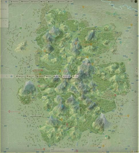
My idea is not to keep is realistic: the small hills will be replaced with mountains... As a medieval illustrator may have done (or not? 🤔🤷♂️). Many more trees and extremely less streets will be around.
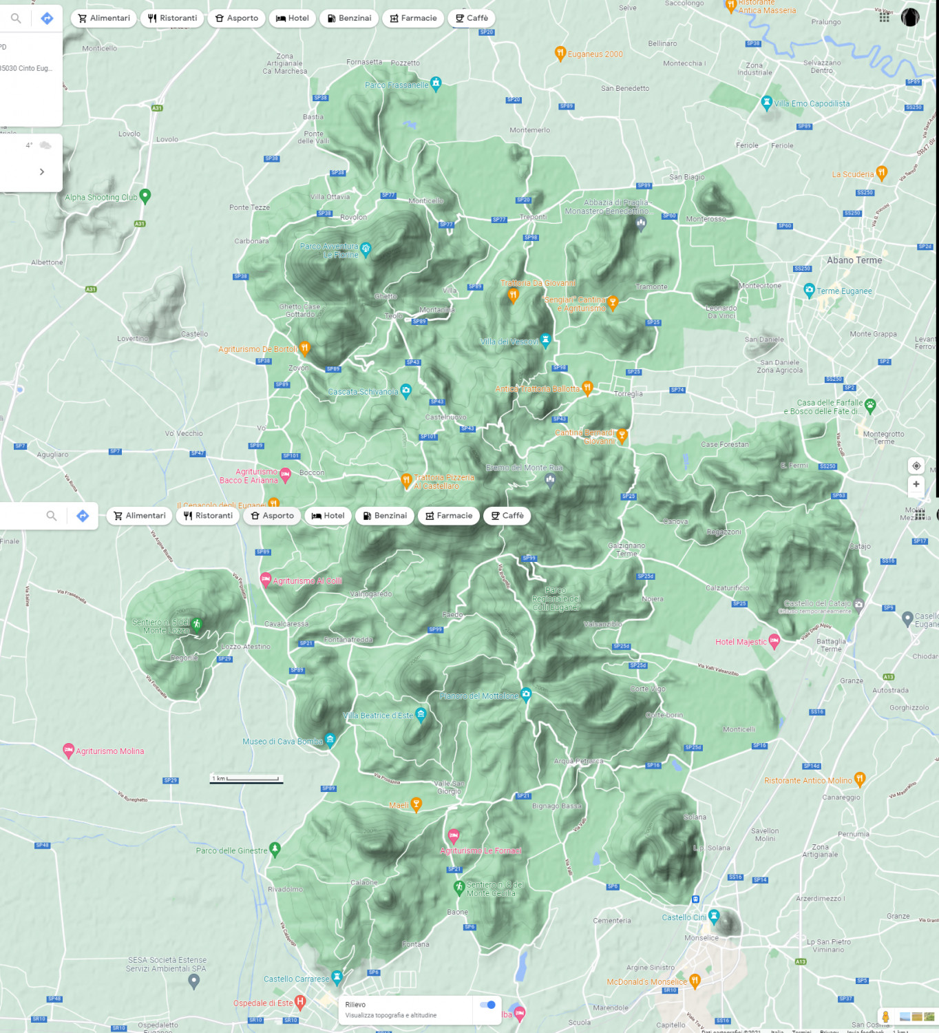
So, first step is to use the map from google as a background picture to decide where to put most of the stuff (main hills, cities, main streets, and so on)
So far i just added mountains and forest. This style looks really good to me for these kind of small scale maps (this is 18x20 Km):





Comments
I started to add some cities/villages and roads... I also changed the size: some extra place for map's name and cartouches ;)
Still a lot to do but I like how it is coming together!
A very beautiful map!
Cal
Thanks @Calibre :D!
I managed to populate a bit the map with fields and to sort the symbols
Still a lot to do :)
I slowly slowly added some details to this map. I think I am done with the farmland, the streets, and the cities/structures.
I feel like the map is somehow unbalanced. Maybe too full in the center and too empty on the borders. Hopefully the places nalmes will solve this. How would you do that? I was planning to use the wonderful banners done by @Loopysue but plain text may merge better in this case. Suggestions?
Maybe, the compass rose may fill the void in the top left...
Also... It is really green! 😅
PS: "symbols along" is my new beloved discovery!
Some of the expanses of farmland look like scaled skin - civilisation built on the back of a dragon, perhaps? 😉🐉
You could perhaps fade-out the outer edges of the whole, maybe using an overlay sheet with a large Edge Fade Inner Effect, to get away from the "edge of the world" look of too much in the map's centre compared to the periphery.
Text in banners might be too elaborate for this map; probably worth trying just text at first (you can always add banners later if that still seems needed).
Thanks, @Wyvern!
Both are suuper good suggestions! I'll give a try and post here the result.
They may indeed be farming on the belly of a dragon: all the area is known for warm water springs!😄
The map is almost done.
The next steps will be fixing small symbols misplacements and color schemes.
Wow. I really enjoyed getting to watch the evolution of this map. I think it looks great.
inspiring work! thank you!🎨
Thanks, @Ricko Hasche !