WIP: Fire Fields
Hi all,
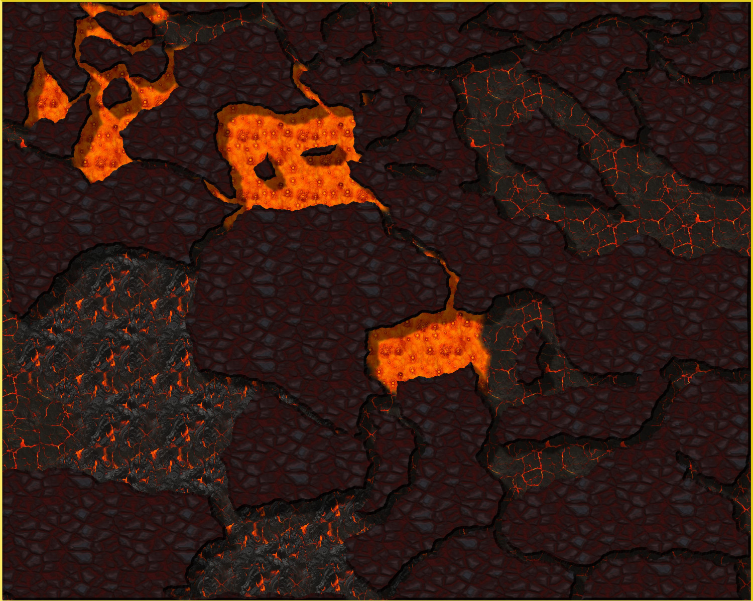
Long time lurker, first time poster. This is an attempt at a volcanic area where players will be hunting fire elementals. I'm going for raised flat areas of basalt/volcanic rock rising from lower, hotter areas with varying levels of "molten-ness."
Question: Shadows are being cast on the lava portions and logically the lava should be emitting light and casting an orangish glow on the rock above it. Is there a way to do this but still have wall shadows falling upon the other parts of the map?






Comments
I suggest you play around with the edge fade or outer glow effects to try to do what you want. You can have multiple effects per sheet and the order they are in affects how things look so you might have to play around with that as well.
Looks good enough as it is, but JulianDracos is right - play with glows. Coloured shadows can also have interesting results.
Find attached an alternative way to get that lava glowing:
The Dark Cover sheet (added) works on the premise of using Colour Key to make cutouts where the light source is. The resulting edges will get the full Blur + Edge Fade, Inner treatment. This is also why a default square polygon tool was used - so as to not have those effects bleeding into the picture across the map border.
The (also) added Lava Light sheet is operating simply on Blur and Transparency - and you can see how these shapes roughly cover the same area as the underlying lava floor texture and Dark Cover cutouts. Other than taking control over how the lava "feels" this essentially is the coloured shading as suggested by @Loopysue above.
Using the same floor sheet for both liquid and solid lava, rather than involving a wall sheet, seems to have done away with undesired wall shades as well.
If shades are still desired to differentiate between different levels it's just a matter of adding more floor sheets and stack them in the desired order.
Wow, thanks all. Lillhans, I'm going to study this and find tutorials on color key as well; since I've never used that effect. Baby steps and all that.
I'm going to study this and find tutorials on color key as well
@Rob_Wordsmith actually, Color Key is very simple: When the color matches the one specified, that area is "cut away".
And that's pretty much how it works. The rest is just figuring out how it interacts with other effects (ie: stuff like "Glow" will be calculated differently, since these "cut outs" introduce new edges).
@roflo1 has it: in addition, it's worth to note that the object of the trigger colour (here seen; the default) only affects what's further in the back. So in the below example, I did a beige square, over which came the trigger colour square, and finally a grey square.
I find that - when combined with fading effects such as Blur or Edge Fade, Inner or Transparency - there is a tendency for Colour Key to incur artifacts if it isn't sat at the very top of the sheet effect list.