Map of a real region
 AleD
🖼️ 11 images Surveyor
Hi everyone!
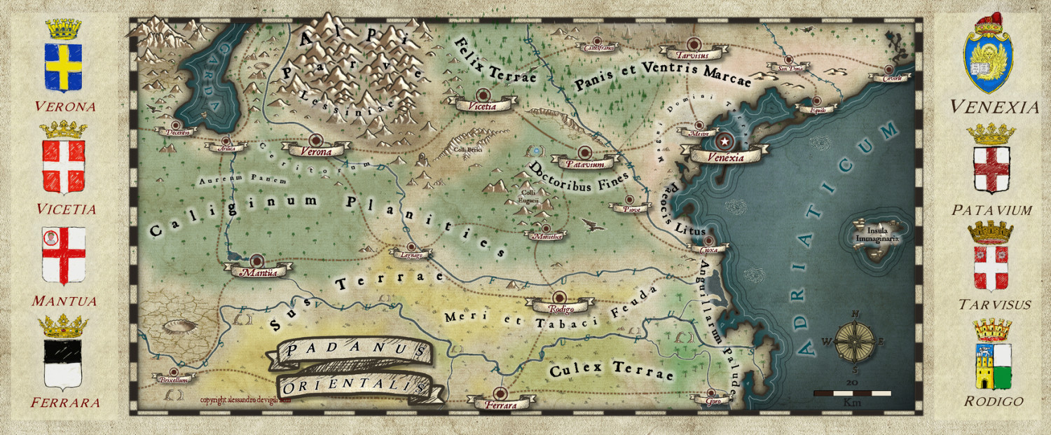
I'm almost done with a regional map of my region, redrawn from a google maps screenshot, with Erdan Worlds. Names of cities are quite accurate while names of areas are sort of funny names... Both in a macaronic latin.
Have a look and criticize it. I'll be happy to get as many suggestions as you like ;).
I also have a question: I drawn the heralsds copying the originals. I didn't manage to find a good way to proper integrate them in the map... I tried with RGB matrix, transparency, glows... But not a great result so far.
I guess that a proper RGP transformation that turns everything in to something paler and yellowish may work... but i didn't manage to et it.
Suggestions?
Tagged:





Comments
I love the map, but I'm a bit confused about the issue you describe with the symbols you made.
If they are bitmap symbols, and if it is that they don't look like they are draw on the paper background you could try importing the paper background into whatever app you are using to create the symbols, and multiplying it over the symbol at an appropriate opacity. That should imprint each symbol with the same kind of texture as the rest of the map.
Thanks @Loopysue !
That is a good suggestion. I'll try to work directly on the symbols -before importing them- rather than in CC3+. I may also try to add texture to the symbols within CC3 and see what happens ;)
You can experiment with sheet effects in CC3, but as a general rule not many of the them work on symbols.
Yes, yes, I know. But you can remove the limitation with the specific command (with DELAYDRAWSYM set to 0).
I'll try to add a texture effect to the symbols through CC3+ first. The software is so powerful!
I'm not sure if that setting will 'stick' between different sessions, even on the same map. I don't use it that often myself because it can cause other things to happen that were the historical reason the symbols were drawn twice in the first place. That's what normally happens when DELAYDRAWSYM is set to the default 1 - the symbols are drawn twice.
Hey all, kinda busy this summer... I love the map! If you ask me, i´d go with a bit more of transparency on green textures, but apart from that, it looks really nice :)
If you want to change a bit the entire image, play with Matrix sheet effect (or do it on an image editor like Gimp or PS if you prefer so).
Thanks @Medio !
That is a good idea I will try out when the map will be completed.
@Loopysue I think you are right, the setting should disappear on each restart of CC3+... 😅
I worked a bit more on the map, basically changing the heralds png files and trying to add a frame for them in the map.
For the heralds I added a couple of layers on the original files with the style background texture and a mix of darkening and lighting effects. They don't look bad when in the original size. The "paper" effect get a bit lost in the map. I think this is due to the different size of the texture in the map and in the symbol. Something I may work on in the future.
The frame for the heralds don't satisfy me to much. Do you have suggestions on how to make something that could look more drawn?
It's coming on really well, though I think you may have misunderstood me when I suggested the paper texture in the symbols. The idea was to multiply the texture over the top of the entire symbol so that the paper texture is effectively mixed with the colours of the symbol rather than just a background, so that in the editor you are using to create your symbols you get this:
For the frames, maybe just a simple line at zero width around each one, and a blend mode that is set to overlay with opacity reduced to such an extent as to make them nearly invisible. Be careful, also to leave at least a small space all the way around the inside of each frame so that the text doesn't touch the sides. Probably better to reduce the size of the text a bit so the symbols don't start to look small and lost.
@Loopysue super thanks! Super useful tips!
I'll try to redraw the frames (maybe with the hand drawing tool and the drawing tablet?) as you suggested.
For the heralds themselves, I did not explain me well. I added the texture on two top layers (with a simple clipping mask to have it just above the drawing) but not with the multiply mode. In the first I used a "darken" mode (which it appears to have a strong effect on the light colors), and on the other one a "pin light" mode (which has a stronger effect on darker colours). BUT, I didn't consider the multiply mode, which may be a better solution in this case. I'll play around with it 😄.
I was thinking about adding also the heralds of the small cities (smaller than those of the main cities, and set in 2 lines, above and below the map) but drawing all of them may take quite some time. So, maybe, using the original png files (from wikipedia) and just adding the texture may result in something good enough.
You're welcome :)
Remember that what I think is right is only what I think is right, and not necessecarily right for everyone. This is just my own method for imposing a texture over a whole drawing (or in this case symbol)
A simple hollow rectangle shape might suffice as frames, but you could hand draw them... I'm talking about drawing them in CC3, not as part of the symbol... with the freehand tool instead if you are looking for a more rustic feel.
I think you've got the general idea for the smaller symbols.
I think I finished refining the map.
After quite some effort I decided to keep the frames very simple.
I quickly edit the map with a bit of contrast and some sharpened effect as last touch.