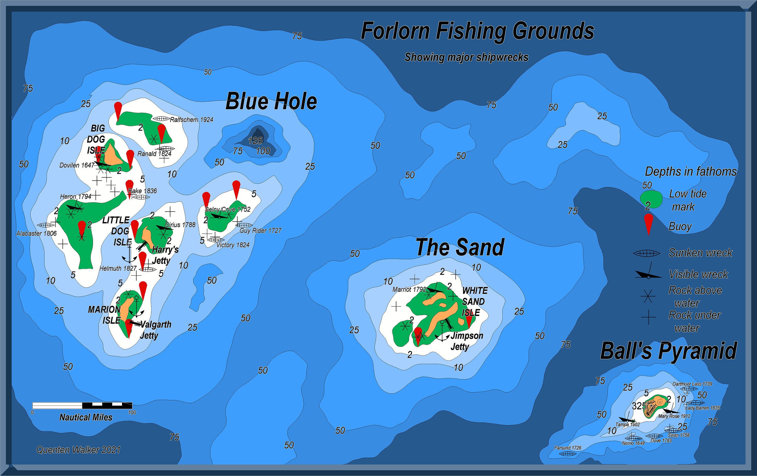
Community Atlas - Forlorn Archipelago - Marine map
I have wanted to do a marine map for the Atlas for some time - what better site than the Forlorn Archipelago where Jim had kindly indicated some 'fishing grounds' terrain.
I will also use this as an 'environs' map for a map of an area around The Sands when the underwater annual comes out.


Comments
Definately. I mention fishing grounds on my maps, as how are people who don't farm going to eat ? Or, the soil is rocky, etc.
You might want to add a box and maybe a background to the map key here, and move or delete that "50" fathom depth label currently in the key. It looks a little odd to have the green low tide line marker set between the 75 and 50 fathom contours presently, for instance. Might be worth adding a land indicator to the key as well? And perhaps a compass pointer.
Good points all. Thanks
My revised version. Thanks to Wyvern for his critique - it has led to a better map.
Interested in the fact you've also used the contours in a different way to how they're usually presented, where the standard system runs: land - green tidal - darkest blue - lighter blues - white, with as many other white contours as may be needed for still deeper areas after that (as described in the Marine Maps PDF mapping guide, for instance).
This isn't a criticism, as I found exactly the same issue when constructing one of my Errynor maps for the Community Atlas last year using this style (we'll get to that going into the Atlas in a few weeks' time, all being well). It felt counter-intuitive to start with dark contours and progress to lighter ones to me, but as I was dealing with the lightless ocean deeps, I have to say I felt no qualms about simply swapping things around, though I decided against using the green contours, and no land (as none of it breached the surface where I was mapping).
I think my favourite discovery was playing around with what could be done with the contour labels in this style, as they'll take text as well as numerals, which meant I was able to label my map using both feet and metres for the contours without needing a key for it.
I've always used light ocean bitmap fills for shallow, as they are lighted by the sun.
Deeper the depth, darker due to lack of sunlight. So I use darker bitmap fills.
I agree with both of you - which is why I reversed them (of course, living in the Southern hemisphere, everything is reversed here)
Landlubber heresy!!! 😋
Of-course deep water is white and the shallows are dark... We should stay clear of the shallows and keep to the high seas.
The land is light coloured, Yellow or White, not as interesting apart from navigational points. This also gives us high contrast between Land and sea.
I am proud to be a landlubber heretic.
Now in the atlas: