Advice sought...
 Calibre
🖼️ 39 images Mapmaker
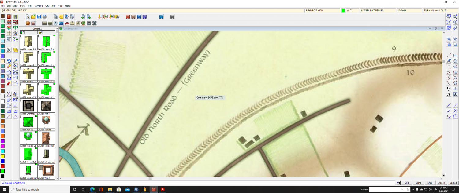
for how to render entities in this screenshot into CC3+, please
?
Ok, entities 10 which is a very high Hedge
and entities 9 which is a dike or ditch.
I realize there are symbols for these already, but they stand out too starkly. Should I attempt to make my own symbols? I get lost in the instructions on this process. Or, should I just draw spline's and texturize? Or what.
I know there are very experienced CC3+ users on here. Please lend me your advice. Also, I suppose the same technique you guys share would work for those small hedges and fields on this map. Please lend me your expertise ?
thanks
Cal


Comments
Are you trying to preserve the hand-drawn look exactly? By which I mean, like on the ditch, features like how the opacity would fade from right to left, and slightly consistent trends in spacing and size? (Right to Left, gradually gets smaller and closer and the "c" loses its curve and then the curve comes back in)
If not, do you still want some variation? or all consistent?
Not necessarily trying to preserve the 'painterly' look. Some variation would look cool I think!
?
thanks
Cal
You could do the hedge with an ordinary line on a sheet with a Distort effect followed by a Blend mode. Use a dirty brown colour for the line and set the Blend mode to Multiply at about 20%.
You could also put the ditch symbols on the same sheet, but they would need to be vector symbols in the same colour - a handful of them, maybe 4-5 of them. Just draw little polygon shapes by tracing what you see, then turn them head to top and make a symbol of each one. Create a catalogue of them and you will be able to use them with Symbols Along.
The image used in the Distort effect would have to be some kind of general noise, and the settings adjusted so that it jiggled the edges of the lines only just enough to break the unforgiving straightness of the vector line. There are several options already in the Filters\Images folder, Or you could make your own by creating a small patch of noise in GIMP.
Well, here's my hedge symbol, but...
As you can see, there are issues with shadows. I drew this in Paint 3D, then followed Remy's vid tutorial on creating symbols. I didn't anticipate that the end of the hedge would produce regular intervals of thicker hedges. I did deliberately 'cutoff' one side intending that edge to be a 'connector'.
Please advise: should I just draw another this time with tapered ends? Or?
@Loopysue Thanks indeed, but I don't see a distort in the list of effects. Displace maybe? Never worked with that.
thanks
Cal
Sorry. I meant Displace. I think Ralf covered it in his Sheet effects Live Mapping session, but it might be the one he missed out.
Not sure I understand what the problem really is with the hedge symbol.
I tried displace and it works well on the brownish shadows the original map has, so thanks indeed.
For the hedge, well, there are regular clumps of thicker hedge all along the line. I'm fighting madly with Symbols Along... argh. I fixed the shadows by simply increase blur size it and it looks good now heh. I really need an indepth vid on Symbols Along... I checked out JS's vid, but there was no indepth explanation. I seem to recall Remy doing one, but I can't find it :S
thanks
Cal
Could you show us a shot of the Symbols Along setup please, Calibre?