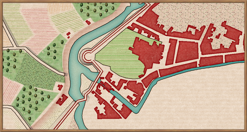
New project. Historical city detail: Padova. WIP
 AleD
🖼️ 11 images Surveyor
Hi everyone!
I started a new small project using the Ferrari's style. I will redraw some portions of old-ish maps (1600-1700) of the city I'm living in, Padova. I came up with this idea after seeing some maps cowering parts of the medieval walls and canals' borders while under restoration.
I really love this style (I should thank @Loopysue, right??), for which I am rescaling a bit the fills to fit better the small map's size. The style may look "easy" to use as the drawing tools are quite straightforward. But, because of that, I think it is really important to have a clear idea of what colour you want to put where. So I think it is a good style to train with on map's "color composition"... if you get what I mean.
There are still many things to do (as the fields borders, walls details, buildings internal gardens...) but I already like it. I am not sure where I will put the legend: bottom right seems a good place but I get intrigued by @daperdepa map composition with the legend on an external box on one side.
I may use it for a play with some RPG like Vampire, Lex Occultum, or maybe Vaesen.
If you wonder, the map shows the roman "Arena area" with the Scrovegni Chapel (where a famous Giotto painting is present) and the Augustinian "Eremitani" monastry, together with the surrounding canal's, parks and city.


Comments
Looks like a great start. Looking forward to how this will turn out. This style can really look nice.
Oh, what a lovely coincidence! I had the luck to spend part of my last year in high school living in Cadoneghe and attending a high school in Padova as part of a student exchange. The Cappella degli Scrovegni caused me a great impression, with the beautiful, stark colors of Giotto's frescos against that electric blue ceiling. It was my first experience with anything close to the Rennaissance.
Sorry, I could talk about Padova for hours, as my wife always reminds me. Let's talk shop. Thanks for the appreciation, @AleD, but I don't think my approach is the right one for you. My maps tend to be, well, messy, for lack of a better word: usually dark or heavy polychrome, lots of mixed sheets and layers, and tons of Edge fade, Transparency and Texture Overblend. This helps me correct my many deficiencies as an artist with symbol sets and added depth, but it also make very difficult to label the maps, so I thought about it and a separate, old paperish space where elegant writing in the fonts included with the software is clearly readable was a natural solution. It also adds a nice contrast to the intense visual of the map. I also have to add the small clear elipses to facilitate reading the number and letters on their position in the map. So, in summary, I'd only consider it using it as a first choice if your are going to use many different drawing tools. You could create an external box with a legend similar to the one Sue included in the last page of the annual's mapping guide, which is really good.
Now, I love @Loopysue's work in Ferrari's specially because it cleans up really nice, with beatiful, marked lines, and textures and shapes clearly distinguishable. I find labelling a map in this style much simpler, as you don't have to deal with too many colors or visually dense backgrounds. Googling around, I found several maps from Ferrari, the original artist, and Sue achieves a great result emulating the labelling in those in the Annual with simple, thin black letters, starkly visible against the clear background. You can probably get some inspiration as well from examining a few of them like the ones here. I hope this helps.
Your map looks very promising, I'll keep an eye on your updates.
Thanks @daperdepa for the suggestions! I'll think about it and then decide where the legend will go. I may also have a look at the original map and copy from there ?. (Here some examples: https://digilander.libero.it/clapad3/mappe/lista.html)
It's so cool that you visited Padova, @daperdepa!
Hi, dear friends.
I am writing again to ask for help.
I had some trouble with the Ferrari's style from the beginning, with the drawing menu making the software to slow down a lot. Now it is quite worst and impossible to use.
It is not dependent on the sheets effects, as it happens when effects are off. It does not depend on the map, as the same happens with other maps with the same style, when something is present on the map (I mean, if the map is empty it is ok). It shouldn't seem related to CC3+ in general, as other styles don't show the problem. I also noticed a progressive worsening with CC3+ crashing from time to time or, more often, to just "not responding". It is particularly bad when I open the advanced options, and if I do that I have to force the software to stop.
I repaired it (installing all the 2020 annuals, as I have only the installer of the complete collection) but the problem is still there. Also, I freshly installed CC3+ and addons very recently after changing the HD.
Does anyone have some suggestions?
Thanks a lot for the help
Hi AleD!
Please can you upload the FCW file so that we can work out if this is a map problem or an installation problem?
Thanks :)
Hi @Loopysue !
Of course! Below the FCW file.
In case that could have an effect, I created a some new drawing tools based on the originals.
Thanks a lot for the help!
Thank you.
I don't seem to be having any issues with the map itself. Unless Remy or one of the others can find something it is just possible that there is a problem with the app itself.
You mention attempting to reinstall and/or repair something in the thread above. Have you done that as the Administrator, and have you then also reinstalled the most recent CC3 update at the end of it all?
Works okay for me. I do have a new computer that is much faster than one I had last year at 3.6 GHz. My previous one was 1.6 GHz. Same memory at 8 gigs of ram. Win 10 takes about 1.5 gigabytes to operate just itself.
Hi Sue,
thanks for the reply.
I just reinstalled everything on a new hard drive about two weeks ago. I am currently using CC3+ v3.94. The "About CC3+.." also mention CAD version 6.20.0.
The issue comes when opening and scrolling the drawing tools menu, especially when showing the preview.
Thanks @JimP. It may be that the PC itself is a bit old. However, it is a i7-4700HQ with 2.40GHz and 8 GB RAM. It was not so bad when I get it (but it was years ago?).
I think you might have to contact Tech Support about it because I can't replicate it here on my machine.
The drawing tool display is slower than you might expect because several of the tools have more complicated display images sourced from a set of mini maps (other very tiny FCW files contained in the drawing tool folder) to help mappers see what they are about to draw, rather than the raw lines and polygons as they would appear without the native sheet effects. Normally, though, this just causes a blinking green screen in the background when scrolling the tools, and hasn't so far resulted in things vanishing the way they appear to have done for you. At least - not on my screen they haven't.
Thanks @Loopysue!
Sorry I couldn't be more help than that.
I hope you get it sorted out soon. It's a good looking map.
No worries @Loopysue!
Actually after another fresh install it works much better. I am not working much on it in the last days but it never crashed.
As mentioned I managed to go on a bit with the project adding some details here and there. But now I think I didn't use the best template: I found another map of, more or less, the same time with much clearer details. I may try to use it to fill the "holes" with proper content (which is in 90% of the cases just gardens ?).
Below how it is slowly progressing:
That desaturated, almost "dried blood" look for the built-up areas might have interesting possibilities for those wanting to map in the expanded Ravenloft setting recently published for D&D too...
Hi!
I Think I am done with the map. It is not super polished but I think it is ok.
It is, at least, quite faithful to the original (that is the reason of the super small text).
As always, suggestions and critiques are welcome. 😃
I think it's beautiful :)
The only suggestion I have is that the labels on the land should be a dark brown or black to make them easier to read, although I understand why they are blue if the original is like that.
Thanks Sue!
You are right they are really difficult to read. Actually the blue was a conscious choice of mine... I tried the black and it looks much better (Also, I cheated and did, at least some of them, bigger... I guess Mr. Voltolina will not complain 😜).
I may also add a scalebar and a compass...
Definitely better :)