Bone Hill and Environs
 Dak
🖼️ 37 images Surveyor
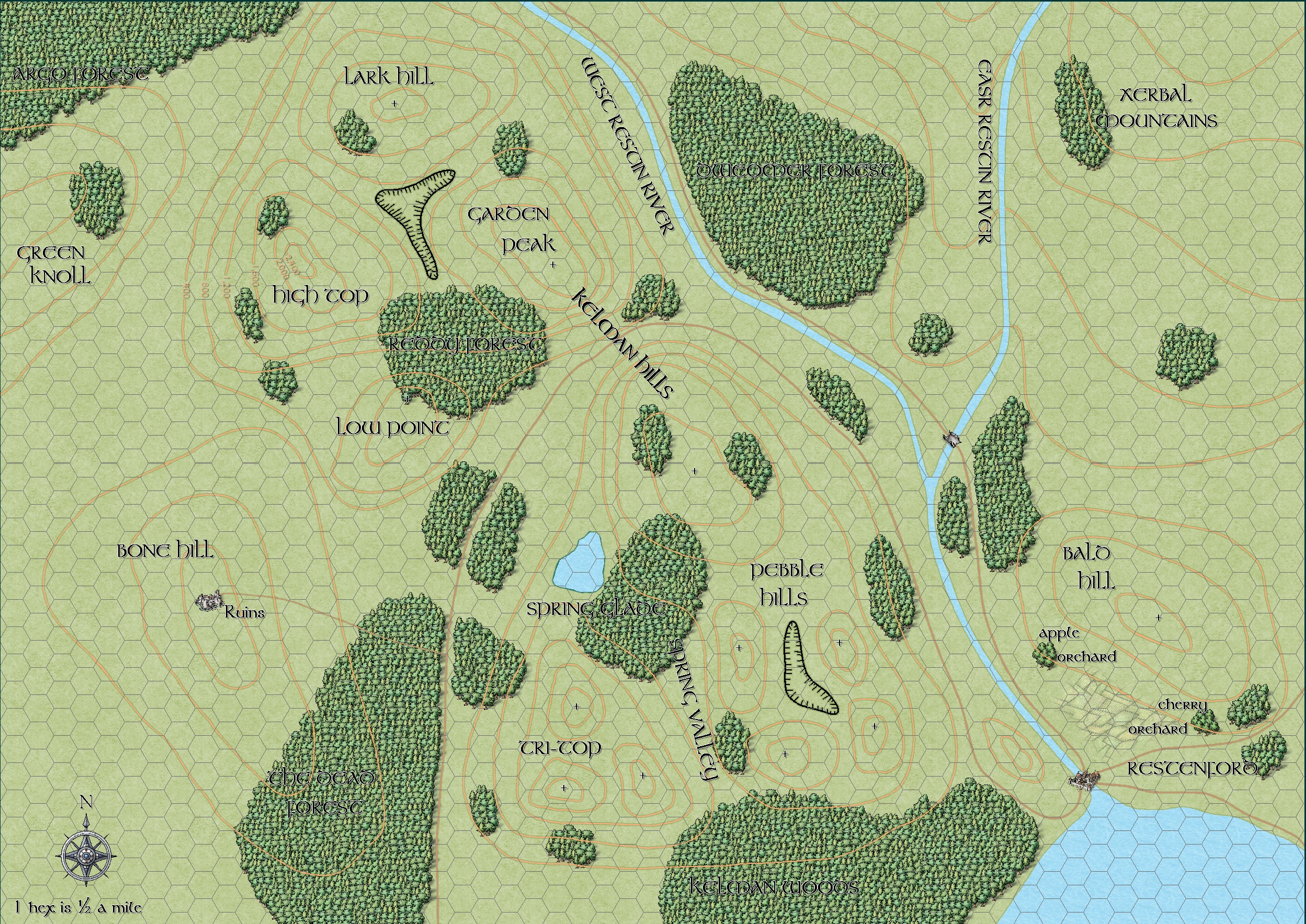
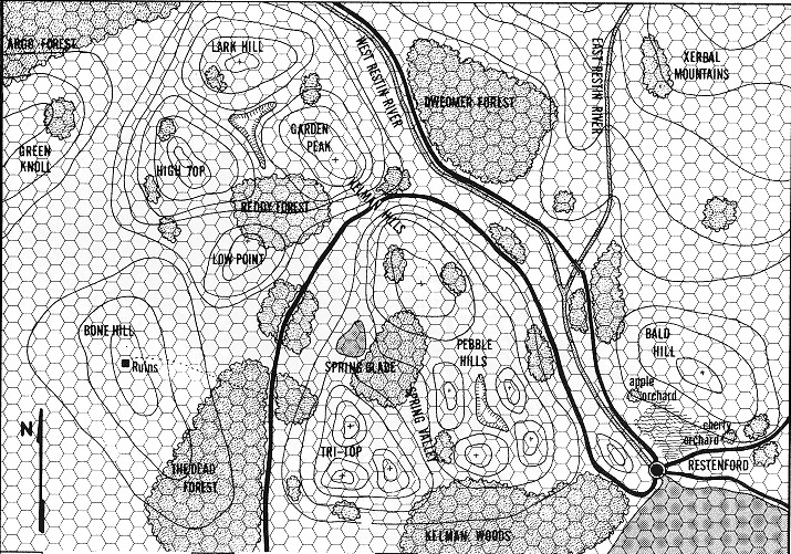
Here is my attempt at 'The Secret of Bone Hill' module maps from the L series of modules from 1981.
I was inspired by pkfrye's map in his gallery. I produced the wilderness map using Mike Schley's style. Originally it was going to look too much like pk's map, so I changed which tools I was using and tried to base it on an Ordnance Survey map style using the contour lines from the original map.
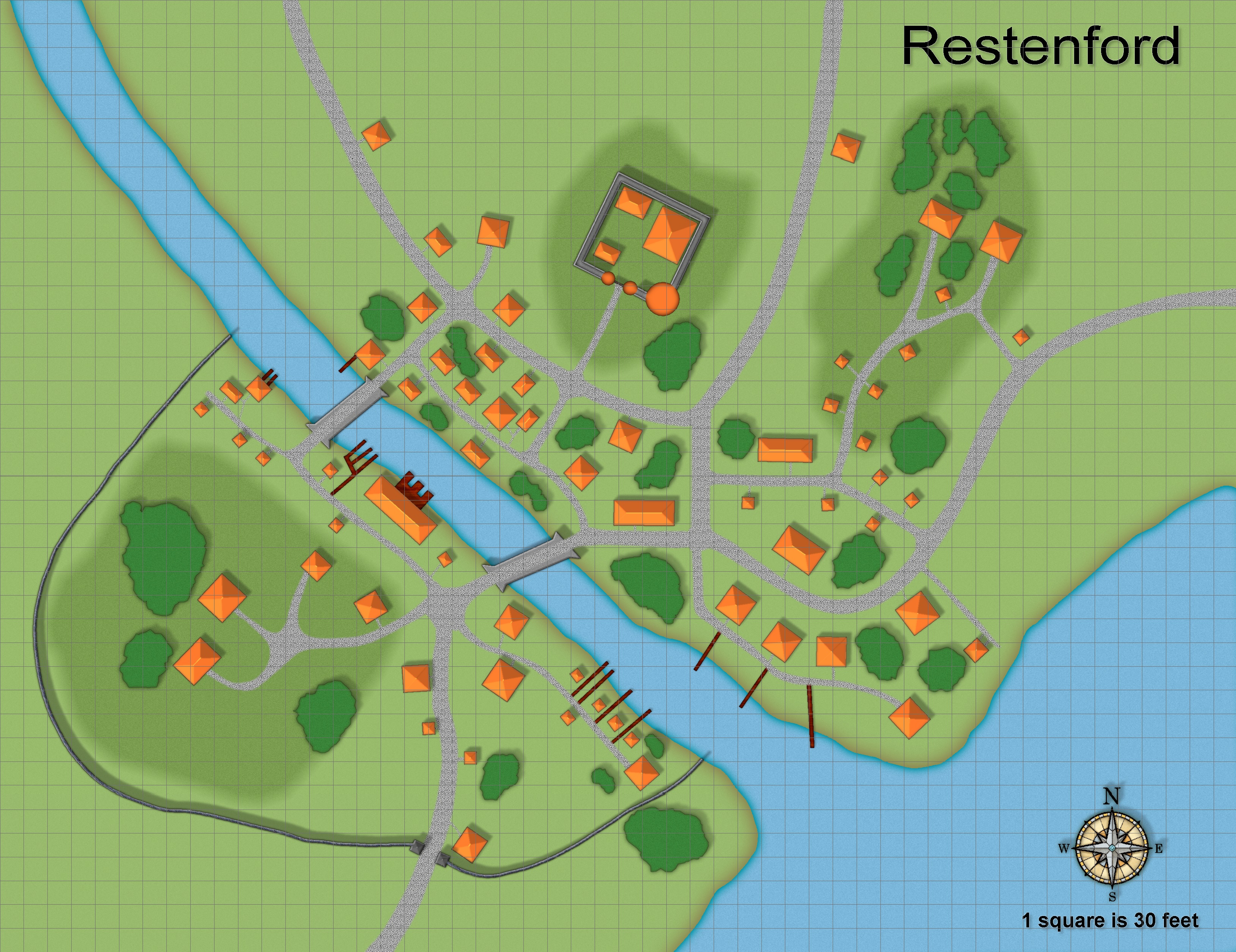
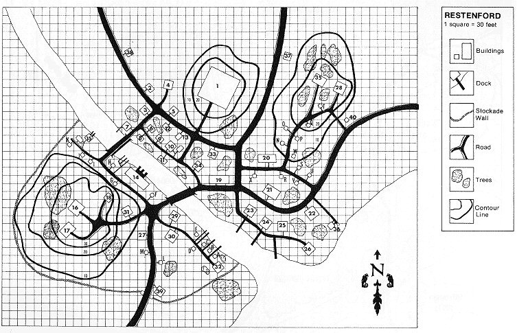
Restenford is the first city/town map I have finished. I have begun others but am struggling creating decent looking cities so I though if I trace a map it may help with my own creations. I used the default Bitmap A style for this.
Comments and critiques are most welcome.




Comments
I like them quite a bit! One thing I notice on the b&w overland map is that my eyes can sort of shift focus between the contours, or the map features like forests. I can't quite do that on the color map and so it feels on the verge of being overcrowded, but it's still good. One other thing I didn't really notice at first is that the road on the overland map is very similar to the contours, I didn't realize it was a road at first. I think changing the color would be easiest, but you could also go for dramatically changing line thickness like they have to do in the black and white versions.
The style on the city map is a very simple style so I think from the scaled back distance like shown here the roads look slightly out of place having the graininess of the cobblestone. It does look better zoomed in though if that's how it will be used. I'm not quite sure what exactly would help for the larger view of the city; maybe a blur effect or just a more general solid color? It'd be one of those things I play with for way to long trying to figure out ?
I have that module. My impression, as you can see from the b&w maps, shading is used to show terrain changes.
I made my own map for the TSR B2 module. I had to alter it so it looked good as a cc2pro map. You may have to do that for this map.
Thanks for the comments and advice. I have changed the scale of the roads/paths and doubled them (from 12½' to 25').
Looks better to me.
Nice looking maps!
Beyond what's been commented already, for the area map, I'd be inclined to either make the hill contours a little more prominent, or add different coloured polygons for the different height bands. They're looking a trifle "lost" presently.
Thanks for the area map comments. When I look at the map in CC3+ the contour lines look so much more vibrant (orange colour 152, I think), but when I print the map, they become dull and look very much like the road.
I'll try and correct this tomorrow, if I'm not absolutely shattered from digging the garden again.
You could use a sheet, say CONTOUR HEIGHT, and set bitmap to Solid white 30 (or whatever); then use polygons to fill in the area of each contour, with each overlapping contour being lighter than the one below (the Solid White fill stacks, so no need to change it from 30 to 40 etc)
I show an example below - before and after.
Hi Quenten, thanks so much for this. This is the effect I would like to use but wasn't sure how to achieve it. If I can figure out exactly what you've done I'll try to reproduce it on the map. Thanks.
Hi @Dak Great looking maps.
I feel the forests could be softened a touch. It's been awhile since I did an overland map in the MS style so I can't remember how the tools work exactly but I would do is; if the symbols are on a background fill, usually a shaded polygon, delete just the symbols, then select the polygons and use the "Symbols In Area" command playing around with the settings to get them looking a bit softer.
These look great. I love the fact that you are working elevations with this map. I would make the elevation lines a lighter color but brighter. Perhaps white or yellow. The tan color you are using blends in with the forests a bit to well.
@Dak I set my bitmap fill to Solid White 30. I then added a sheet called CONTOUR Shade (or something like that). Next I drew a solid curved polygon around the first contour; then the second etc. With each addition of the contour polygons, the polygons became lighter and lighter for each contour elevation (I always prefer light at top, dark for bottom.
If you want the overall bottom to be darker, then just alter the Adjust Hue sheet effect.
I hope that is clearer than mud.
Thanks for the comments everyone.
The forest symbols are individual trees and there is no background fill, I'd hate to delete them after it took so long to place them. Maybe if I put a fill behind them they may look better.
The contour lines are actually an orange colour. I have made this an even brighter orange colour but when I print the map they look as they do here. The map I made in CC3+ looks a lot brighter. Maybe I've done something to make them print duller but I don't know what that could be.
Thanks for the tips Quenten, when I have more time I'll try and recreate what you have done in the example you kindly sent to me.
Some years ago I had a course at university that was part of physical chemistry where we were shown via some videos and grafics, that orange is a shade of brown, and that our human brains decide if we see brown or orange, depending on the surrounding colors.
The forest symbols are individual trees and there is no background fill, I'd hate to delete them after it took so long to place them. Maybe if I put a fill behind them they may look better.
My apologies, they look as though they've been done with a forest drawing tool - so kudos to you for doing that! In that case completely disregard my comment for this map, however, do keep it in mind as something to try in future maps.
Thanks JM, I did start to use the tool you suggested but changed it to individual trees. I will try to use it on future maps to follow through your suggestion.
Theschabi - I saw a documentary on colours some years ago and it had the same info' in it; that the colours we see depend more on the colours around it than the colour itself.
Nice work DAK.