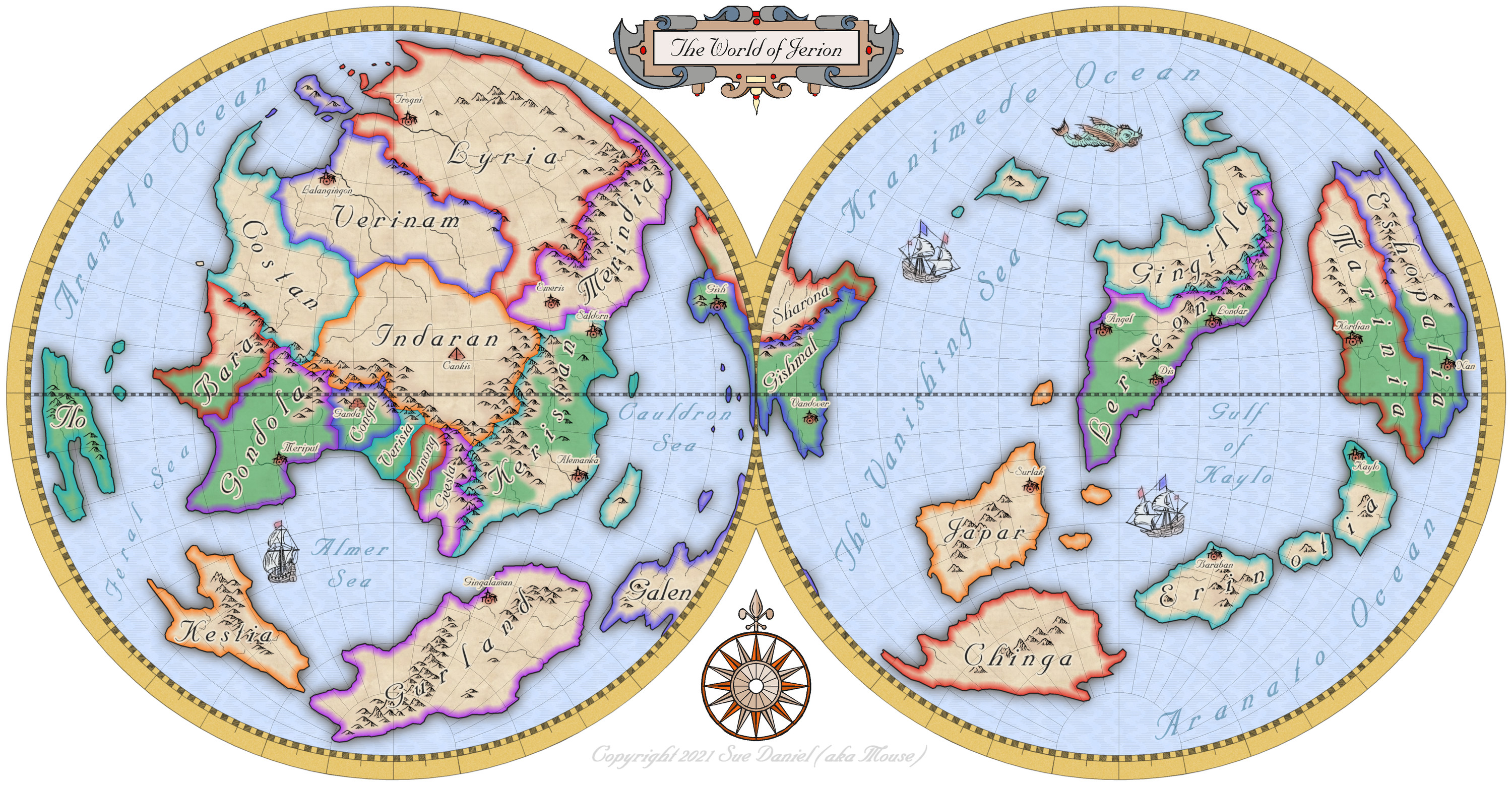
Mercator style world map of Jerion
 Loopysue
ProFantasy 🖼️ 41 images Cartographer
Hi Everyone :)
Following on from Ralf's recent Live Mapping session covering the use of the Mercator style from the first ever Cartographer's Annual, I decided to take a couple of days break to make my own Mercator map.
I hope you like it :)
Tagged:







Comments
Very nice!
Did you carry over the landforms from FT3?
Thank you :)
Yes. Jerion is a world I created as an example map for another annual some time ago - 2019, I think. CA155 - The One Day Worldbuilder.
This is the original FT3 file showing one of the two hemispheres. The trick is to use an Orthographic projection and do each side separately, using the projection settings to get it spot on.
Fractal Terrains-->Annual #1 Mercator — ProFantasy Community Forum might be of interest as well. Orthographic has a bit of distortion around the edges that won't quite match up on the Stereographic projection.
@jslayton ah ha! Is that what it was.
Well, I've done the maps now, but at least I know for next time - thanks :)
Thanks - that worked. I can't seem to turn it for a better fit, though. How do you do that?
The composite projections have the major limitation that you have to put the center of projection in each segment. In this case it would be the -90 and 90 after the projection name. I think this request is on my bug list, but I'll note it again to be sure.
Thank you :)
@jslayton, what about the AE hemispheres projection available in FT3?
The forum post I referenced above is the AE Hemispheres definition. Depending on your FT version, it may or may not be present in the Projections.txt file.
Sorry, Joe. I meant is it better than 2 orthographic spheres?
It appears I already had the AE Hemispheres definition! Sorry, Joe. I think I must have been mislead by hearing the Orthographic projection was the way to do it somewhere else.
I will leave the map as it is now that it's done.
At least I have learned to be confident in adding any new projections that come along.
I can never remember when that projection got added to the list. As for whether it's "better" than the orthographic one, the best way to answer that is to look at the grid for the projections:
Azimuthal Equidistant is a pretty good match for the grid on the CC3+ template, while Orthographic really isn't. But the AE Hemispheres definition isn't quite right. A better fit is to use the stereographic projection as shown in the bottom images.
Oooo thank you Joe!
That's another one I'll be adding ASAP!