WIP - Cahokia symbol collection
 Daniel Pereda De Pablo
Surveyor
Hi, everyone.
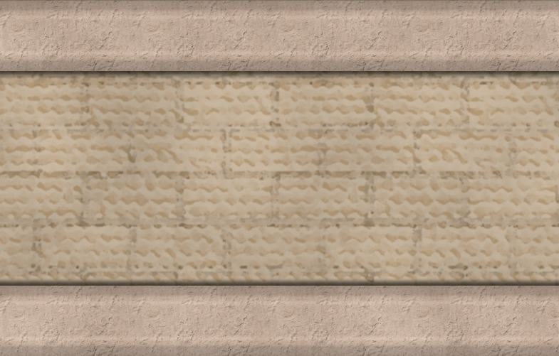
I've been working for some time on a symbol collection inspired by the architectural style of Cahokia and the Mississipian settlements: steep, thatched roofs, mounds, adobe walls, etc. The base is Bitmap A thatched edited and modified in Photoshop with free online textures and symbols.
I'll be posting some of the individual symbols in here as I keep creating them, so any feedback you may have will be deeply appreciated.
The first one, adobe walls. I'm trying to make a connecting wall based on this image, but it's going to take a me a while.
Enjoy!


Comments
These are red cherry palisade segments and doors.
They are transparent background PNG files, even if they don't look as such.
These are stairs for the mounds. I'll talk about how I make the mounds in CC3+ another day. It's easier than I expected.
Some buildings, mostly huts and stone roofs for temples. The huts are made as steep Bitmap A thatched buildings, and later edge focused and distorted in Photoshop. They look too "crispy" up close, but on a 1000x800 city map the appearance is quite good, IMO.
:
Finally (for now), a two stories, bronze domed temple:
Great symbols. My only beef is about the stairs - they look too rounded and don't give an impression of going up or down.
Thanks for the input. I've added a linear gradient effect to create the effect of elevation, and my idea is creating a slight bevel sheet on CC3+ to give them a more natural look.
Stairs are always difficult. I think the first one is best.
I'm really excited by this. I have been thinking for a while of doing a city similar to Cahokia, since the Mississippian culture has been an interest of mine going back to university when I first learned of it. These would make for a beautiful map.
There was a recent kickstarter for an rpg set in an uncolonized version of North America. It was called Coyote and Crow. Great project. I mention it because from what I understand it starts characters in Cahokia.
Two more buildings today: first, a slightly modified hut.
And a woodhenge, an astronomical construction built following the stars. There are more versions of this in the way.
I agree with Sue about the first stair in the last posting being the best.
I hope this can be worked into an annual perhaps, with other Native American architecture - wigwams, pueblo 'houses' etc
Wow! Are the shadows hand drawn or a sheet effect? If they're an effect, how'd you get the taper?
That would be great, Quenten. While reading about Mississipian architecture I have found lots of resources about native American and Mesoamerican cultures that are really inspiring.
Thanks for the appreciation. The shadows are hand drawn, but curiously they are easier to do with sheet effects. I draw them in Photoshop mostly because it was more time effective than make the poles and the terrain and add the shadows in CC3+ later on. If you want to create shadows like those with sheet effects, you only need to create a sheet with polygons or ellipses / circles in black just beneath the symbols and apply a 35-50% transparency effect, and depending on the rest of the map maybe some edge fade, some blur... Wall shadow can work just as well, but you'll need to add the taper manually with transparency anyway.
I do that with most my CSUAC maps, and the look is very good.
The final four, slightly different woodhenges. I usually apply an Edge fade effect to structures like these, so the transition to the "standars" terrain looks better. I'm going for the pits and poles now.
A series of round-ish pits. A couple of rectangular / square ones will probably follow.
I've started to think that I'm going to need to create seamless textures of all the terrains I'm using in order to avoid a lot of complicated editing once the map is finished. I've never made seamless textures before, any tutorial you guys can recommend me?
These are amazing!
There are all kinds of ways to do seamless texture editing. Many bitmap apps claim to be able to do it, but the results are highly variable. and depend very much on the size and detail of the initial image. A more or less evenly packed image of 50 or so daises scattered in a relatively large and even grassy patch, for instance might work a lot better than an image of a single object on a relatively plain background, which ends up looking like some kind of printed curtain pattern.
Krita (free) is an exception to the rule, and allows you to work on an infinite canvas where you draw your texture by hand and if you press the W key on your keyboard lets you draw (for example) a horizontal line that can roll off the right side and come back on the left side to meet itself. I used Krita to make most of the textures for the Ferraris Style in the February 2020 Cartographer's Annual issue here https://www.profantasy.com/annual/2020/2020-cartographers-annual.asp#February
Press W, and you get the infinite canvas.
It is a very handy and completely free piece of software.
Bitmap apps work mostly with photographs or hand drawn patterns for the most part. There are also some relatively expensive bits of software you can get that will allow you to generate them the same way that land is generated in FT3, using fractals. Most of these use nodes and can be a bit tricky to get used to. The one I use is almost certainly on its way out as abandonware. I can no longer access the image library that once existed and the forum is dead, though the app itself is still apparently for sale. I don't actually recommend you buy this one at all, but I can use a screen shot of it to show you what I mean about building a texture with fractal nodes. In this snapshot you can see the nodes on the left and the result of their particular combination on the right.
And that's about it. I think if I was just starting out all over again with seamless textures I might get hold of Krita first and have a play with it
Thanks a lot, Sue! I'll do just that.
You're welcome :)
One last thing! The drawing you do in Krita is only seamless if you use the wraparound screen view (W). Otherwise its just like drawing on an ordinary image.
Back from a long weekend, I've finished a few more symbols for the walls. A square adobe wall tower here:
Next, a round one:
And finally, the gates:
I'll be creating wall segments and bends for the next few days to create the continuous wall. I'll let you know how it goes.
@daperdepa Here is a NY Times article on Cahokia with goo reconstruction picture. I just thought you may be interested.
Thanks, Quenten! I had already read that, their reconstruction and the one in a National Geographic special issue are the basis for most of my symbols. The textures as well.