WIP - Naktamun District Map
 Dak
🖼️ 37 images Surveyor
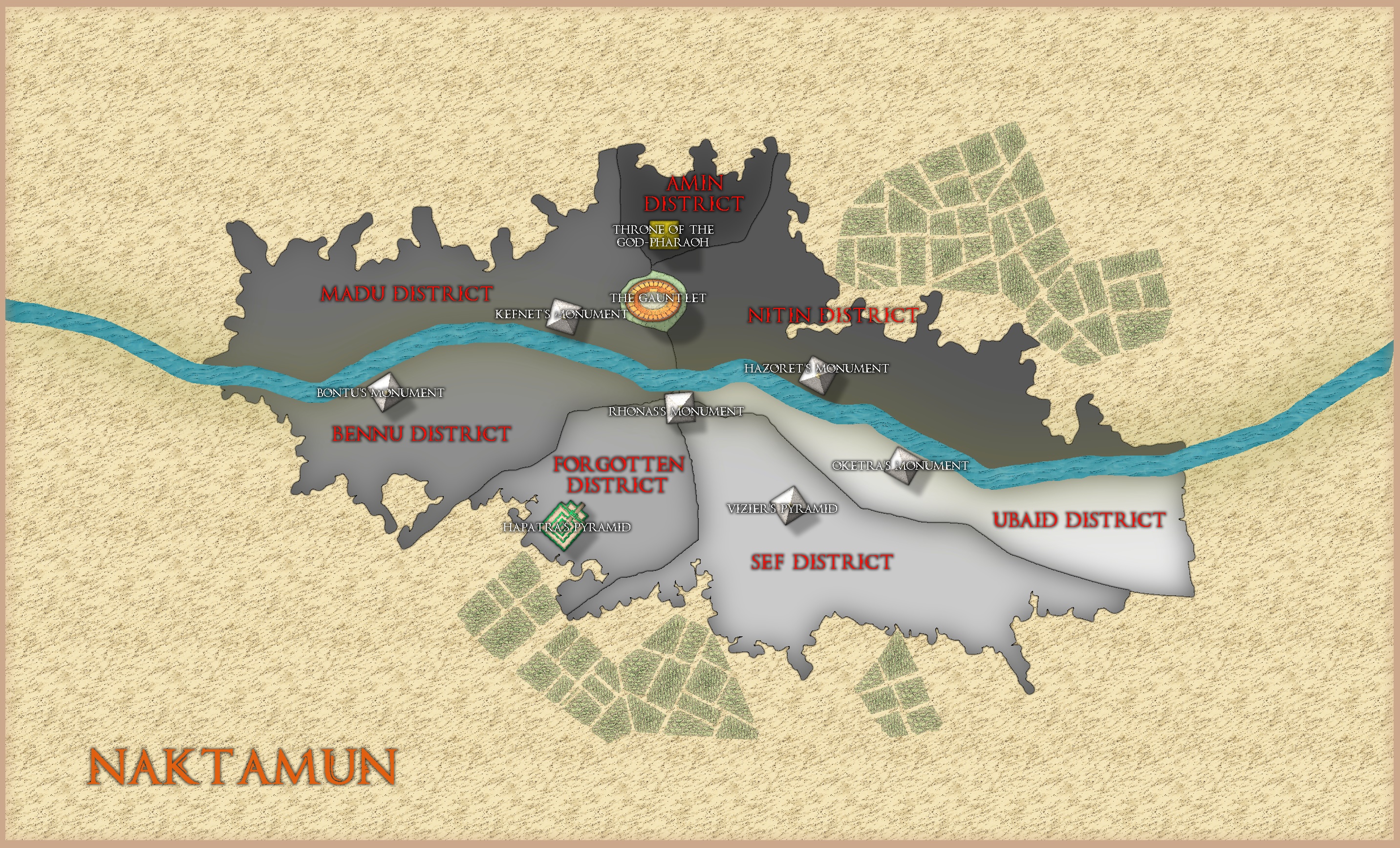
In a previous post Monsen advised me against making a huge city map with regular building symbols and suggested I start with a district map with major features.
Here is what I've done so far.
I'm going to make the river smaller (and make it fit the map this time), but does anyone know a technique where I can make the different districts more 3D, and does anybody have any ideas for how I can show the Hekma (a water based magical barrier that protects the city from the desert). I'm using Mike Schley again for the map.
Any other ideas of how I can improve the map will be appreciated.
Dak.
Tagged:






Comments
For 3D effects you might try adding a Bevel to the different districts (each adjacent district will need to be on a separate Sheet, or they'll all show the same Effect, however).
Some more information on exactly what and where the Hekma's supposed to be would be useful in trying to advise further regarding that. Is it a dome over the city, or a (force?-)wall around it, say? Does it have a particular shape, or follow the outline of the settlement? Is it visible - and if so as what - or invisible?
By 3D, do you mean perspective, or an illusion that the sites and districts are not flat on the page?
Hi, by 3D I mean the illusion they are not flat on the page.
If bevel is the way to go, the districts are already on a separate sheet, so I'll try to do that if I can find the time today.
As for the Hekma, the description what I wrote is all I can find on the mystical barrier. It's from a MTG plane called Amonkhet, so it has card sets illustrating the world. I have only seen the Hekma displayed on 1 card and it looked like a multi-coloured thin barrier which I take surrounds the city in what I imagine is a dome.
For my map I thought about using the road tool to surround the city and changing the colours and effects to symbolise the Hekma.
I put the bevel on the districts.
I love the colour choice of greys. The only niggle that I pick on on the first view of this are the Admin District and Nitin district labels.
Oh then there are the white labels over the symbols, could they be moved above/below the symbol?
I've made a few adjustments using the suggestions above. I didn't like the interior boundaries between districts so I put those south of the river on 1 sheet, and those north of the river on another sheet. I might divide them with a dark line to see how that looks.
It still needs a little tidying up though, but I think Monsen was right about a district map over individual buildings.
If you need a dome for representing the Hekma, perhaps one of the transparent city domes from Sue Daniel's bonus issue in the 2018 Cartographer's Annual might work (if you have that Annual, of course!). There's an impressive rainbow-coloured one among those for example. A quick test shows it will scale-up nicely large without becoming pixellated, and you can adjust the X and Y values for the symbols, which means you could distort it into an ellipse to fit more neatly about the city.
Thanks Wyvern,
That actually sounds perfect as the only picture I can find of the hekma seems to suggest it's multi-coloured. I don't have that Annual though, but I'll look into it.
I ended up using the road tool and re-colouring it a light blue (number 76 I think) just to suggest where the magical barrier would be.
You could also use a glow on it - perhaps a scary purple ?
Like this Quenten?
I like it, what do you think?
I like it too, it's staying. Thanks for the tip Quenten.