[WIP] Atlas Competition Entry - Coils of the Cold Coroner
Hi folks,
I've been unable to sit at my desk for a few weeks due to an issue with my feet, so I'm a bit late to start this challenge. I managed to do a little work on it over two days now, and I'm happy with it so far.
So the idea is to meld a few different ideas together. The first idea was to have a dungeon which would culminate in an encounter with a Lovecraftian creature who will, of course, be cold-themed. I've already designed the creature. The second idea was to have some of the ideas of the dungeon reflect an affectionate but weird take on Fritz Leiber's Swords against Deviltry, which introduced the heroes Fafhrd and the Gray Mouser. Fafhrd hails from the frozen north, in a place called Cold Corner, hence the Cold Coroner of the title. The final element is that I have always wanted to do a very large dungeon, old school style. I'm thinking of something like Keep on the Borderlands, where there are several factions.
I won't bore everyone with the details of the story I've dreamed up, but I'm thinking I'd like to put this on Ezrute somewhere, and that there would be a small community of Inuit/Laplander folk who are at risk from the activities of the creature nearby.
I realize its maybe too ambitious, but I figure I could just work away at it until we're closer to the deadline, and then maybe mid-February go with what I have, adding the final part where the encounter would take place.
Constructive criticism always welcome!


Comments
That's a great start, Autumn :)
I love the idea.
And I do hope your feet get better soon!
Looks good so far
The first idea was to have a dungeon which would culminate in an encounter with a Lovecraftian creature who will, of course, be cold-themed.
Ithaqua?
I never thought about using an actual Cthulhu god - though now I'm wondering! First campaign I was ever in for Call of Cthulhu culminated in my character seeing Ithaqua and rolling 100 on the insanity roll... Such fond memories!
I actually generated the creature in an old roleplaying aid published by Frog God Games called The Tome of Adventure Design. Well, I generated the original form there and then added my own stuff. It's a good way to get initial ideas.
Ithaqua does tend to be more an overland deity in the tales, but maybe a cult of worshippers with a near-deity-like offspring as their central focus for a subterranean setting?
When I wrote Lovecraftian I just meant similar in style, much in the way that early d&d took inspiration from Lovecraft (particularly Moldvay, from what I've read). So I was thinking of some kind of creepy monster that exists on two planes at once and which is psychically controlling a few culty factions from its lair below what I've mapped so far. It's got these tentacle like things that ground it physically to both planes and it blinks from one to the other unless the tentacles are destroyed. Horrific-looking, of course.
You're right that Ithaqua would probably not really work in subterranean setting.
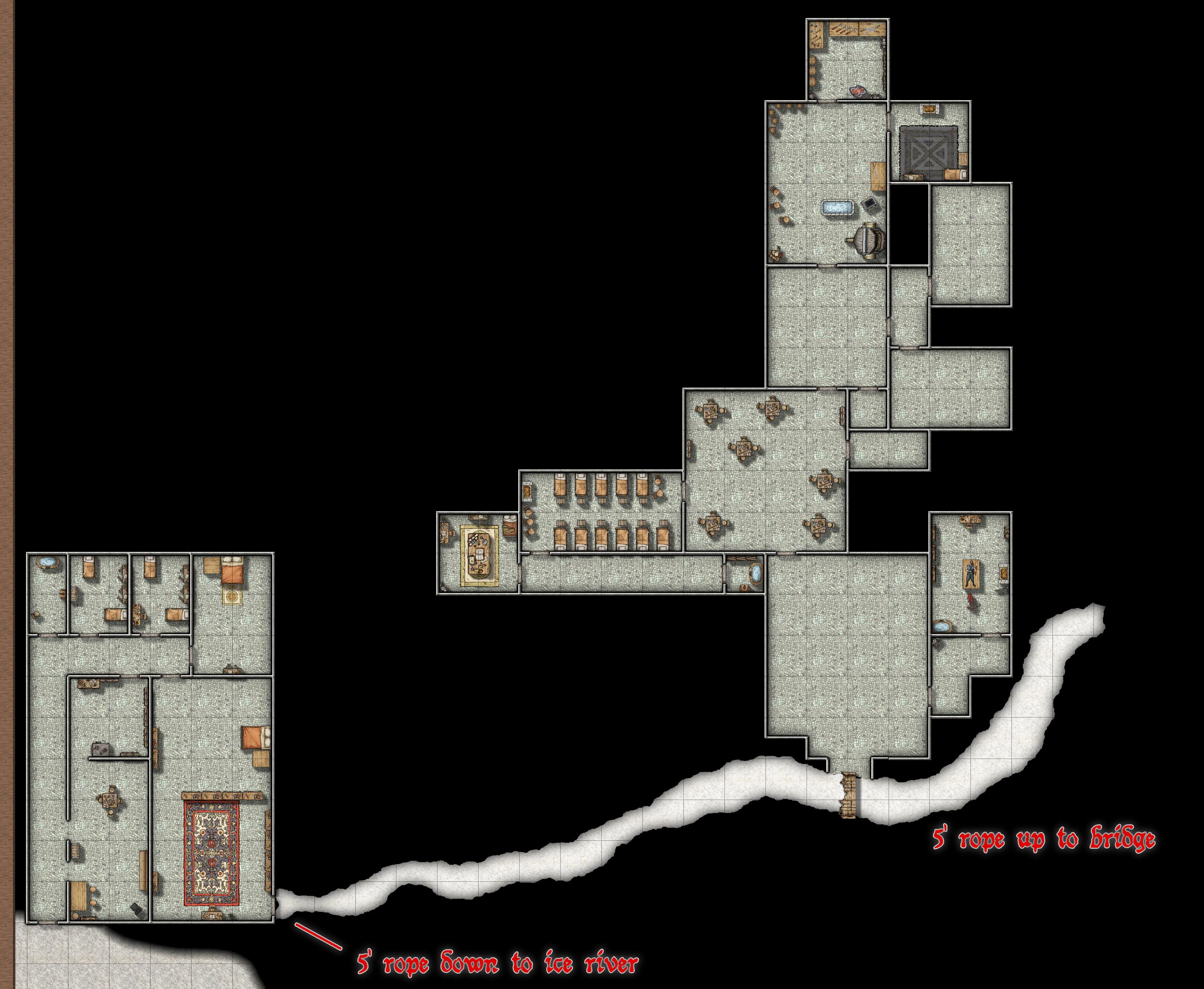
It occurs to me I haven't left an update here in a few weeks or more, so I thought I'd provide a .jpg of the most recent version. Right now I have four general areas: the entrance, which is also where the Cold Coroner has his library set up, a barracks area for the cult, an entertainment area (comprising of a stage for plays and a gladiatorial pit), and the caverns of the snow-women (strange cold rituals are performed here, which include the creation of magical snowballs for throwing at men, as in the original tale). Maybe at some point I'll post the different sections, so its easier to see the details. Let me know what you think!
...caverns of the snow-women (strange cold rituals are performed here, which include the creation of magical snowballs for throwing at men...
Getting visions of something a bit Monty Python here ?
Nothing wrong with a little humour. I suspect you've read the novel? I actually pulled that out about the snowballs directly from it. It is a delightful portion of fantasy literature.
...read the novel?
I picked up the whole Fafhrd & the Mouser series in the Ace editions of 1970 and thereabouts pretty much as soon as I could find a bookshop in the UK that sold them then, as one of the bigger influences on original D&D. Long time since I read them, but I still have the lot! And all the recent talk on the Forum of these stories I read back in this period brings back all the excitement of that first venture into D&D and RPGs more generally (though I didn't know there'd be plurals back in the mid-70s when I started, of course!).
I've added a mausoleum area (a proper dungeon for crawling in) and a set of ice caves at the end of it. I've written a five-page document on the different areas in the mausoleum, and am working to do the same for the caves. Given that there are only 3 days left, this will likely be the extent of the dungeon. Looking at everyone else's beautiful work, it occurs to me that I might have missed the point of the contest, as I haven't done much in the way of making it look icy for most of the dungeon. I did learn how to do a lot of things in CC3 with this contest, however, including how to work more efficiently with the program.
I watched Monsen's video about how to make ice caves and played with it a little here. I think I was able to make something that looks like snow here, but I'm curious how others feel about it. Then of course I had to come up with a rationale for the snow, so I'm imagining that this "dungeon" area is the result of a fissure in the top of hit, so it's more like an extremely narrow canyon (like 5 feet in some places). So the snow could fall in, semi-freeze, and form a kind of snow-crust that us Canadians are used to dealing with :).
I made these areas in a separate part of the same map and will in the end move them to join the first part. I did this because I was hoping to do more stuff in the middle.
Contests here seem to me as much an opportunity to experiment within parameters we might not ordinarily set ourselves otherwise, as anything else. And learning's all part of that. The snow caves look interesting; impressed by their fractal extent and complexity! Not sure they quite connect with the room maze, but appreciate that might be deliberate, given the red number "1" by the double doors.
I like the off-axis room-maze too, but maybe the numbers might be set upright? That could emphasize the off-kilter nature more, though they're perfectly legible as-is.
@Wyvern Definitely planning to fix the tilt of the numbers so that they're facing the more standard direction. I actually swiveled the whole maze around to meet the entrance to the snow caves after I had numbered the rooms, which is why they look so weird. I realize the snow caves don't quite get to the door of the room maze, and plan to sort that out, or maybe do a broken down old bridge. I figure I'll save both those things till I have the final orientation sorted.
Monsen suggested I put together a map for the region this dungeon will be in, so here it is:
Looking at the overland map and I noticed that if you look at it closely there is a very dim image of stuff that should be covered over. I used the wasteland fill in place of the regular land fill and where the hill and mountain backgrounds overlap it you can see the darker areas from the wasteland dimly. The hill and mountain fills have edge fade inner on them. Does anyone know how I can make the unwanted stuff disappear?
What is the inner opacity on that hill and mountain fill? Is it set at 100?
Does it actually matter? It gives me the impression that the blocky ice of the more northerly area continues in places through the hills and mountains, but only by straining quite hard at the image. Gives a feeling that something's not quite what it seems as well, perhaps.
However, I suspect Monsen's right, that the opacity of the fills simply needs adjusting upwards to resolve!
So it looks like Monsen was right. The opacity was set to 80%, and changing it to 100% alleviated the problem. I feel a little silly not realizing that, but I guess a lot of things are obvious once you know them. Thanks!
Regarding Wyvern's comment, I had the same thought that it I liked it as kind of a ghostly image that you might not see. I guess I was a little worried people would think it sloppy. Well, I suppose I have a few hours to decide.
This is a map of the final arrangement and orientation of the dungeon. I still have yet to fix the numbering in the mausoleum area, add numbering to the snow caves at the top of the map, and change the labels to suit some changes in the conception of the dungeon. Also a title and all that good stuff.
I'm wondering how people feel about the background colour as opposed to the black? I've really struggled to find a good background for this map, as I often do with dungeons. The basic stone fills look too regular when zoomed out to do a good job here, thought they're beautiful when zoomed in.
I'm working now to finish the write-up I started. I'm so far into it that it would be a shame not to finish it for the deadline, especially since so much of the "ice theme" of the map is actually wrapped up in the inhabitants of the dungeon. I'm hoping to find a little time to find a way to add some frost to some of the mausoleum floors as well.
By my reckoning I have till 7 am tomorrow morning to finish, so I'll probably just submit it before I go to sleep.
7 a.m. would be right for noon GMT/UTC if you're in the equivalent timezone to the USA's Eastern Standard Time. Livestreams I sometimes try to catch from New York that start at 7 p.m. don't begin till midnight UK = GMT for me! Even worse for folks in most of the EU though, as they're an hour ahead of GMT...
The blue background's perhaps a little too bright and dominant, and might benefit from toning-down a little? However, it's hard to judge fully before all the labels, title, scale, etc., have been added, as that can give a different impression sometimes.
Well I've handed the thing in now, so its all over but the crying. I managed to finish up a so-so document, though the last section is a bit sketch since I was running out of time and feeling tired. I'm posting the final version here:
Some pretty whimsical stuff on there. I thought it would be good for people to get some inkling of the stuff in there without reading a long document.
This is great stuff! For "nearly" finished, it good pretty good to me. Love the commentary notes along the sides ;)
@Lorelei Thanks! I really enjoyed doing this one. It's good to hear that you liked the commentary :)
The blue background looks really good now! Very fine-looking map!
@Wyvern Thanks for all the feedback while I was making the map. I found your comments got me to go a little further to do things I sometimes don't take enough for. And thanks for the compliment! I actually spent a couple hours reading about colour theory...