[WIP] DOTR The End of Castle Wittgenstein
 Morrgans
Traveler
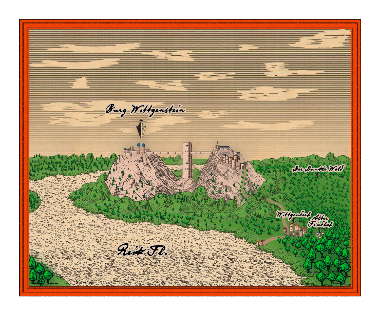
So, what is there to tell. Party sounders into the worst place (by far) you can pick on that big river and in the end helps to blow up a castle with the equivalent of a tactical nuke in a fantasy setting. What an opportunity to try new things in mapping.
Especially as contrary to other points of interest in the warhammer setting, this one has an actual real life counterpart: Burg Wildenstein near Leibertingen in Bavaria: https://www.wildensteiner-singkreis.de/die-burg.html
On the page above you can see a historical drawing which I took as a source for this itereation of City Panoramas of Annual 2015.
But the real work is the Castle itself and its many rooms and dungeons and whatever for which I bought Dungeons of Schley.







Comments
So the Castle: Actually there are 2 and a Tower between them. Perched on rocky pinnacles (?), connected by a bridge above a precarious drop.
I had to fidge around a bit in order to be able to use the finished drawing in a VTT. Problem was the minimum grid size in the VTT (in Pixel) so that the tokens of the party AND opposition can move through the corridors and doors...
In short I decided to cut the map into 2. One is the east side up to the tower in the middle of the bridge, the other contains the rest.
The first one is finished. more or less and looks like this:
A few obstacles I ran into and the solution I got from the helpful folks on this forums:
1) The steps at the north western part of the court yard. I added some more sheets between the plain outside sheet (where the grass and mud textures of the other part of the courtyard are) and added some polygons in the same fillstyle with an outer glow.
I had to get an extra sheet in with just a solid polygon, which traced the top-most floor in order to get rid of transparency acne AND in order to have an extra layer so that the other floors on the same sheet do not have the same sheet effect.
Same for the round steps in front of the bigger tower in the north part.
2) Symbol placing. In the standard Mike Schley Dungeon template are quite some number of sheets for symbols (symbol, symbol lower shadow, symbol on walls ...). I had to add some more in order to get the layers correctly ordered. With symbols above the ground textures but below the bridge and walls and what not.
3) Stairs... this I am not quite satisfied with... to be honest. Stairs are symbols (ok. good) which I feel should somehow align with a certain interior wall symbol. But I can not make it look good on a landing.
4) Ground textures. I still have trouble to get the outside look good. (Middle of the courtyard) The overlapping textures even the transparent ones do not mesh well. I could use some help with that.
Now I am starting with the western part...
Cheers
Olaf
That's awesome work. I was stationed in Germany twice and got to see lots of castles, frequently while we were training and I would note the locations on my map, then go back when I had time with my wife. I never came across that one being stationed in Fulda and Boeblingen/Stuttgart. About the only time I went to Bavaria was to go shoot at Graffenwoehr, know as "Bavarian Siberia" where I got snowed on in July.
I would have loved to seen that castle. The bridge construction must have been brilliant.
I played The Enemy Within campaign when it was originally released in the late 80s (the GM gave up during Power Behind the Throne, which was a bit complex to run). My elven cat-burglar led the way through the spooky Castle Wittgenstein.
It must have left an impression, because looking at your excellent floorplan brought back memories of sneaking up the big staircase in the other half of the castle 30-something years ago!
I'm planning to run the new version of The Enemy Within, but the printed version of Death on the Reik isn't out yet. I'm looking forward to seeing the other half of the castle.
Wonderful. Just wonderful. Funny, i was just playing around with the panorama city annual the other day. Your map is MUCH better than mine, to say the least. Love this. Would you consider putting it in our community atlas?
Yes, I would love to contribute to the community atlas. It is a map I made myself, but the property (Castle Wittgenstein) is from Games Workshop. If that is a problem I can rename it and put it in under a new name.
Cheers
Olaf
Would love to see it in the atlas ,both the overview map and the battlemaps.
But yea, you would have to change the names. I'll also need you (or someone else) to find a location in the atlas where it will fit and look like it belongs, and the names would then probably have to be changed to match the location you place it.
Soo of we go to the western part then.
So far the Kitchen Garden (cue "Mean Green Mother from Outer Space" from Little Shop of Horrors) and the main Tower and the base of "the Temple"(TM) are done. The pit is at this moment just a reminder. I had a little trouble with the temple floor. I tried to combine two kinds of rectangles but multi-poly would omitt the overlapping parts. So I took the "dumb way" and just traced the violet-ish form.
Memo to me for further reference: The "Wall-Tool" does not close the wall on right-click. Therefore place first the door and then do the circumference otherwise weird things happen. (Which is not that unexpected considering what place I am trying to map...)
Also the bridge on the eastern side looks kind of weird but zooming in the pieces are aligned....
Ok... here is the status update for the western part of Castle Stone Pinnacle:
I did run into some issues here and there which I will try adressing below... Off we go.
Here is an excerpt of the lower left corner:
Ther are 3 prominent things I need help with.
(1) - The most glaring issue: Apparently the textures align globally. In this case "wooden floor oak vertical" is vertical to the global axis system not the local one for the room. I tried to be clever, started a new room perfectly aligned (texture looks promising) and then rotating (texture orientation stays the same ?!? so basically you rotate the walls around the texture. That left me a little stumped. Is there a way to rotate the texture? or align it to the walls?
(2) Stairs: The main hall has a pair of big stairs leading to a balcony. So this will bite me shortly.
These are the symbols for stairs (in this case wooden) with a curious symbol from "wall features" which is labeld "FC wall interior Stairs".
It just occured to me that FC stands for Forlorn cottage ?!. So these two might actually have nothing to do with one another at all. Anyway. Is there a best practice to construct these kind of stairs?
The symbols do not quite align:
Without the Glow you can see that the edges are a little different. The glow itself makes it look like the stairs is ending at some kind of wall. When reordering the wall to another layer (symbol flat) without the shadow it looks like this:
I did try something in the gate house in the middle of the bridge but I am not really satisfied with it:
(3) what kind of wall is the Interior wall symbol? I tried to match it with fill styles but to no avail. At the moment it is contrasting starkly with the dark wall texture but "natural stone" or similar did not match as well.
Thanks and I am looking forward to your input.
Cheers
Olaf
Wall tool:
The wall tool is a line drawing tool and doesn't join into a closed polygon. A wall is a line with a width. Conversely, the room drawing tool automatically draws a closed polygon wall (which is rendered hollow by the line width) because it doesn't know where you want the door to be, or even if you want a door.
The bridge symbols meet at the highest resolution. There are 4 images of each symbol in a graded set of resolutions to speed up the zooming process, and where they are fuzzy-edged pixel images sitting on a precision vector reference grid they can appear to have gaps between them at lower resolutions. If you have issues with this it may be necessary to draw another line of them off the map somewhere initially using the snap grid so they are perfectly horizontal or vertical, and jink them closer together by hand. Then the string of bridge bits can either be grouped and moved, or just moved to position on the map.
1) Textures aren't aligned unless they are made to align, and you can only do that with a filled polygon, not a wall. Happily, your floor is a filled polygon. Hide all sheets but the floors and right click the Polygon button on the right toolbar. Click the floor on one of its long sides. The fill will align to that side, but it will also shade like a pitched roof. To get rid of this you need to type EDITSHADING on your keyboard and hit the Enter key. This is a command you have just given CC3. Check the command line at the bottom of the window and see that you are being asked for the entity to be edited. Pick the floor and then in the dialog that appears check the little box called "Shade Only Copy" and OK.
You should end up with something like this. Here I have shown the 2 steps from left to right.
2) Before you place the symbols, but while you have them on the crosshairs ready to paste, right click your mouse and then click the Set normal button and the More button and see if that works better for scale. The stairs align perfectly with the snap grid for me.
3) The interior wall is a symbol, not a fill. I rarely use them at all because they don't match the fills that well. I usually use thinner regular walls drawn with the wall drawing tools, or I draw the entire building in these interior walls.
I think I got everything there?
Hello Sue!
(1) Some addition: right-click Polygon Command --> Shaded Polygon (Angled by Edge) --> I had to pick the side where both endpoints were the lowest (In my case the right most edge) The rest worked fine.
(2) Ok, I figured as much when I wrote the post above. Sooo I have to obscure the irregular edge of the symbol with a floor, because there is no connecting part.
That would then mean somehting like this:
Original placement:
Added an extra Sheet just above "WALLS" and named it Floors_Stairs:
The stairs themselves can then be put to any "symbol" Sheet depending on the desired sheet effects (shadows and whatnot).
The bridge symbol alignmend I will check when producing/printing the map.
And no more FC Interior wall symbols.
Thanks!
Olaf
Oh yes! Sorry. I completely missed that bit out of the instructions.
And it looks like you've got the whole thing about sheets clear in your mind. That is exactly how I would have done the mid stair section.
Back after a week of recovering from some nasty stomach bug... and on to the Bug-Part of Burg Wittgenstein. Sometimes it is funny how things are connected, isn't it?
The lower part (Main Hall and Balcony) are now laid out and partly furnished:
You can see the effect of the discussion bitween Sue and myself with the stairs in the big hall.
The three additional rooms with flagstone covering are a cheap way around the texture issue also mentioned above. or maybe... nevermind I just changed it as I replaced the floor with a polygon anyway after the walls were ready (so startet with an circular room, broke the wall on the balcony side, added extra wall, deleted the floow, added a new floor with the floor tool). HA! So only the Taxidermist room (top one) has a stone floor to better get rid of the scraps after his work....
By the way is there a chance we could get additional furnishings for mike sley? like piano, music instruments, torture equipment, etc?
The black tower is done in layout...
for the "crunchy" ground level I added an extra sheet to the mix (floor covering) where the texture has an opacity (60%) and an edge fade inner sheet effect.
I chose the stone_lava cold fill style as the thousands of cock roaches covering the floor (also some interesting textures to play around with, spider webs, bugs, slime, pretty much anything you could have in places troublesome adventurers are poking their noses in... that would be nice... like a SS6 "Mike Schleys nasty bits and things")
Oh and the temple of mindless debauchery, abandoned, is also ready (There you have a central place for the prince of hedonism on your grounds and all they are able to do is play with themselves, completedly abondened... nobody went in there for a long time, they all grew out of their "Wild years" like a century or so ago... must be really frustrating for that deamon brood there...) and eagerly awaiting the party (both.... the party and the excitement when the party gets there...)
Now what is left to do? Floor 2 and 3 of the main building, the dungeons, and trees.... and incorporating it into the VTT and adding there the walls for dynamic lightning, NPC creation, going over the rooms at least three more times and then improvising on hte fly as players tend to turn around unexpectedly. But that's why we are doing it.
Have a nice week-end!
Olaf
Western Part nearly done:
I got rid of the lava as bugs after playing around with "Symbols in Area". So I placed around 4000 bug symbols in the bug tower...
Keep in mind while doing it is easy, leaving it with shadows on might tax your rig... I noticed a definitive refresh page improvement after putting the bugs on the "symbols flat" sheet...
Furnished, and nearly ready to go. I am still searching for good symbols with a "torture" or "Frankenstein" feel for the last room (the tower floor with the circle in it) and how to proceed with the pit. It has some cthulhuesque protoplasmic monster in it... bars, mist, tentacles the whole shebang. But that is secondary, some torture/dungeon (as in bastille) symbols, that would be nice. So if anyone from you got a hint, I would appreciate it.
Have a good start for next week!
Olaf
Wowsers !
Thanks!
Another question with "Symbols in Area". The bugs(-symbols) have all the same orientation (per symbol) so bug1 is always looking at 2 o'clock, bug2 at 6 o'clock etc. Is there an option which reandomises the rotation like the one for size and placement?
And I am still looking for neat steampunk/Frankenstein or torture chamber symbols. Is there an annual where I can find it, or maybe SS modern?
Cheers
Olaf
Unfortunately, the symbols in area don't obey the random rotation symbol properties.
As for steampunk, nothing in the official symbols as far as I can remember. Would have made a nice annual though.
For torture chamber symbols, you might try adapting some of the existing DD3 ones, or simply repurposing them. For instance, one or other of the varicolor statues, or maybe even a top-down humanoid creature, possibly resized, might work as an iron maiden viewed from above, say, while a rack can be fairly easily constructed from a wooden table (maybe elongated in one dimension), and fitted with other symbols - again, possibly stretched or shrunk - to serve as the rollers/pulleys at top and bottom, with appropriately coloured drawn lines of suitable thickness for the ropes. There's already a brazier for those hot irons of course!
Frankensteinian items might be similarly constructed using things such as the alchemical equipment and some of the magical effects. Again, a lab table for a constructed creature could be formed from other components like the rack, while there are already things like cages and iron cage bars available in DD3. OK, it's a bit more work than simply picking out existing symbols, but sometimes you just have to think a little more laterally ?
Wowsers !