A new take on an old map
 Dak
🖼️ 37 images Surveyor
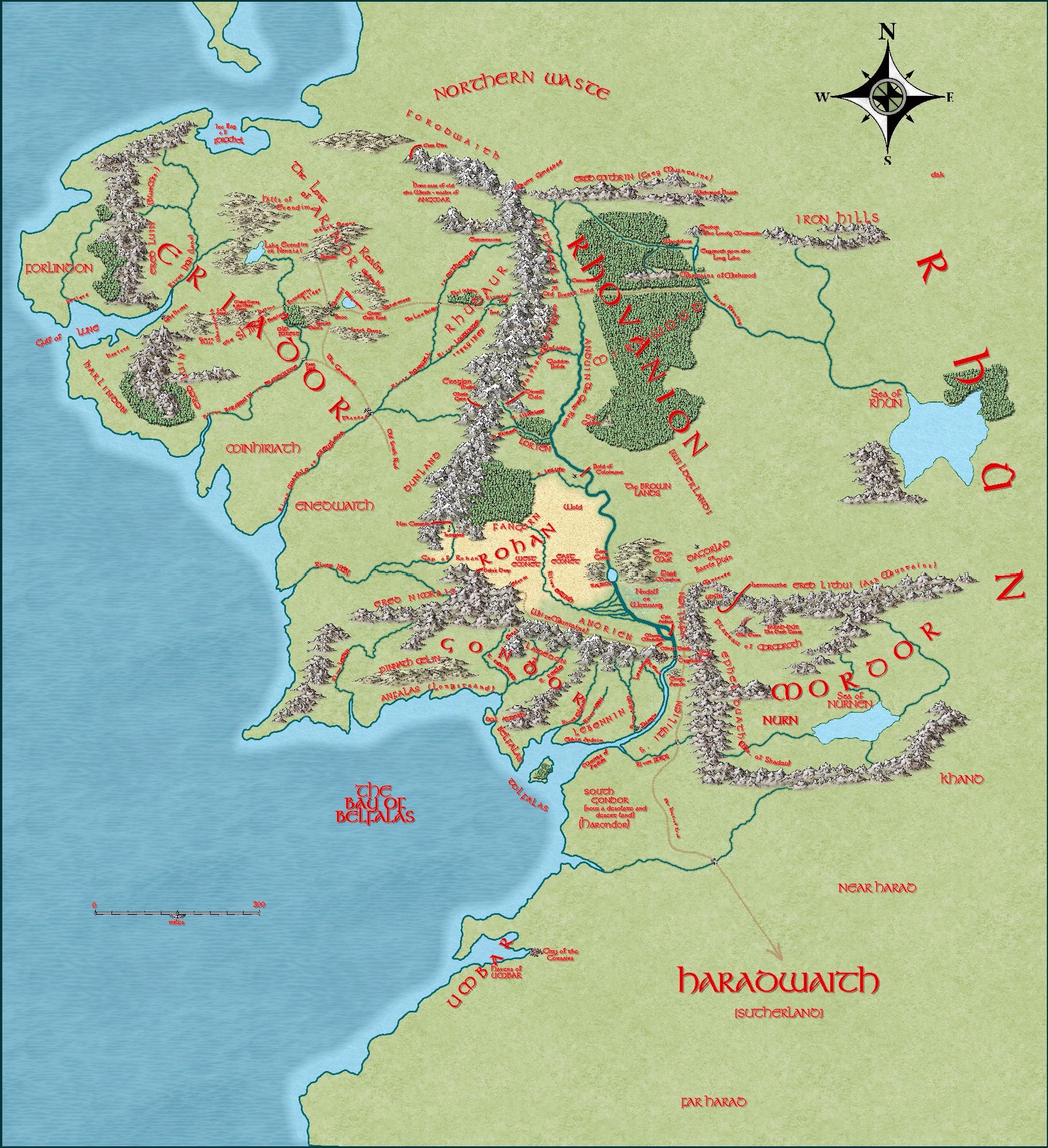
Here is my version of on an old favourite. I tried to be as true to the original as I could using Mike Schley overland, and the Tolkien font.


Comments
Good map, Dak :)
I think the red labels are possibly a little bit too jarring, but maybe that is just a case of me being more used to black labels with Mike Schley.
I used red just because the map I used as a trace from the book had red lettering. It looks a lot better in a higher res'. I'm a bit disappointed in how the lettering looks at this res'.
The biggest challenge I've found so far with CC3+ is getting the lettering right. I've tried black, white, red, and can't decide which looks best and how much border and what colour to add. The lettering on this map took me longer to do than the terrain.
Labels can be tricky to get right, and not everyone has the same idea about what 'right' really is. There have been a few occasions when I've been convinced I've got something spot on, but then had comments about legibility or visibility myself.
I think I remember seeing a map with red labels. I think it was also a black and white version. bright labels quite often go well with black and white maps - particularly red labels.
Yup....labels. I always have trouble deciding how to best label a map. I agree with Sue, the red is difficult to read at this resolution for such a large map. But....who doesn't love a visit to Middle Earth? :)
At least you have done all the hard work, Dak. They are most beautifully laid out :)
That's right Loopysue, it was the black and white map with red labels which I think was drawn by Christopher Tolkien.
I've uploaded a higher res' version into my gallery so the labels are clearer.
Just to be awkward, I think the red labels work well here ?
I'm with Wyvern 100% on the labels. Perhaps the drop shadow could be dropped - it will make the smaller ones easier to read, as will a black or white glow (not too much)