[WIP] Community Atlas Competition entry: Thing beneath the Iron Mounds
 Lillhans
🖼️ 7 images Surveyor
"But I don't know how to do lava dungeons!"
Which is a great reason to do just that for the competition.
Progress so far
Brief concept of the map: 250 x 250 ft battlemap, mixing natural cave and dwarf-built structures.
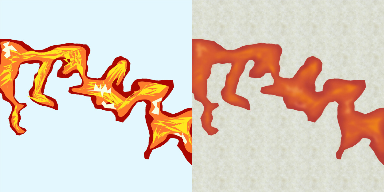
Three sheets of lava seems to do the trick. Perhaps too red currently, but I mean to also flood it with a transparent, blurred sheet of yellow with the (theoretically) added benefit of "illuminating" the rock walls.
They need to make some "Polygons made me do it"-hoodies for the webshop.
The Jonathan Roberts Dungeon kit comes with some great textures. Using one here for my "canvas". Not sure I'll end up showing too much by way of style specific fills, but it's great for morale to have it around: makes one focused on keeping those polygon-made textures cool (or hot, as it were).


Comments
Will probably need more light features for the rock walls. Other than that: bang on what I was hoping to achieve - softsharp cartoonish qualities. Will keep the canvas texture showing for sure!
It practically draws itself! Now working on the perspectives, the idea being that areas exposed to the direct light of the lava below get a brighter colour. These parts also get the radiance treatment. With the darker topside, this should - in theory - create the desired contrast and establish a sense of elevation/overhang.
The sollution to the font issue can be seen at the bottom right: a very accurate representation of my actual handwriting abilities.
I may end up trimming the rock face a bit but, by and large, I'll think I'll chalk this one down as a success.
Next up I think it's on to the tunnels on the north side; south will feature the accessway and battlements: I reckon the dwarves built it to keep things away from reaching their settlements above. So that means there will be large, magical runes carved into the ground and specific locations - which means in turn there will be some blue light as well.
Or, just procrastinate for a month.
The tone and grainy quality provided by the background texture get to stay. The "naked" variant is, however, a strong contestant: if I were to guess the lava texture somehow informs how I look at the rest.
But, no, not killing this darling. Just yet.
It's weird not working with shadows - like, at all. Pillars probably won't make the final cut, and I remain undecided about keeping the grid at this time. Kind of done with the north side, though, I think.
Oh! And I just remembered this is not my first tampering with lava: I seem to recall having already fooled around with the three sheet combo a while back (as a response to someone asking on Facebook how to make lava caverns). Plot twist: I am in fact super-talented at this already. lol
Pretty sure bedrock doesn't look like that when you lift the top off, but if it works for tree trunks right? At any rate, it had to be distinctively different from the rest of the terrain in order to work.
It would be super-cool to be able to have the walls ease into the cave floor - you know, like how caves actually work - but that's probably for another visual package alltogether.
Happy with the Paizo cartoon map vibes.
looooooooool
The battlement needs to have the colour choices sorted out and its stairs added...at some point.
I seem to recall a Leonard Cohen line about killing the flame but I think it might be a bit too dark at the present time. But that could just be my fantastic laptop and eyesight playing tricks. Overall though, I think this is probably the right move for introducing shadow play on otherwise very flat-looking cave walls, which aren't supposed to be served by the light from the lava below.
It's not that I don't like the preivious look of things, but it's just that going back to it now seem a bit impossible - so that means it must have been an improvement, right? :D
That would be "not working with shadows" to "cover everything in shadow" over a few days off. It's adding some time to the process but also gaining something in the totals: it feels like it's no longer about *figuring out* how to uncover the good stuff, but rather a matter of making it so.
Anyway.
For the curious, the below is what Colour Key, Blur (with a generous border) and Transparency turn into the above.
The Transparency regulates the Leondard Cohen of the screen (black square polylgon)
The Colour Key (mixed fruit yoghurt colour bit) cuts out the parts that should be default bright.
And Blur, finally, extends the cut-out by toning down the edges of the black polygon - which is treated as now including also where the Colour Key area ends. The latter allows, of course, for adding more dots of "luminated" areas as seen where the fluorescent gem is doing its thing. Somewhere, there is probably a Lighting Effect I should be using instead...
Super printer-friendly map!
Also; I am not saying I will necessarily be doing it, but here is what things look like if one keeps multiple Colour Key below Transparency in the sheet effect stack. This means the colour of the Colour Key will seep through to some extent. Keeping mutliple Colour Key Effects one can then have a colour specifically suited to the light source's colour. Obviously, needs more discipline in regards to how far the glow should reach: seen here is "light" in places which - again - probably should not be as illuminated.
Options, options, options.
So if I understand correctly, you're drawing various coloured polygons with sheet effects and some line work using just the CAD tools in CC3+?
Mate, this is bloody brilliant. Consider my mind blown...
That's a definitive probably on the protective sigils, I think. Now to design the rest of 'em :D
Had to try the "seeping colour key" effect with a different colour from the light source on the lava bit also, and - as seen below - it looks just a little bit more hazardous. More red-bluish=hotter if I recall? Too much for the current map, but certainly keeping that for large scale magic fires or otherwise funky coloured light.
Kind of looks like a fuzzy still from a shit 80's animated movie, come to think of it. Cool stuff!
In response to your question there @jmabbott, you understand correctly: CAD tools are that awesome and anyone who tells you otherwise just hasn't seen the light of the Polygon. Here is what it looks like without the superimposed Leonard Cohen-sheet and effects turned off:
I keep getting back to how I couldn't pull this off in GIMP/Krita. I mean I think - given some time - I could figure out what brushes to use and how to work with the toolbox offered in such applications. And then, I couldn't consistently replicate the look anyway because I can't be bothered to acquire actual free-hand drawing skill: this is MS Paint precision at best - as the absolutely fantastic polygon assembly above attests to.
All I need to worry about is where to put the things in order for it to come together nicely. Like a flannelgraph. A cool flannelgraph.
It woudn't be like the maps you get in game supplements if there wasn't at least one feature which renders the map useless to some extent: if it's not a matter of fruitless attempts to align your VTT grid with that of the map's - which utlimately forces you to crop the the damn thing in segments (cutting and pasting) - it's some text or otherwise invasive blemish which has to be GIMP:ed out somehow.
Almost there now: the "exterior" rock wall on the south needs to be defined in a manner closer to what's going on up at the north end, and then it's just making shadows less sloppy and then I think it's actually done. To think the pillars got to stay this far into it!
Next time you get to see it, it will be accompanied by a fancy write-up and the .FCW file. And, might I say, what a rewarding project this has been: getting to explore the application. Such fun!
@Lillhans wrote
And, might I say, what a rewarding project this has been: getting to explore the application. Such fun!
That's great to hear. I think that is one of the main parts of a competition like this. Experminent, learn and have fun. They give you an opportunity to make something you wouldn't normally do.
Map looking great so far.
I like this lava! I feel that for givign that extra gloss look one pinch of yellow would help, but i like the contrast it does with the greys. Nice work.
Oooh, will try it.
For a while, I was entertaining the idea of adding contours to the steam, making it a little more stylized. But that woupd probably work better if the overall "technique" was more unison.
Even without the purple glow as per previous experiments, it still kind of carries itself like an animated movie still, in that it's very obviously different methods for different parts of the image.