Trade Town of Calantis
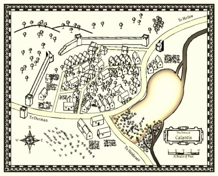
Since subscribing to the annuals, I begun trying out all the new types of maps on locations in my current campaign world. Here's the first result: Calantis. A small trading town at the crossroads between various towns. It was built among the ruins of an ancient fort.
I used the John Speed style, and used the ruined tower symbol from the Overland B&W style for a couple of ruined towers. I'm quite pleased with how the ruined wall turned out but I would really appreciate any suggestions on how to make the swamp at the south end of the lake look better.

I used the John Speed style, and used the ruined tower symbol from the Overland B&W style for a couple of ruined towers. I'm quite pleased with how the ruined wall turned out but I would really appreciate any suggestions on how to make the swamp at the south end of the lake look better.


Comments
Anyway, really like town. The ruined wall and towers are a great addition. The swamp does need work, but as I haven't tried this style yet I can't really help.
I love the symbols and I think we need lots more in this style/perspective.
This 'map seen in moonlight' lends itself well to B&W maps.
Good looking map.
To be constructive and to answer your question, the lake could be uniformly bordered. The NE side has a black outline wheareas the SW hasn't. It's perharps because you don't want to make the transition clear (twould be realistic for a swamp) but my eyes want's to find an outline there two, even if it's the road/street (whose outline is thinner).
The swamp symbols look too regular on the SW edge and too overlapping everywhere else.
Is there any way to align the field (I suppose that's what it is) with the overall angle ? The square angles look at little out of place but it might be my eyes again, eh?
Thanks. I'm going to try that and see how it comes out.
We gamed with this map last night and it turned out wonderfully. Having this sort of tool to visualize for both me as DM and the players is such a help. Now we can look at this map and say "That's the tower where we pissed off the local lord and were imprisoned". That's the tavern we blasted with lightning bolts" "oh, and there's the freshly tilled field we found the mass grave in!" (all of which actually happened in this town last night. Great times)