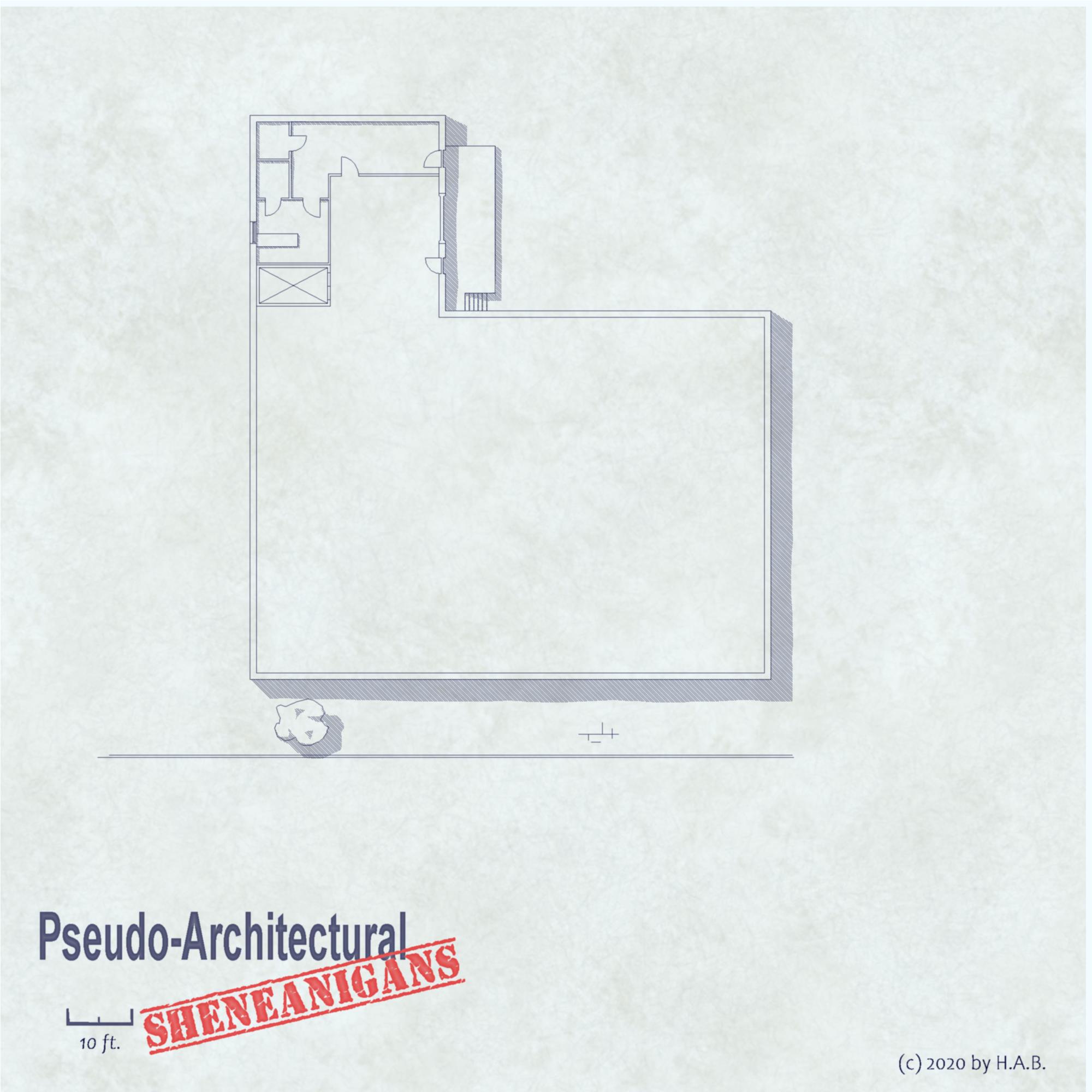
Pseudo-Architectural Shenaningans (WIP)
 Lillhans
🖼️ 7 images Surveyor
I am 100% confident it will spill into 2021 before this one's completed. It seems like a good excuse to start building a symbols catalogue proper, for future projects in the same category. Seeing as I have no idea what type of building it is, however, procrastrination most likely will win the day.
Tagged:


Comments
Looks like a largish house to me, with the back door opening into a nice big kitchen, off which so far you have a scullery and various pantries and cupboards.
Check out https://cad-blocks.net
They have collections of CAD blocks for free.
I really like the stairs, and have downloaded it
That CAD Blocks site has a lot of good stuff. I've added it to the list in the Free Symbols resource thread.
These CAD blocks are actually ready to use symbol catalogs, which is very neat. I first thought I would have to resort to just copy/paste from the drawing, but load them up as a symbol catalog, and they show up as proper symbols.
@Monsen could you explain in more detail how to load the CAD blocks as symbol catalogs? I haven't downloaded one yet but I'd like to be prepared. I'll probably do some editing since I like to simplify things anyway.
@DaltonSpence wrote:
could you explain in more detail how to load the CAD blocks as symbol catalogs? I haven't downloaded one yet but I'd like to be prepared. I'll probably do some editing since I like to simplify things anyway.
Just hit the Open Symbol Catalog button and load the file. Note that it doesn't have a filter by default for .dwg files, but all you have to do is to enter *.dwg in the file name field and hit enter in the browse dialog, and then browse to the appropriate directory and pick the file, just as with a standard symbol catalog.
Note that some of these symbols are made with white lines only, which can make them rather invisible in the symbol catalog window, but you can change the default background color by going to View -> View-Window Color and setting another color. This will impact the mapping window too, but it won't affect prints or exports.
Monson, Thank you, I did not know that, I have been procrastinating on building symbol files from them.
It's an existing style in that it simply uses CC3's out-of-the-box tools @DaltonSpence - very much like the previous "handdrawn" efforts but with a more strict approach - akin to construction drawing. The idea here being, ineed, that it can be used as a VTT battle-map if so desired.
As seen below, all that is added is a background bitmap for that papery texture (and sheet effects of course). And, if I do say so myself, it doesn't look like absolue rubbish even with the bells and whistles turned off; a testament to the strength of construction drawing :D
My dream house!
Hmph.
Nice map though :)
Oh, the rest of the floor will be back office, a hole-in-the-wall diner, and shops. Thinking ground-floor of office building. Exits are a-coming :)
Too small and inaccessible loading bay for servicing a warehouse the size of the entire interior, probably: for a logistics hub it's simply not an ideal basic structure.
So the elevator/stairs core is probably off by a whole lot, structural engineering-wise, but since the building is for dynamic entries and kinetic activities (and other murder-deathkill stuff!) who cares!
TEE kitchen and staff area needs sorting out - as well as the NE/SE quadrants. Suggestions more than welcome at this point: I'm procrastrinating my way into 2021 as it were. Utility room/shafts? Travel agency? Realtor? Art exhibition?
That kitchen probably needs to meet some sort of regulation standards. Also: while I have seen smaller staff areas....yeah the security closet probably needs to migrate to the southeast quadrant :D
Horrible manager office, no window....
I reckon they work the counter most the time, though. But yeah, it's not sweet deal.
This will have to do for 2020. Wrapping up in 2021.
Looking great so far. You've given yourself quite a huge time frame for when to finish it now though :)
For fonts on architecture type drawings, I think the 'Damned Architect' looks good. I also sometimes like 'Douglas Adams Handwriting' or 'Dakota' for some variation.
Can't spell "project management" without "pro"...
In short, it's just the basic drawing tools and a custom background. Style sets that will get you close to it instantly would be 2007's early modern city and 2011's 1930's travel guide which both offer express highways to both look and modus operandi.
I'll try and write a summary of what was used and how once it's complete and ready for posting at the Show and Tell.
Will check out those fonts! Barcelona variations are great but not always. Can't get enough fonts :)
@thehawk forgot: the background is from the Watercolour style.