The Cult of Life and Death - Simple Dungeon Map
 Raiko
🖼️ 32 images Surveyor
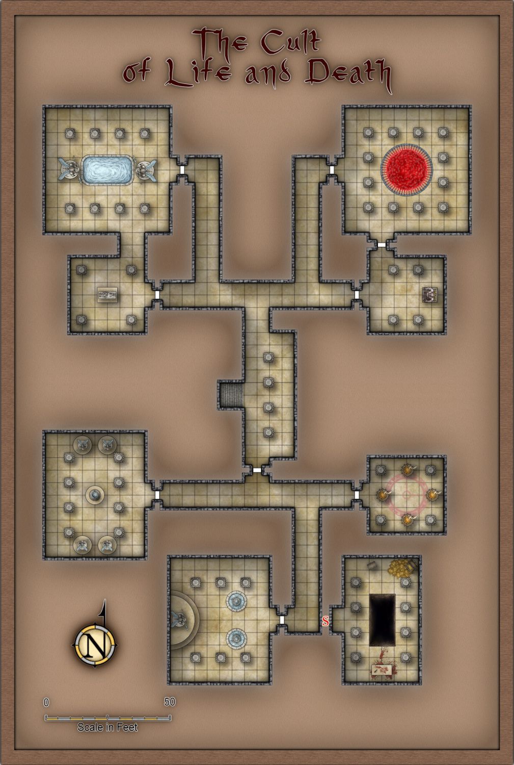
I did this to play around some more with colour key effects - and just to show that sometimes I actually finish my maps! 
Some of my previous dungeons posted here from a few years ago had nice effects, but the walls and floors were all complex multipolies and took hours to do. So I wanted to knock up a quick dungeon map that mostly uses colour key to achieve the same results.
The dungeon layout is an export from the Watabou One Page Dungeon generator. I changed the name and the room contents.
The Cult of Life and Death Dungeon.

All symbols and fills are from Profantasy Products, so I've attached the FCW file.
The title font is Narrasil from MonkeyBlood, with was included in the Ryecroft Town issue of this year's annual, but I think you need to install that particular font manually.
Other than that font, all symbols and fills are from either SS4 or the Jonathon Roberts dungeon annual issue. The cartouches are from SS5.
EDIT: I've attached an updated FCW with everything moved to the correct layers - including the colour keys.
Also I realised that there are assets from 2 other annual issues. The red pool is from CA125 and the brown background on the WALLS MASK sheet has a texturize effect which uses a file from CA24.
Some of my previous dungeons posted here from a few years ago had nice effects, but the walls and floors were all complex multipolies and took hours to do. So I wanted to knock up a quick dungeon map that mostly uses colour key to achieve the same results.
The dungeon layout is an export from the Watabou One Page Dungeon generator. I changed the name and the room contents.
The Cult of Life and Death Dungeon.

All symbols and fills are from Profantasy Products, so I've attached the FCW file.
The title font is Narrasil from MonkeyBlood, with was included in the Ryecroft Town issue of this year's annual, but I think you need to install that particular font manually.
Other than that font, all symbols and fills are from either SS4 or the Jonathon Roberts dungeon annual issue. The cartouches are from SS5.
EDIT: I've attached an updated FCW with everything moved to the correct layers - including the colour keys.
Also I realised that there are assets from 2 other annual issues. The red pool is from CA125 and the brown background on the WALLS MASK sheet has a texturize effect which uses a file from CA24.


Comments
Very nice. Love the use of color key. The disadvantage with color key is that you can't really view the map at all with effects off, but it is a great effect to do a lot of things quickly and easy to change later.
Any chance of putting that dungeon somewhere in the Atlas? I'm sure Monsen and I could find a place
How long from export to final map did it take you, do you think?
@Raiko Lovely map. Well done :)
If I use lots of colour keys I sometimes put all the colour key pieces on a separate layer and lock the layer so they can't be selected by accident. I haven't done it with all the maps I've used colour keys in, but those that I have are much easier to edit. It also strikes me that hiding and showing different layers with different sets of colour keys on them could be an easy way of hiding and showing whole rooms or sections of the dungeon during play.
Certainly @Quenten.
I'm making an effort to stick to Profantasy assets only when I make maps just to learn new things, as that they're usable in the Atlas.
I've not forgotten that I owe you a huanted house for the Atlas as well.
Thanks Sue.
I've replaced the FCW file in the original post with a new version where I've moved everything to the correct layers. It has COLOR KEY(LOWER), COLOR KEY(UPPER) and COLOR KEY(SECRET) layers.
The upper and lower layers are because the colour keys are stacked to avoid needing any complex shapes for the walls.
e.g. On the WALLS sheet there is a rectangle that fills the whole map on the WALLS BACKGROUND layer, then a set of room & corridor sized colour keys on the COLOR KEY (LOWER) layer, then the walls with doors in them are 4ft wide paths on the WALLS layer, and finally a second colour key to make the hole for the door on the COLOR KEY (UPPER).
The secret door symbol is on the SECRET layer.
Hiding the SECRET and COLOR KEY(SECRET) layers now removes the secret room entirely - the other symbols are all concealed beneath the walls and the wall mask. A copy of the "secrets hidden map" is shown below.
I'm not sure, I did it all during the afternoon yesterday, but I messed around a lot as usual with sheet effects, and also lost quite a lot of work because I kept clicking "later" for autosave and then CC3 crashed.
Twice.
I'm really not sure why I never learn my lesson with that one.
The bits that I remade after crashes didn't take very long at all, so I think that using this file as a template, I could make a similar map in an hour or so. And much quicker if I wasn't bothering about finding the right symbol.
Now that it all looks good and everything is on the correct layer, I'm planning to have a go at making tools for the rooms, corridors, extra walls and doors. That should speed things up a lot, and I can create some additional tools to quickly add the more complex wall designs.
The Cult of Life and Death Dungeon, with Secret Area Hidden.
Do feel free to share the tools ?