1st maps with cc3+/dd3
 simianorganism
Traveler
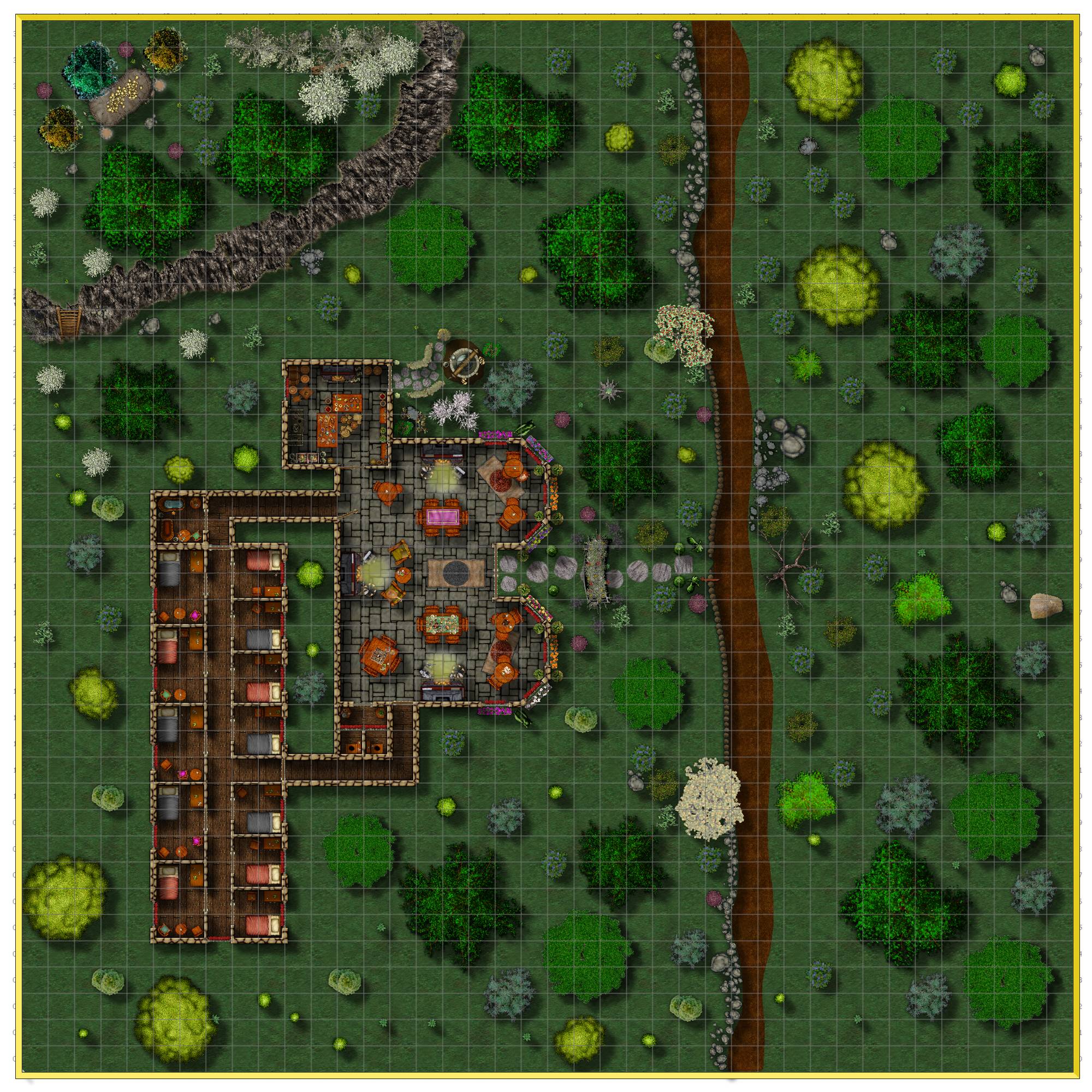
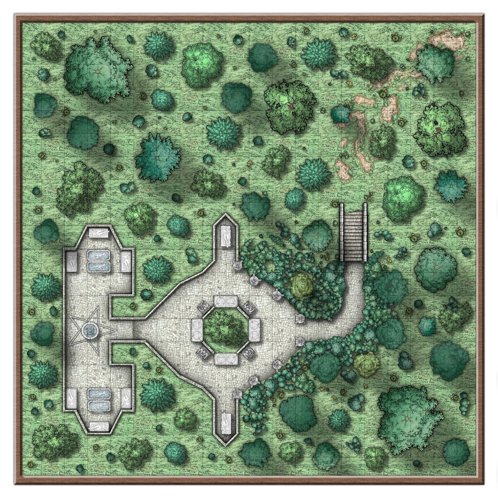
Hey, these are the first two maps made with this software. I apologize for the image quality, I am still figuring out the output settings. To be used as encounter/battle maps for a VTT. The first is trying out different styles, the second trying to match the style of maps made with different software. Please, any feedback, criticism, advice, et al is welcome.
-simianorganism









Comments
Those are really good first maps!
Well done :)
If you are outputting as bitmaps try clicking the Options button on the Save as... dialog box as you prepare to export. You will find a second dialog comes up with all kinds of different options.
Thank you! I should have been more specific - I have a pretty good grasp of the output for the maps I need for the VTT and those look very nice. I meant staying within the size limits to post to the forum without having the image look terrible. Still figuring that out. Regardless, thank you for the compliment and advice. I have actually been making maps for D&D since I was ten or so (created me first continent at 14) but using software for the creation is new ground for me, especially for VTTs. Still, nearly 40 years of being a D&D nerd does have its payoffs.
-simianorganism
Nicely done. These are good maps. That road in the top map looks like it could be improved with a bit of an edge fade though, or something else to break up that very hard edge.
These are really good @simianorganism !
I agree with @Monsen re the road, perhaps you could put some cart tracks in also?
Yeah, I am not thrilled by the edge of the road in the first map. And I had not thought of cart tracks. They would add to the "realism" for my players.
-simianorganism
Update of the inn encounter map. Faded the edge of the dirt way enough to make it more of a footpath. Tried out cart tracks but couldn't make them appear natural so skipped for now. Something to work on in the future. Removed the shadow for some of the smaller rocks, etc.
-simianorganism
These are great looking maps @simianorganism. ?
The rocks alongside the road look odd, they look like they're supposed to be a stone wall - in which case you probably need to add more symbols or an underlying polygon to fill in the gaps. Or if it's a stony edge, then I think you need to reduce the shadow, as it's the same size as the wooden fence shadow.
The shadow on the cliff looks weird as well. I think you need the ground at the top of the cliff to be on a higher sheet than the cliff and then cast a big wall shadow from there - so that the shadow is cast across the cliff sheet itself - then add a subtle shadow or large dark glow from the cliff sheet. That's how I did my cliffs for The Misgivings.