October Community Challenge - Faeridge
 Mike Patterson
🖼️ 11 images Surveyor
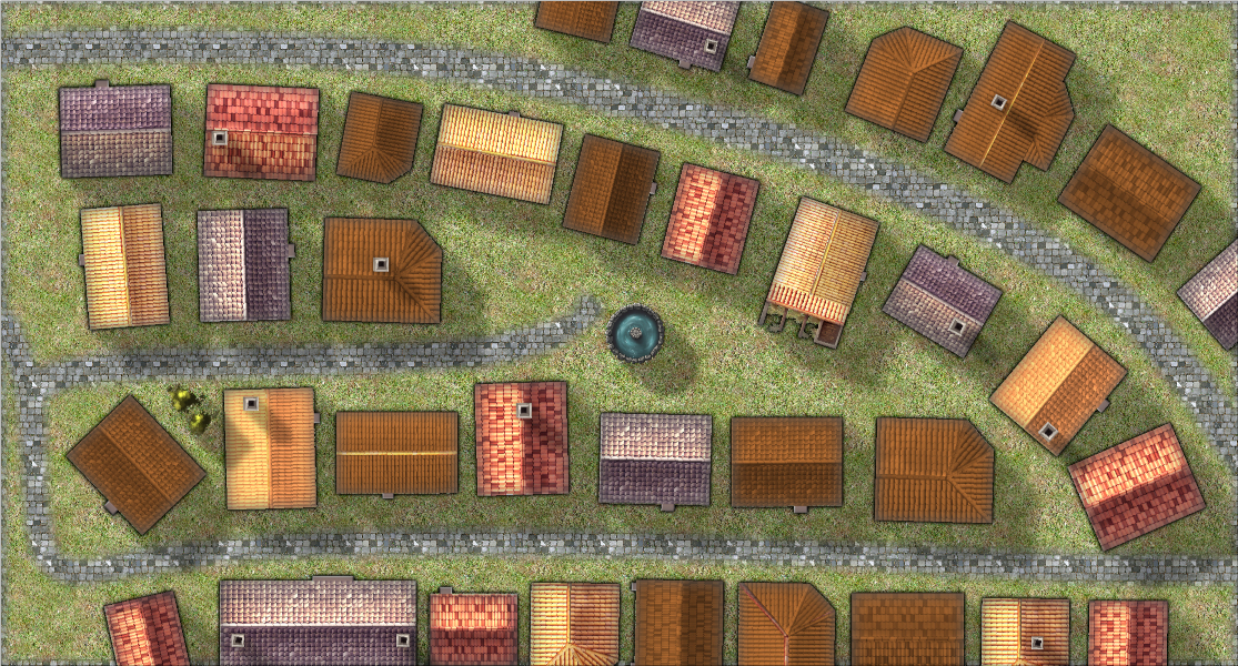
I made a start on mapping Area 14 of Dunor, the neighborhood/street Faeridge.
Still to come - Legend and labels, scale bar, compass rose, etc. I've got to decide on building purposes and names, too.
Comments, suggestions, etc. are welcome and eagerly awaited!


Comments
I'm still not sure about the house style - I am playing with several - so while the layout will stay the same (it's true to the original map) the house styles might change.
Nice start :)
I think Remy said something about it not being necessary to stick absolutely rigidly to the original map, but I can't remember the wording of it. So don't feel you have to stick to it like the original is an OS map ;)
Cities aren't my usual mapping "thing," so I'm having a hard time deciding if there's anything else I need...
I'm picturing this as a residential / mercantile neighborhood, with the Sherrif, Bailiff and Catchpole all having residences here though their work takes them throughout the city. That small courtyard type area with the fountain just seems like a natural place for people to shop. I could crowd more businesses in there, I suppose, though I'd want to make sure they're ones that don't stink to high heaven - it just seems like a little more upscale place than that to me.
Nothing you necessarily need, but depending on the detail level you wish to achieve, you could add things like vegetation (bushes/flower/vegetable garden), wagon tracks and wagons, worn trail from the road to the doors, various items (creates, benches, lights, tools), fences, animals, ....
Ah, those little details that make it homey. OK, I'll work on that. I don't have any of the third party symbols from CSUAC or Vynteri, so no animals unless I pick those up I think. But I'll see what I can do.
Thanks, Remy. (And Sue as well, for your pointing out that it doesn't have to exactly match the original map).
Got the paths to the doors put in, as well as the bare dirt in the courtyard where the fountain and the storefronts would cause much more traffic. I also figured some of the homes would have more prominent people - or maybe just people who think they should be more prominent, and would have cobblestone paths to their doors rather than bare dirt.
I just noticed that I really don't like that dark, dark tree in the little grassy picnic area - I'll have to find a symbol I like better for that.
Faeridge feels pretty well complete to me. I changed out the tree and added in a few gardens. I'm afraid that if I put much more it will start to feel cluttered. I also changed the font to JLC Ancient (from Character Artist 3), and I believe that this should work for the Atlas now. Please let me know if there are any other suggestions for improvements!
I think it has much more character in it now. You have added your own personal little details without going overboard too far and just cramming it with lots of meaningless things.
How about if you straightened that little road to the fountain and made it end at the fountain by placing a dead end circle of road like a path around the fountain. And then, how about placing the fountain on a sheet of it's own without the shadow effect so that it sits on the ground?
Both excellent suggestions, thanks! I'll work on those tomorrow :).
Well, that was more of an undertaking than I thought it would be, because of the way I set the map up originally. I've got three background layers (Cobblestone, Dirt and Grass), and used Color Key to mask them in different combinations to make the road and the dirt areas show through the grass. BUT, I think I've got it now. I softened up the edges of the road and dirt areas a little as well.
It was definitely worth it - all that effort with the background sheets and using the colour keys I did wonder how you had made the roads look so nice, so you've given me some ideas for my own map. Stolen from Maidhc!
Awesome! I learned that trick from the Watercolour annual, and I love it!
Soon as I'm sure I've finished tinkering with it I'll attach the .fcw file to the last map I post as well. It's a mess, with lots of little individual purple polygons that the part of me that's obsessed with order and structure wants to combine into one big multipoly. But that would be a lot of work, and knowing me I'd end up messing the whole thing up :).
I think I'm calling my October Community Challenge map complete. Thanks much to Remy and Sue for the suggestions - implementing them made it a MUCH better map!
I've attached the .fcw file to the last post with a map in it. Everything comes straight from CC3+ (mostly the annual City Streets style, but the font and a few of the symbols are from other add-ons), so it should work fine for the Community Atlas if you'd like to include it.
Remember to post the map to the competition thread. I cannot go thread-hunting around the forum when the deadline arrives.
Oh yeah - thanks for the reminder!