Creating my own style.
Hi Folks,
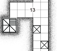
I'm creating a heap of Old School dungeon symbols as PNGs ready to import into CC3+ (I'm about half way there). So with the the various tuts I think I'm OK to create the .FSC files. What I'm wondering is how do I create a bitmap fill to use...see the below image.
That stippling pattern is what I want to create as an edging for the outer walls but I've no idea how to do it.
Currently it is four separate layers in Ps with the stipples at differing densities each with a layer mask. I used to select the floor path and then stroke it using decreasing brush sizes on each stipple layer mask. So Stipple 1 (least dense) would be stroked with say, a 200px brush, Stipple 4 (most dense) would be stroked with a 50px brush to create the effect you see.
Any ideas?


Comments
You just need a constant stippling texture, preferably seamless, and to draw a polygon of it under the floor sheet on a new sheet of it's own. This polygon needs to extend an even width beyond the floor all the way around, and to have an Edge Fade Inner sheet effect on it that is about the same extent in width, so that it fades away from the building.
This might not give you as soft an effect as you are after, but you could always add a very subtle blur to that sheet to get rid of any hard edges and corner marks.
I don't think there is a quick and easy way to get this working in CC3+. Fills cannot bend around corners and follow walls, so this isn't something that can be represented with a simple fill style.
The way I could see it working is drawing the fill using 2 or more "expanding" polygons. The first polygon would have a fill equal to the most dense stipple, and be drawn just a little bit bigger than the dungeon floor. Then the second polygon with the slightly less stipple would have to be drawn just a bit wider than that again, and so on. You'll need to fade these over in each other, so each will need to be on their own sheet, with the edge fade effect on it.
The dungeon floor should use a white background fill and be on top of everything so it would cover the other stippled polygons under it.
As an alternative, if you only plan on allowing straight walls and 90 degree corners, the stipples could be symbols. You'll need symbols for straight sections in all four directions, and for inside and outside corners. This could perhaps then be made into connecting symbols like Sue's cliffs from the most recent annual.
You could use the very same texture on both those sheets Remy just suggested, but just have an Adjust Hue/Saturation sheet effect on the more extensive one at the bottom, to make the texture paler.
Thanks Remy and Sue,
I'll think about that, the multiple polygons with the various densities of fills would not be too dissimilar to what I do in Ps...
So I couldn't trace the wall/floor with the drawing tool I use for the fills?
Unfortunately, the symbol idea is out as there may be odd angles and circular rooms...I could always post process in an app that is capable of opening .psd files, I think Krita and Affinity can...but then if I'm going to do that, it's probably just as easy to do the whole thing in the one app...
If you made symbols out of your stipple effect, then you might be able to get this effect using the symbols along path command, like the dungeon wall annual does with random bricks.
You'd be able to add more than one version of each stipple density, and also add randomised sizing and rotation to the symbols. Placing that sheet under the floor or using a color key effect would hide the inside of the pattern.
I'm not convinced that you'd get as good an effect as the PS stroke path, but CC3's symbols along path is similar to stoking with a bitmap brush in PS.
Remy is the expert on this kind of thing.
I still say that all you really need is a decent texture. The rest is effects.
@jmabbott said:
So I couldn't trace the wall/floor with the drawing tool I use for the fills?
Trace them yes, but the texture of the fill won't magically align to the edge. Whatever fill you make will either be stretched to fill the whole area, or be tiled. It won't neatly wrap around the shapes of the rooms even if the polygon itself does so.
There are effects like edge fade that can be used to make a stronger or weaker edge, but that fades things out, it doesn't make a less dense speckle as you are trying here.
Hmm...I had a look through the annuals this evening and the B&W dungeons is more or less the look I'm going for, I think I'll have more of a play with that and see what I can come up. No point in re-inventing the wheel! I'll check out the effects in the Tome and see if any of them can be applied to create something usable.
You always can take the symbols and textures of the Annual and modify them to your pleasure. It saves time!
I have taken templates, modified them to my needs, and saved as a different filename.
Thanks everyone. I'll probably do just that, modify the B&W dungeon template to suit.
Cheers,